
How to Draw Graffiti Letters Online: A Beginner Step-by-Step Guide
Last updated: July 23, 2026


Summary
To make graffiti letters online, enter one readable word, choose a clear style preset, then adjust letter structure, outline, color, shadow, and export settings. Start with block or bubble letters before using wildstyle so the design stays readable at poster, sticker, or profile size.
Learn how to draw readable graffiti letters online with beginner-friendly structure tips, style choices, color layers, examples, and export-ready design steps.
If you are new to graffiti letters, start with one readable word, not the most complex wildstyle piece you can find. Build the letters with a simple structure first, then add weight, color, outlines, and movement. That order works whether you are sketching in a notebook or making the design with an online tool.
This guide is for beginners who want to make graffiti letters online without guessing their way through every setting. You can sketch along by hand, or jump straight into our free graffiti generator and test the ideas as you read.
The workflow is based on the same practical teaching pattern used in classroom and graffiti education resources. Oak National Academy connects graffiti-style letters with structure, sketching, color, shadow, shapes, and outlines, and its digital media lesson covers layering, gradients, and shadows. The Museum of Graffiti also starts beginners with tag sketching, so this guide keeps the online process focused on readable letters before effects.
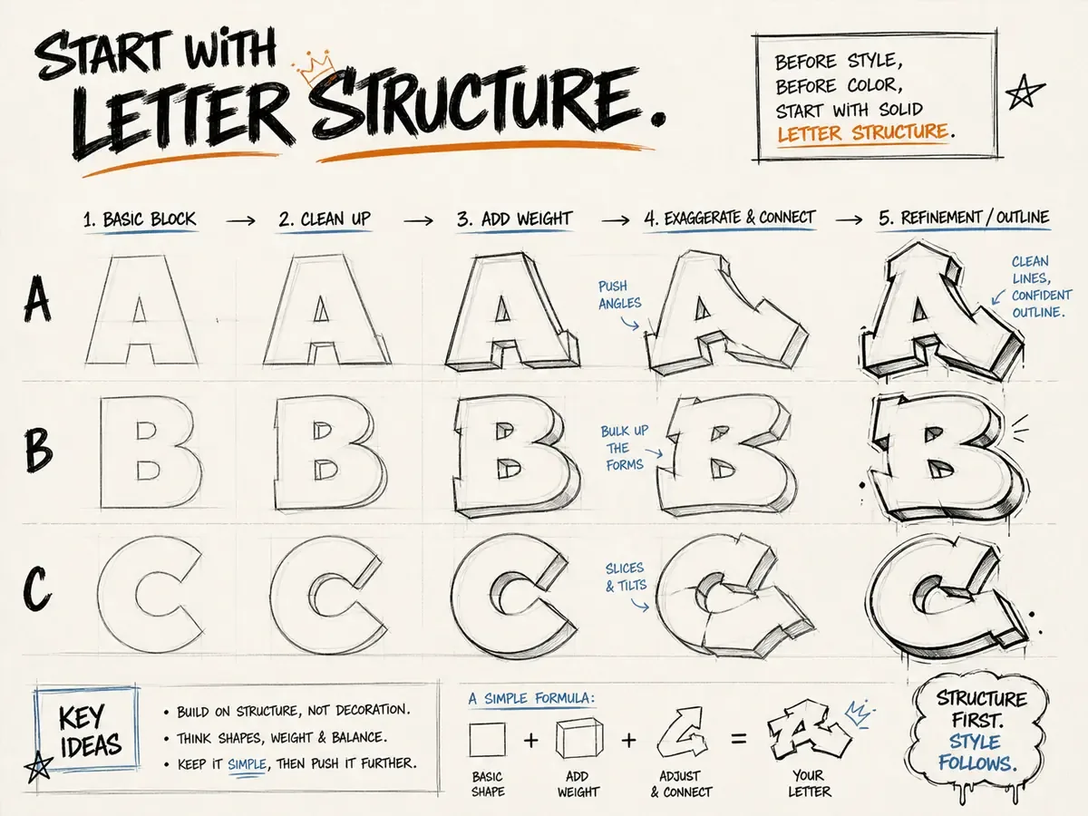
Start With Letter Structure
Every graffiti letter still needs a skeleton. For a beginner, that skeleton can be a plain block letter. Type or draw the word first as normal capital letters, then make each stroke thicker. Keep the inside spaces open enough to read. If the word is already confusing in black and white, color will not fix it. This is why a simple graffiti alphabet is useful practice: you learn the basic shapes before trying to decorate a full word.
A useful trick is to work one letter at a time. Open the graffiti letter generator, test a single letter, and look at how the bars bend, overlap, or stretch. Once you understand the shape of one letter, building a full word becomes much easier.
A Simple 5-Step Method for Graffiti Letters
When the page gives you too many style choices, slow the process down. A good beginner workflow is not randomizing until something looks cool. It is making one clear decision at a time.
- Choose the word. Pick four to six letters. Short words leave room for thick outlines and shadows.
- Set the skeleton. Start with clean block letters, then decide which bars can lean, stretch, or overlap.
- Add weight. Thicken the strokes evenly before adding extra style. Uneven weight is one of the fastest ways to make a word feel messy.
- Separate the letters. Use an outline to keep the word readable on a wall, photo, poster, or transparent background.
- Finish with one effect. Add a shadow, 3D edge, shine, drip, or arrow. One clear effect usually looks stronger than five competing effects.
Pick One Style Before You Add Effects
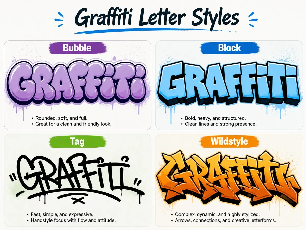
Bubble graffiti letters are forgiving because they are round, readable, and easy to color. Block graffiti letters look stronger and cleaner, especially for posters or thumbnails. Tags are faster and more personal, but they depend on rhythm. Wildstyle looks exciting, but it is usually the last style a beginner should try, not the first.
If you are unsure which generator fits your project, read our guide to choosing the right graffiti generator before you start. It explains when to use text, name, tag, letter, font, and AI art tools.
If you want to compare full words instead of single letters, use the graffiti font generator to switch between readable graffiti lettering styles quickly. For a hand-drawn signature look, try the graffiti tag generator and keep the word short.
Build a Word That Still Reads at Small Size
A lot of beginner graffiti fails because the letters fight each other. The first letter is huge, the middle letters are squeezed, and the last letter runs out of room. Before adding arrows or drips, check the spacing. The word should still read when you zoom out.
Names and short aliases are perfect practice. If you are designing a personal mark, start with the graffiti name generator. If you want a full phrase, slogan, or banner-style word, the graffiti text generator gives you more room to tune the text effect.
Example: Turn BLAZE Into Graffiti Letters
Let us use the word BLAZE because it has a good mix of round, straight, and angled shapes. First, build the skeleton: keep the B round and open, make the L sturdy, give the A a wide base, let the Z carry the sharp angle, and keep the E simple so the word does not become too busy.
Next, add weight. Make the B and E slightly wider so they can hold the ends of the word. Let the A lean a little toward the Z, but do not let them crash into each other. Add a thick outline around the full word, then use one shadow direction, such as down and to the right. For color, try an orange or yellow fill, a dark outline, and a red shadow. That gives the word energy without making it hard to read.
If you test BLAZE in the generator, make one clean block version first. After that, duplicate the idea as bubble letters or a tag. Comparing versions of the same word is much more useful than jumping between unrelated prompts.
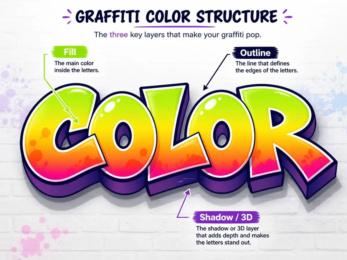
Use Color in Layers
Do not choose five bright colors just because they are available. A simple graffiti color system usually has three parts: the fill, the outline, and the shadow. The fill gives the letters personality. The outline separates them from the background. The shadow or 3D layer gives the word weight.
For a clean beginner setup, try a warm fill, a dark outline, and a slightly darker shadow. If the background is busy, make the outline thicker. If the letters feel heavy, lighten the shadow or remove extra highlights. When in doubt, export one version with the wall background and one transparent version so you can compare them outside the editor.
Move From Letters to a Finished Piece
Once the letters work, you can decide how finished the design needs to be. A transparent PNG is best for logos, stickers, overlays, and profile images. A wall background is better when you want the design to feel like street art instead of a floating word.
If the design is going onto a real bedroom wall, studio corner, shop backdrop, or printed display, check the final scale before you export. A design that reads on a laptop preview can feel too thin on a larger wall or too crowded on a small sticker. Save a clean version first, then test the same letters against the background color and display size you plan to use.
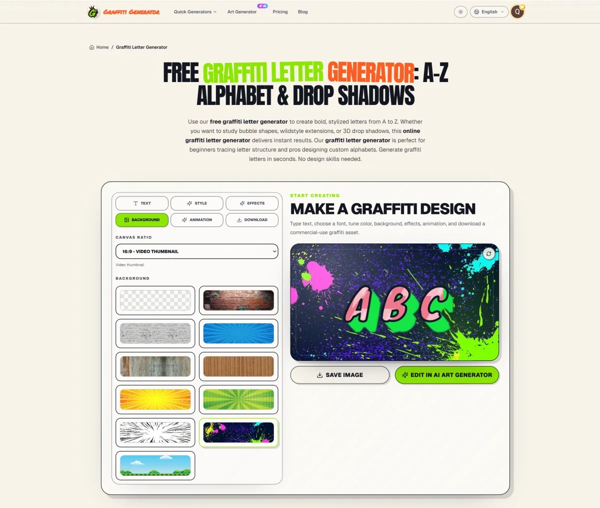
For a complete scene with backgrounds, spray texture, and bigger visual ideas, use the AI graffiti art generator. If you want the fastest browser-based workflow with text, styles, and export options in one place, start with the online graffiti generator.
Common Beginner Mistakes
- Using wildstyle before the basic letters are readable.
- Adding too many arrows, cracks, drips, and highlights at once.
- Choosing colors that disappear into the background.
- Making every letter a different size without a clear reason.
- Exporting only a wall version and forgetting to save a transparent PNG.
Quick Practice Plan
Pick a four-to-six letter word. Make it once as block letters, once as bubble letters, and once as a tag. If you are also building a personal graffiti alphabet, repeat the same exercise with initials or letters you use often. Save the cleanest version, not the most complicated one. Then adjust only three things: outline thickness, shadow depth, and background. That small practice loop teaches more than endlessly randomizing styles.
Try the same word in the online graffiti generator, export a PNG or JPG, then shrink the image down on your screen. If the word still reads clearly, you have a strong base for a poster, sticker, thumbnail, or more detailed graffiti design. Keep that first successful version as your reference before you start making louder variations.