
Bubble Letter Y
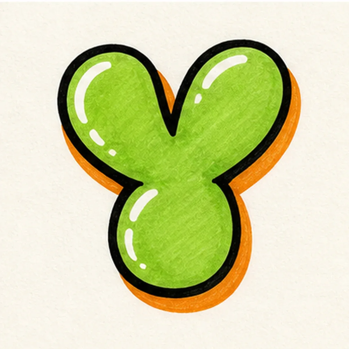
A rounded bubble letter Y with soft branching arms and a sturdy lower stem. Leave the fork open so the top still reads as a Y after the outline gets thick.
Explore Bubble LettersExplore graffiti letter Y styles, from bubble and block letters to wildstyle, tag, and 3D examples. Study how the arms branch from the center fork, then use the builder to create your own Y design.
AI Letter Builder
Open the AI graffiti letter generator to create more custom graffiti letter Y ideas.
Choose a letter
Choose a style
Write your instructions
Compare the main Y styles before you draw or generate your own. Bubble and block versions keep the fork simple, while tag, 3D, and wildstyle versions add motion, depth, or sharper extensions around the arms.
A rounded bubble letter Y with soft branching arms and a sturdy lower stem. Leave the fork open so the top still reads as a Y after the outline gets thick.
Explore Bubble Letters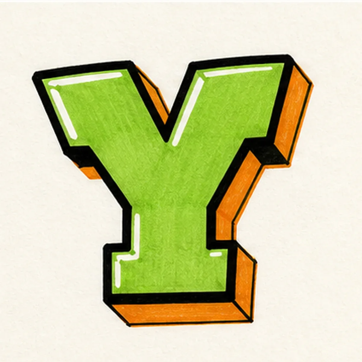
A strong block Y built from two angled arms and one vertical stem. Keep the upper arms close in weight so the letter feels solid instead of lopsided.
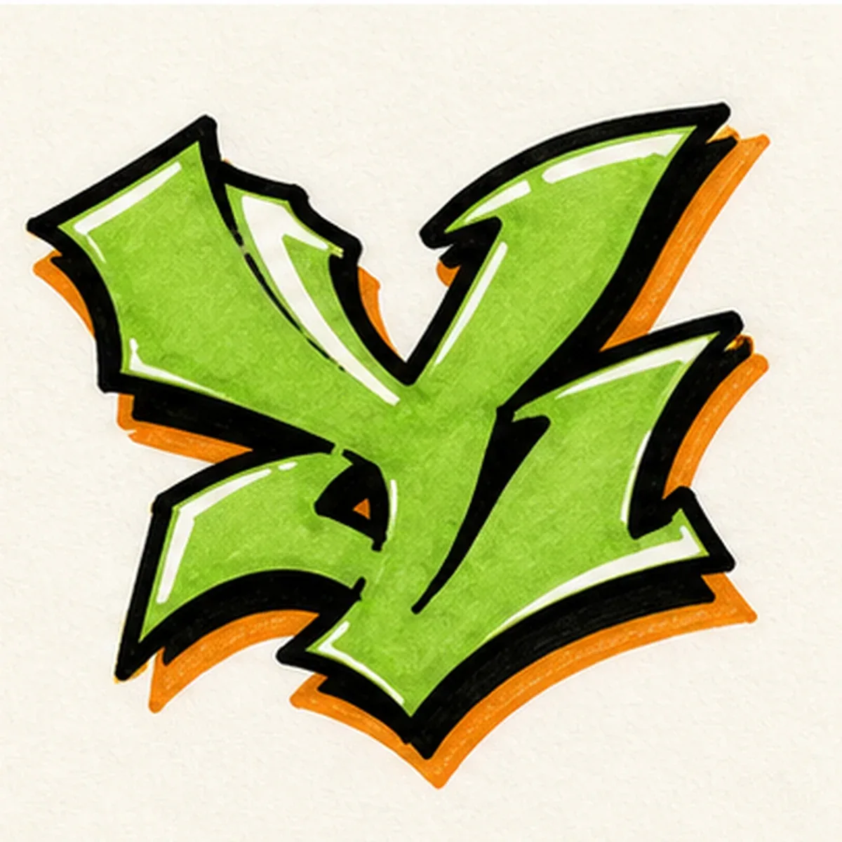
A wildstyle Y with arrows, cuts, and extensions growing from the upper arms. Add energy around the outside while keeping the central fork easy to spot.
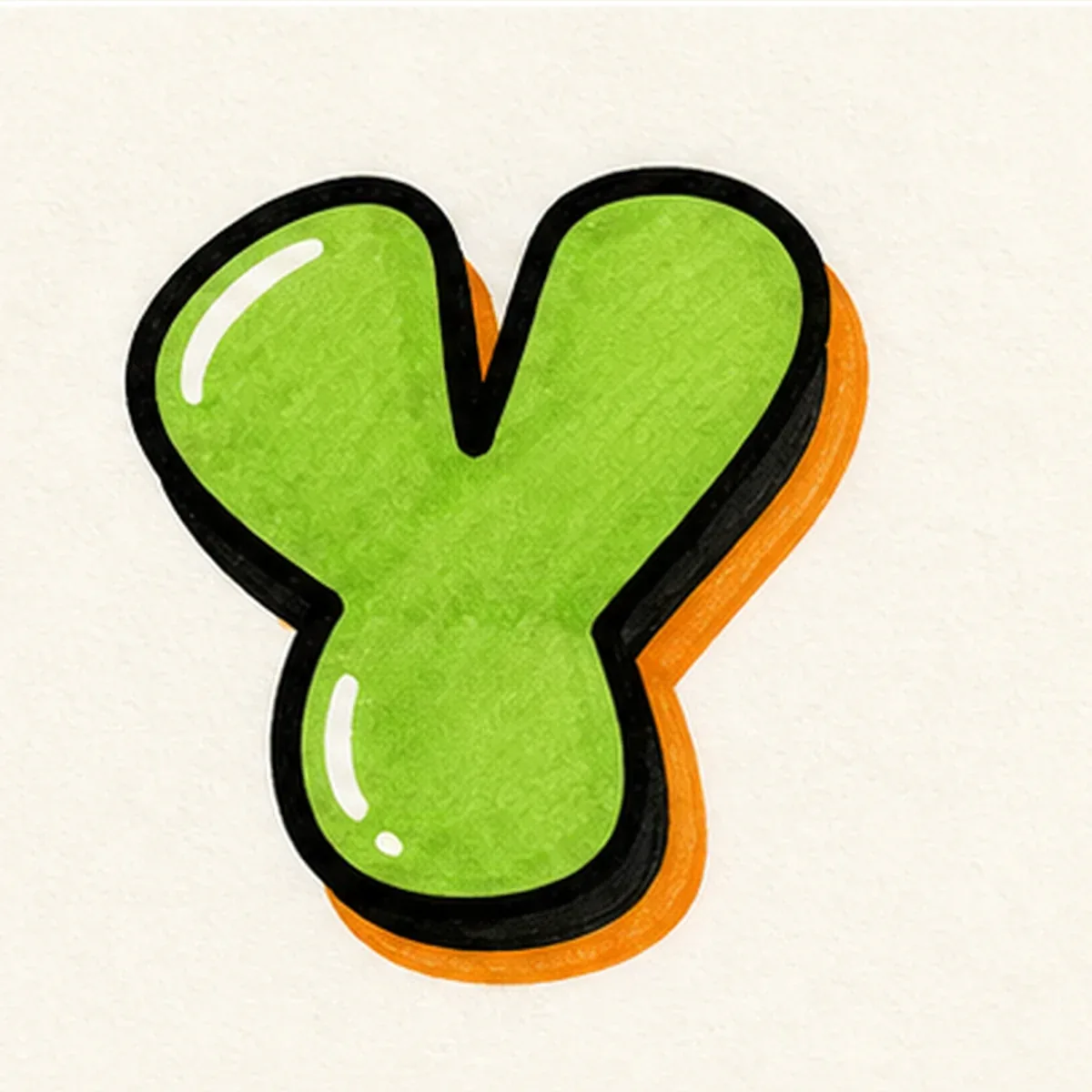
A quick throw-up Y with inflated arms, a simple fill, and a bold outline. Wide upper branches and a clear stem make the letter easier to read at a glance.
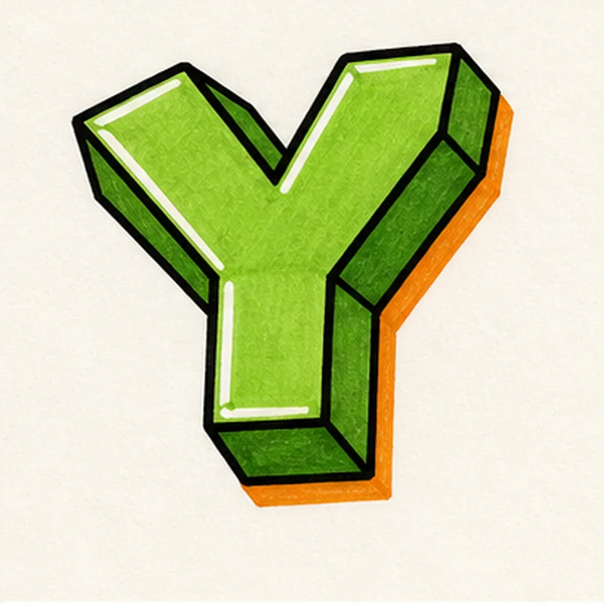
A dimensional 3D Y with one shadow direction across both arms and the lower stem. Consistent depth keeps the fork clean instead of making it feel tangled.
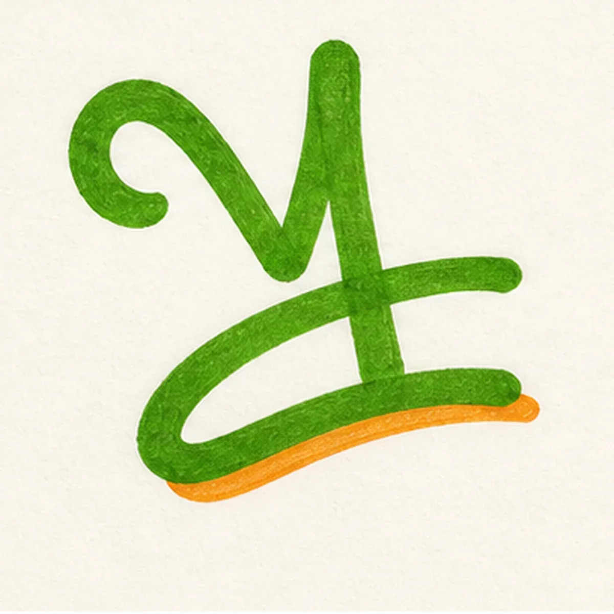
A handstyle Y built with a quick fork and a confident exit stroke. Use the tail to lead into the next letter without covering the Y shape.
Start with two diagonal arms and one lower stem, then build the Y in layers: rounded form, clean fork, bold outline, shadow, and final color.
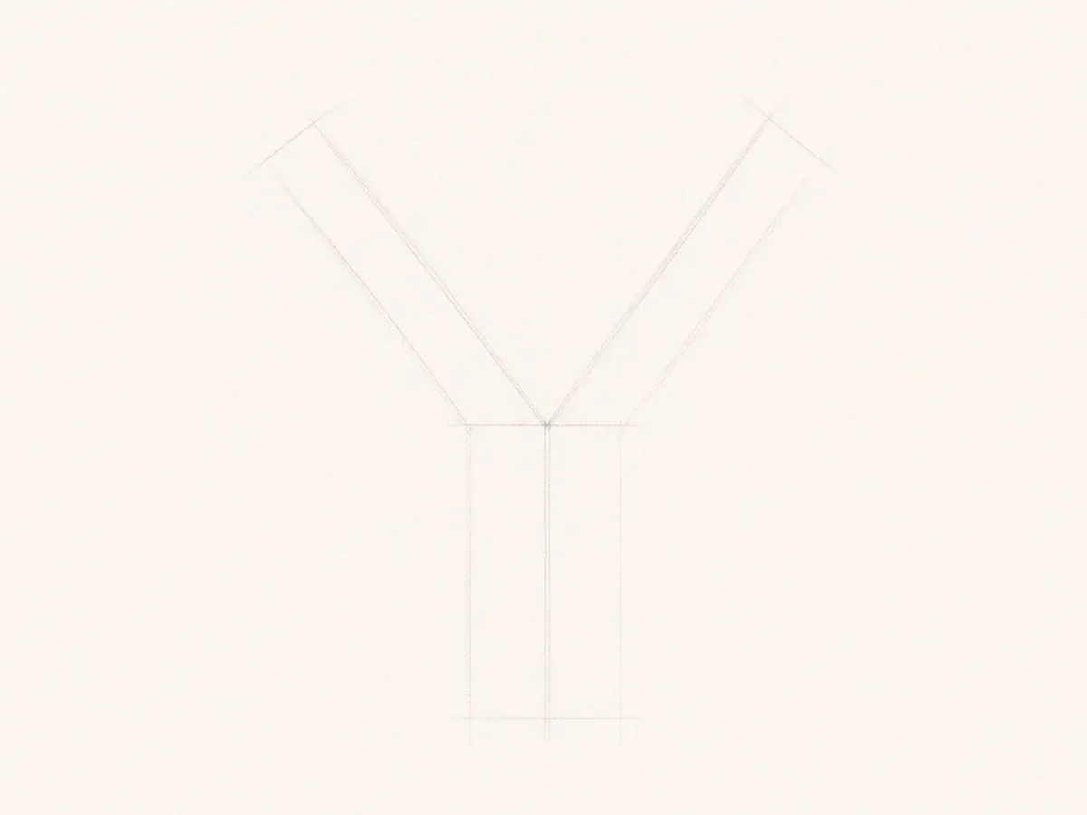
Draw two light diagonal arms that meet in the middle, then pull one stem down from that join. Check the fork before you make the lines thicker.
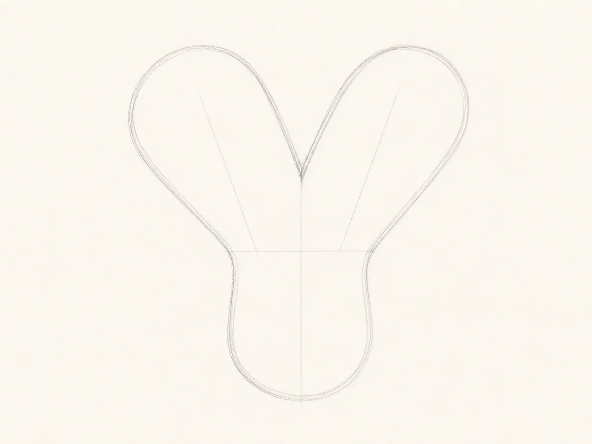
Wrap the guides with a rounded bubble outline. Keep a clean V-shaped notch between the upper arms so the Y does not close up.
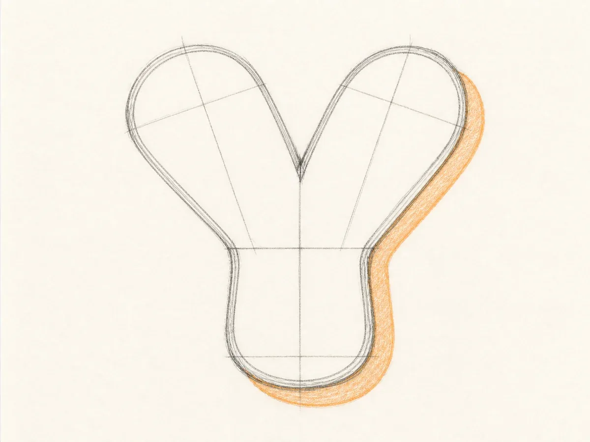
Tidy the spot where the arms meet the stem. Balance the arm weight and make the lower stem wide enough to carry the letter.
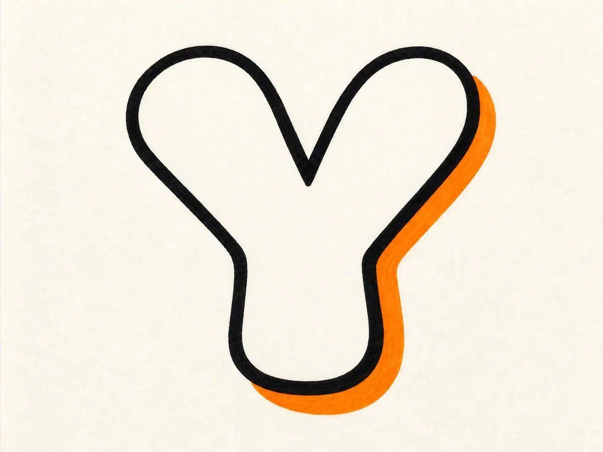
Add a bold marker outline and choose one shadow direction. Follow the arms and stem evenly so the depth feels planned, not crooked.
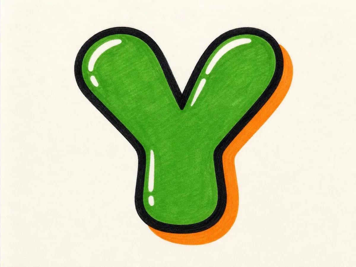
Fill the Y with color, add highlights near the upper arms, and keep heavy accents away from the fork so the final shape stays clear.
These drawing steps keep the fork, rounded arms, lower stem, and shadow direction consistent from the first sketch to the finished Y.
Make the inner V clear before adding arrows, cuts, or highlights. If the fork gets crowded, the shape can stop reading as a Y.
For bubble Y, round the arm tips and bottom stem. For block Y, keep the diagonals straighter. For 3D Y, push every shadow in the same direction.
Build the simple Y first, check the fork and lower stem, then add wildstyle extensions, drips, highlights, or color around the outer arms.
Use uppercase Y for bold standalone initials and alphabet practice. Use lowercase y when the descender can add motion inside a name, tag, or signature.
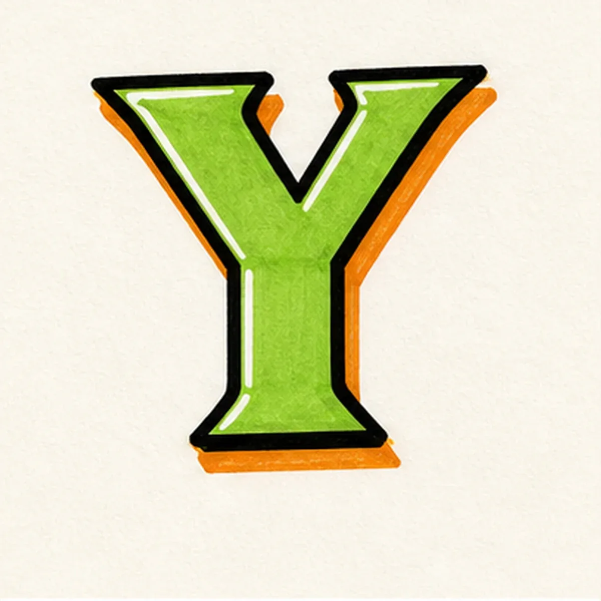
Best when the Y needs to stand alone. The two upper arms and single lower stem make a clear initial for posters, stickers, alphabet drills, and monogram-style designs.
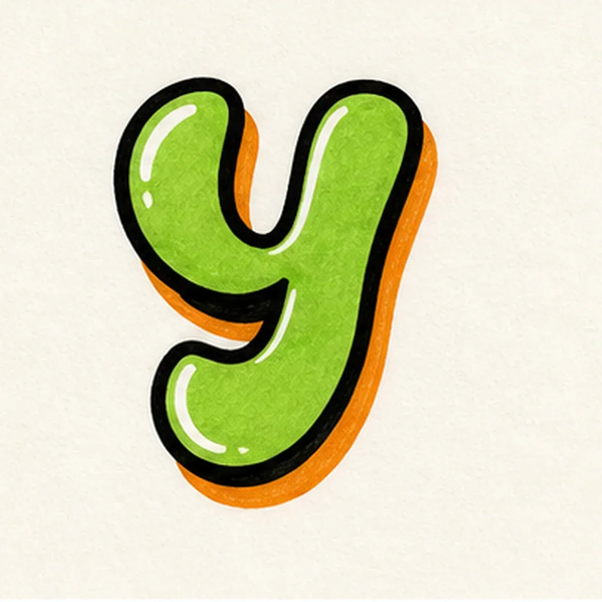
Best inside names and tags. The descender can sweep below the baseline, but keep the tail controlled so it connects smoothly instead of crowding nearby letters.
Use these ideas when sketching by hand or prompting the AI tool, especially when you want your Y design to stay readable after style details are added.
Start with the fork. If the two arms meet too high or too low, the whole Y starts to feel off balance.
For bubble letter Y, round the arm tips and bottom stem, but keep the inner V open so the branch structure stays visible.
For wildstyle Y, extend one upper arm or add cuts near the outside first, then check that the stem and fork still read clearly.
For tag letter Y, let the descender or exit stroke move toward the next letter without covering the fork.
Start with two light diagonal arms that meet at a central fork, then pull one lower stem down from that join. Once the Y shape is clear, build the thicker outline, clean up the fork, and add shadow, color, and highlights.
Bubble letter Y is usually the easiest starting point because the rounded arms are forgiving and the stem can stay simple. A block version also works well when you want straighter edges and a cleaner poster-style letter.
Most messy Y sketches have the same problem: the fork gets crowded or the lower stem becomes too thin. Balance the two upper arms, leave a visible inner V, and add arrows, cuts, or highlights only after the basic letter reads clearly.
Yes. Use the builder above or open the AI tool and ask for one capital Y only, with no extra words or full alphabet. For better results, include style notes such as bubble arms, a clean fork, a strong lower stem, 3D shadow, or wildstyle extensions on the outer arms.
Yes. After creating the Y in the AI tool, you can download the result and use it as a practice reference, sticker idea, thumbnail, initial, or design mockup. Choose a simple background if you want the fork and outline to stay easy to reuse.
Use uppercase Y when the letter needs to stand alone as an initial, poster mark, or alphabet reference. Use lowercase y inside names and tags when the descender can add motion, but keep the tail controlled so it does not collide with nearby letters.