
Bubble Letter H
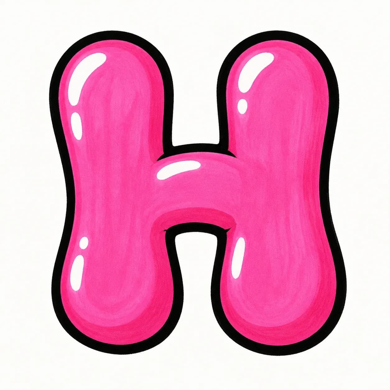
A rounded letter H with two puffy vertical stems, a soft center bridge, and open spaces above and below the crossbar.
Explore Bubble LettersExplore graffiti letter H styles, from bubble and block letters to wildstyle, tag, and 3D examples. Use the drawing steps to understand the twin stems, center crossbar, and open spaces before building your own H design.
AI Letter Builder
Open the AI graffiti letter generator to create more custom graffiti letter H ideas.
Choose a letter
Choose a style
Write your instructions
Compare different graffiti letter H styles before you draw or create your own. Bubble and block H designs help you control spacing first; tag, 3D, and wildstyle versions show how far the stems and crossbar can stretch.
A rounded letter H with two puffy vertical stems, a soft center bridge, and open spaces above and below the crossbar.
Explore Bubble Letters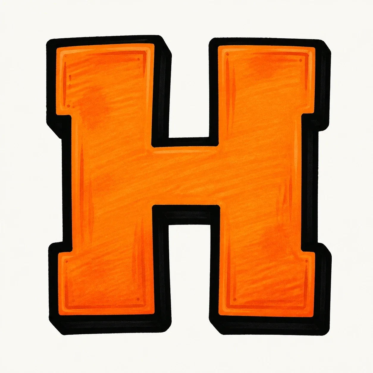
A readable block H built from strong parallel stems and an even middle bar, useful for initials, posters, and practice sheets.

A sharper wildstyle letter H where arrows and cuts can grow from the stem tops, feet, or crossbar while the two-stem structure stays traceable.
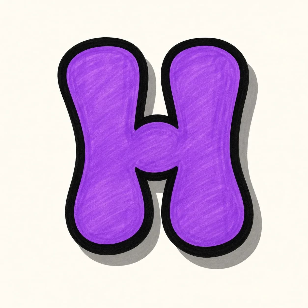
A fast throw-up H with inflated stems, a rounded bridge, and a thick outline for quick street-style lettering practice.
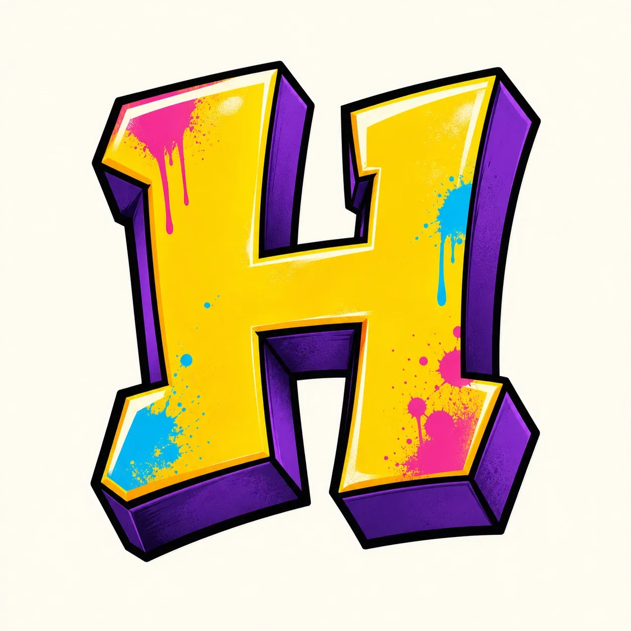
A dimensional 3D letter H that pushes depth behind both vertical stems and the crossbar without closing the open spaces.
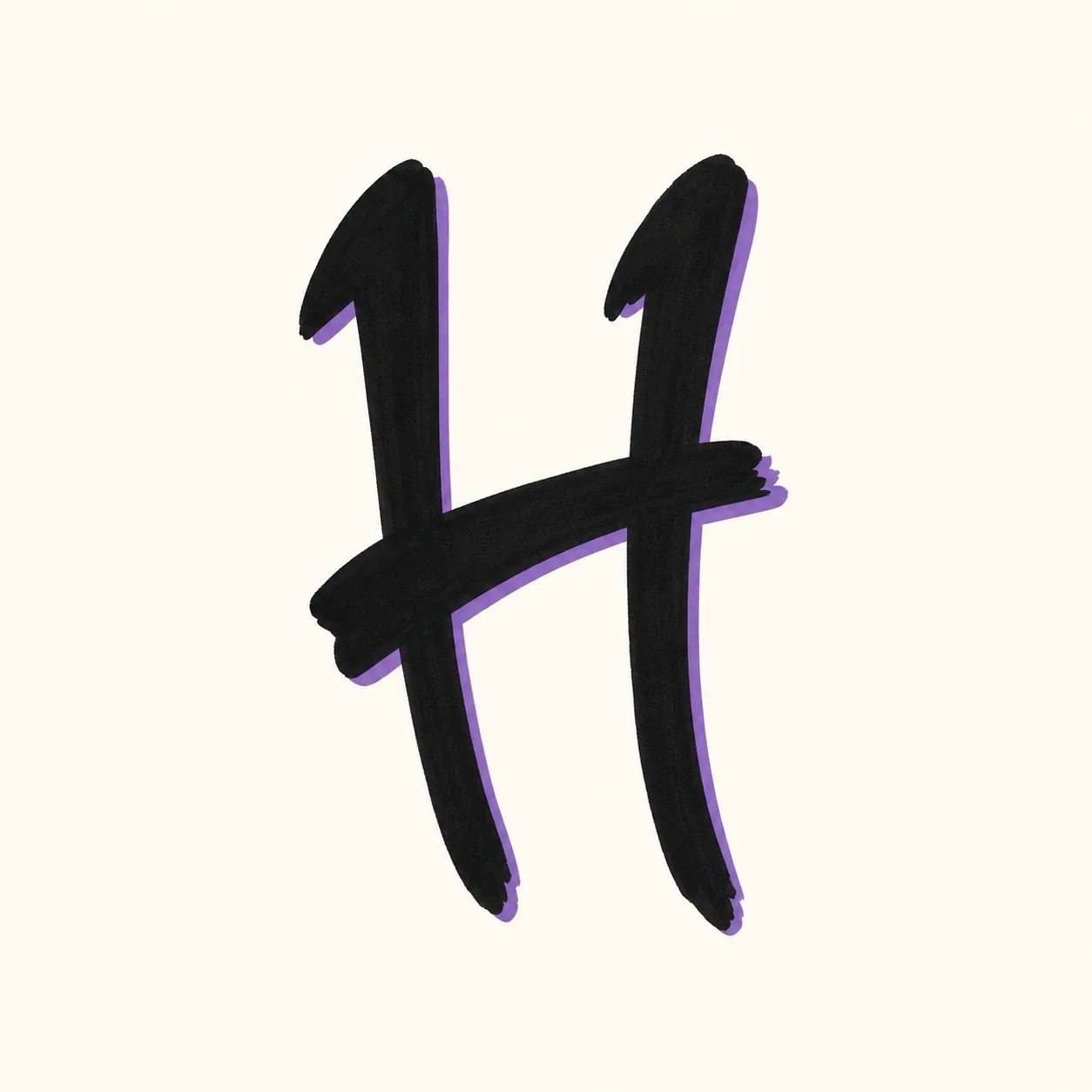
A quick handstyle H made from two confident downstrokes and a connecting stroke, useful when the letter starts or anchors a tag.
Start with two parallel stems and a centered crossbar, then build the H in layers: wider stems, clean bridge, bold outline, shadow, and final color.
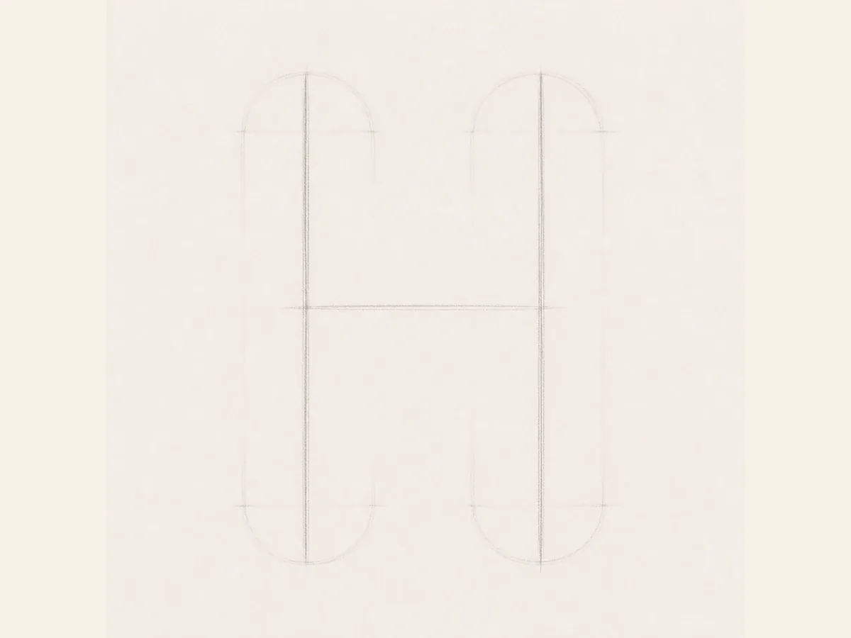
Start the H with two tall vertical guide strokes and one centered horizontal guide. Keep the stems parallel.
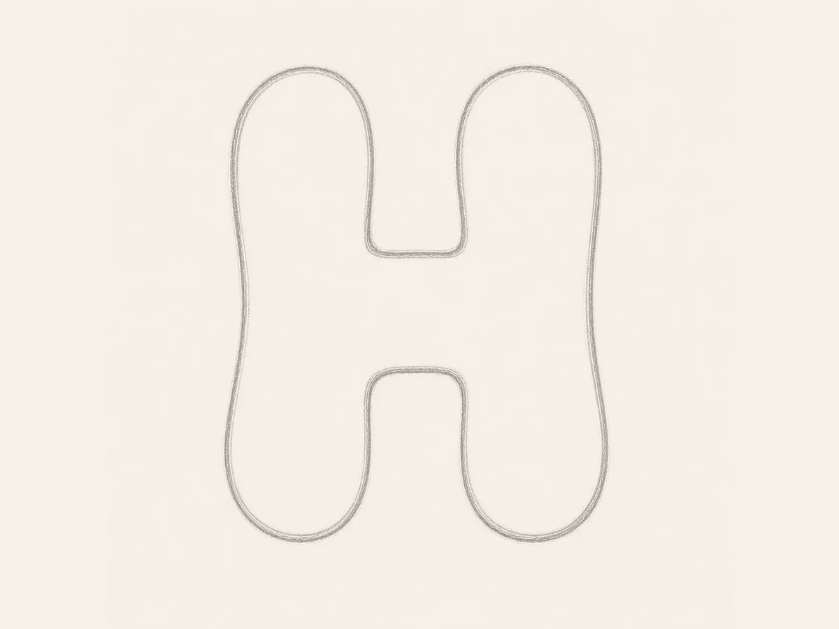
Turn the guide into a wider bubble form. Leave enough open space above and below the crossbar so the H does not feel cramped.
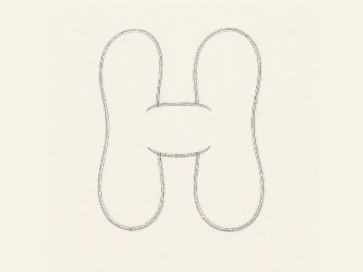
Set the center bridge before adding ink. The crossbar should connect both stems clearly without swallowing the inner gaps.
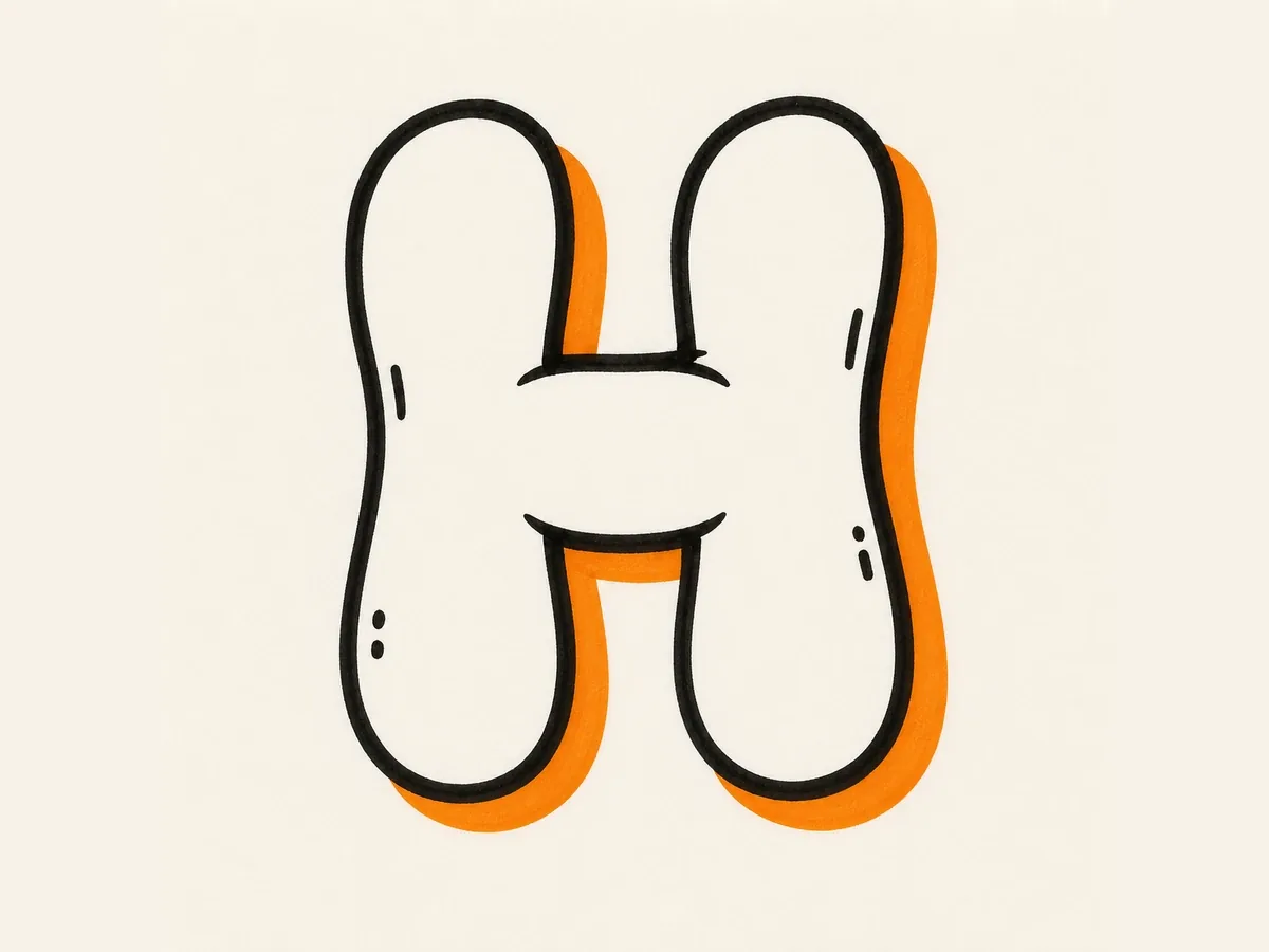
Add a bold outer stroke and simple shadow. Keep the same stem width, crossbar height, and upper and lower openings.
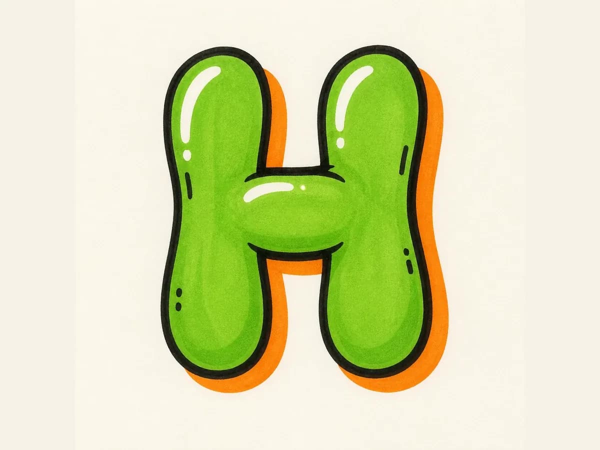
Fill the H with color, add highlights to the stems and bridge, then place small accents away from the readable center bar.
Graffiti letter H drawing steps are created to keep the twin stems, center crossbar, and spacing consistent from sketch to final color.
Start with two balanced stems and place the crossbar near the middle. Keep the upper and lower openings visible.
For bubble H, round the stem tops and feet. For block H, keep the stems straighter and the center bar even.
Build the simple H first, check the stem spacing and crossbar height, then add arrows, shadow, highlights, drips, or color.
Use uppercase H for bold initials and alphabet practice. Use lowercase h when the tall ascender and rounded shoulder need to flow inside a name or tag.
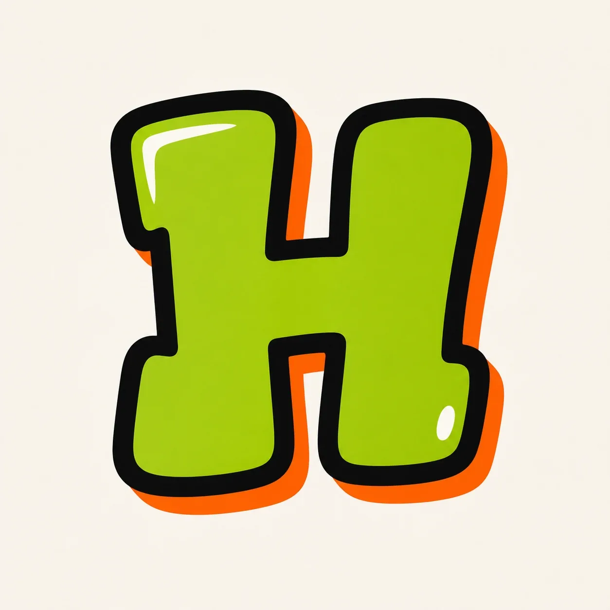
Best when the H needs to stand alone. The two stems give room for 3D depth, and the crossbar can carry shine, arrows, or color breaks.
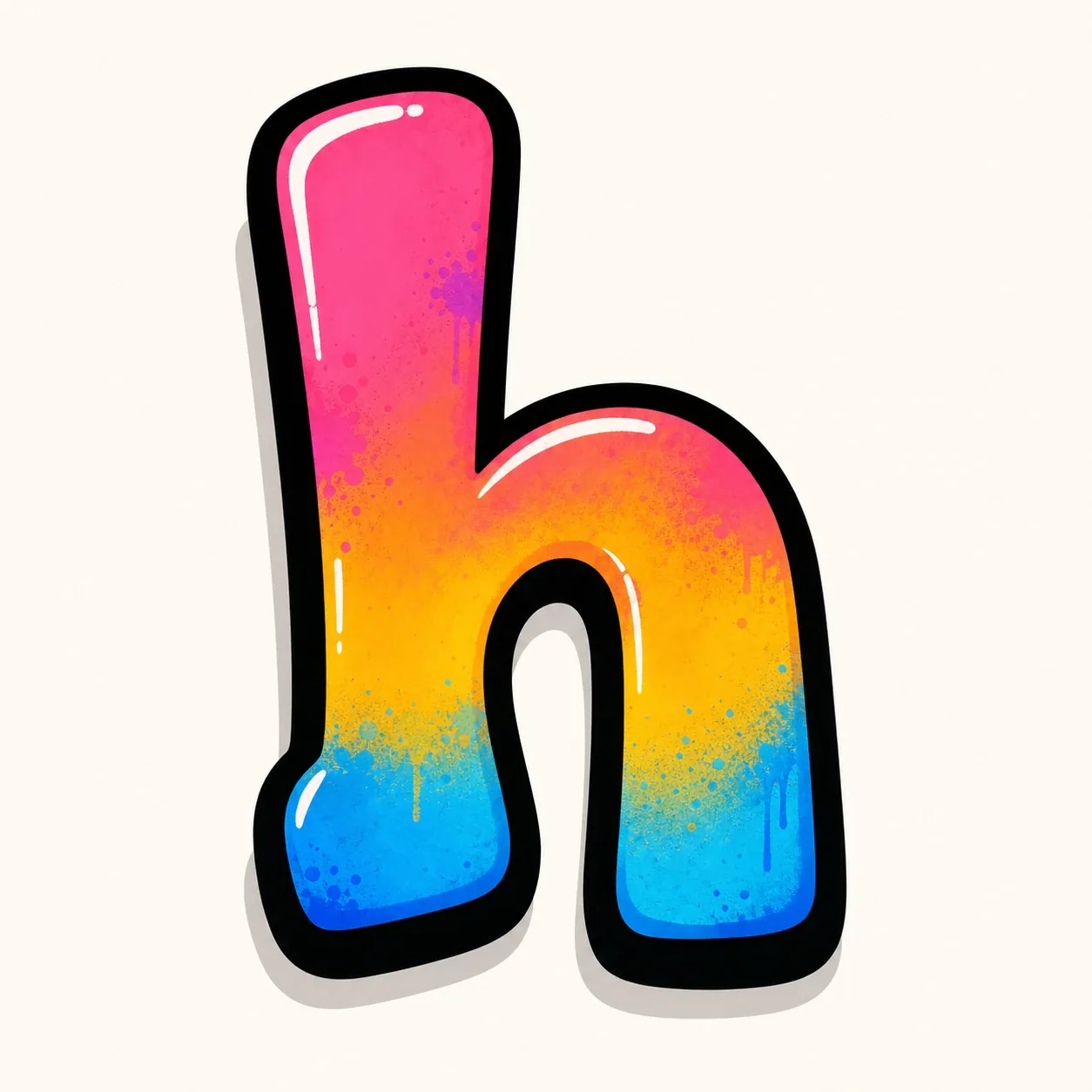
Best inside names and tags. Keep the tall left ascender clear, then let the rounded shoulder connect into the next letter without closing the inner space.
Once the basic H is readable, use the stems, bridge, and open spaces to make a style choice that still feels intentional.
Make one vertical stem slightly heavier, then use the crossbar as the color break so the H feels balanced instead of boxy.
For bubble letter H, round the tops and feet, then keep the bridge thick enough to connect both stems without filling the middle space.
For wildstyle letter H, add arrows from the stem ends or crossbar corners only after the basic H can still be traced from a distance.
For tag letter H, start with a confident first downstroke, then use the connecting stroke to set the rhythm for the next letter.
Start with two vertical guide strokes and a centered crossbar. Widen the stems, shape the bridge, then add the outline and shadow before color. Keep arrows, drips, and extra cuts for the end so the basic H stays readable.
Bubble letter H is usually the easiest because rounded stems are forgiving, and block letter H is best when you want cleaner spacing. In both styles, keep the two stems even and leave clear space above and below the crossbar.
The most common problem is spacing. If the stems are too close, the crossbar is too thick, or the upper and lower openings disappear, the H feels boxed in. Make the stems wider apart first, then add style details after the letter is clear.
Yes. Use the Letter H builder on this page to start with a single-letter prompt, then choose a bubble, block, throw-up, 3D, tag, or wildstyle direction in the graffiti letter generator. Add details like fill color, outline, shadow, or sticker-ready spacing when you want a more custom result.
Yes. After creating the H in the AI tool, download the generated image and use it for practice sheets, sticker ideas, thumbnails, initials, profile art, or other personal creative projects.
Choose bubble letter H for beginner practice, block letter H for clean initials, 3D letter H for a finished poster or logo-style look, and tag letter H when the letter needs quick handstyle rhythm. Choose wildstyle only after the two stems and center bar are strong enough to stay traceable.