
Bubble Letter V
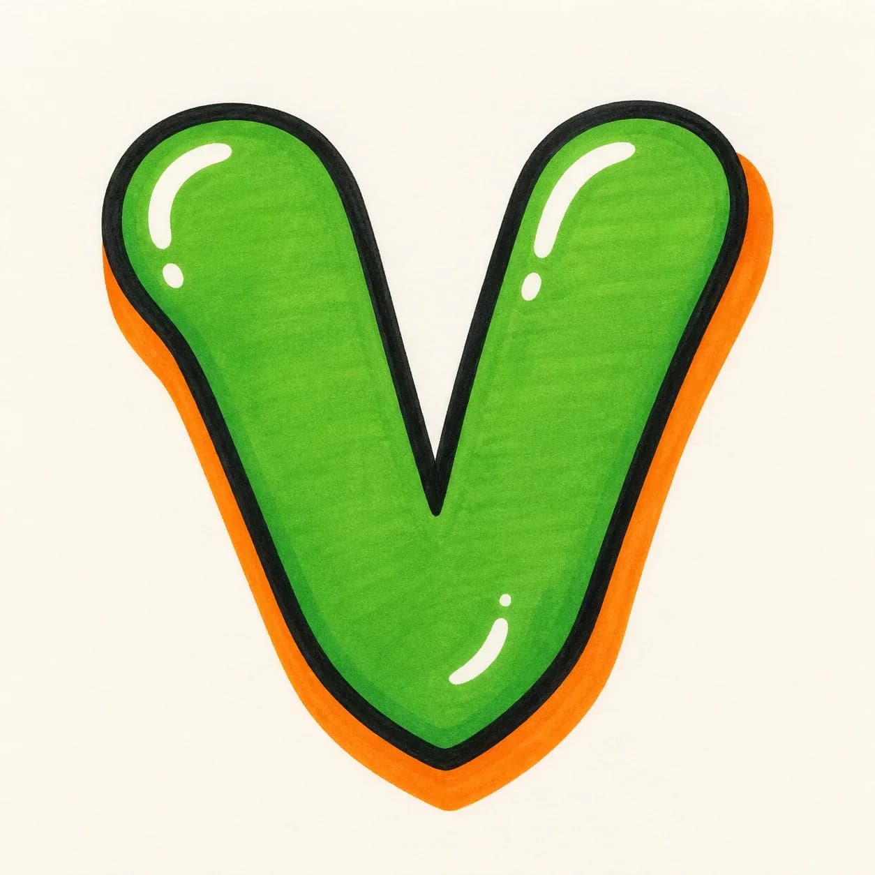
A rounded letter V with soft diagonal legs and a visible bottom point, useful when you want a playful shape that still reads as a clear V.
Explore Bubble LettersExplore graffiti letter V styles, from bubble and block letters to wildstyle, tag, and 3D examples. Use the drawing steps to understand the angled legs and bottom point, then open the builder to create your own V design.
AI Letter Builder
Open the AI graffiti letter generator to create more custom graffiti letter V ideas.
Choose a letter
Choose a style
Write your instructions
Compare the main V styles before you draw or generate your own. Bubble and block designs focus on leg balance; tag, 3D, and wildstyle versions use the bottom point to control direction and energy.
A rounded letter V with soft diagonal legs and a visible bottom point, useful when you want a playful shape that still reads as a clear V.
Explore Bubble Letters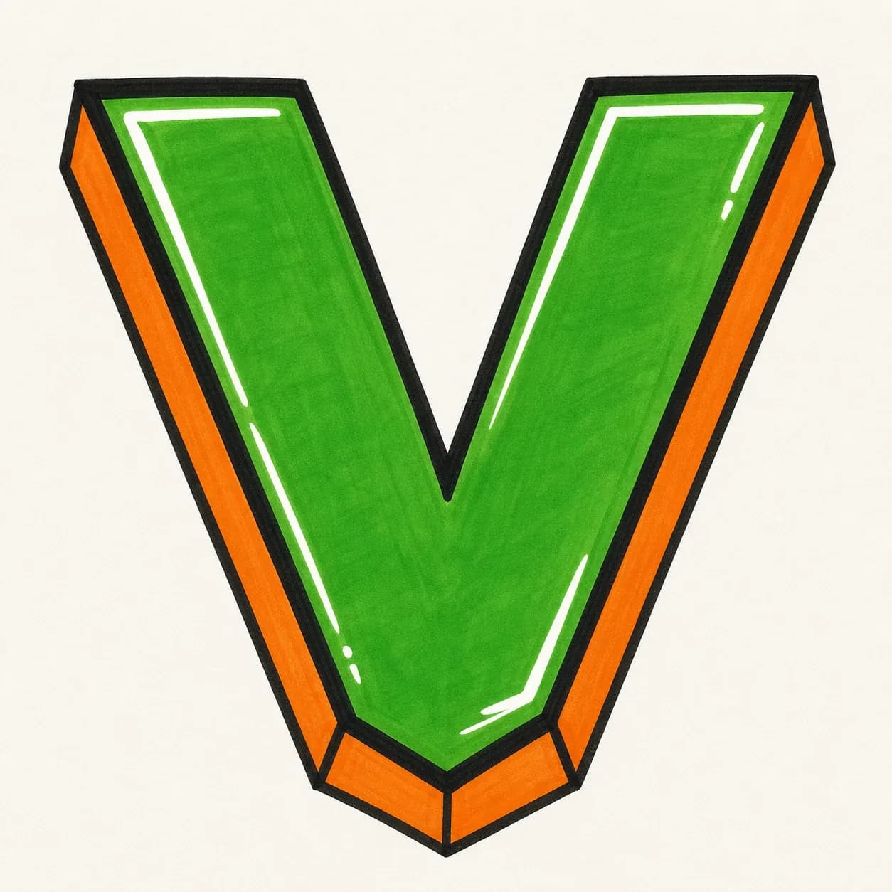
A strong block letter V built from two heavy slanted strokes, best for initials, posters, sticker marks, and clean alphabet practice.
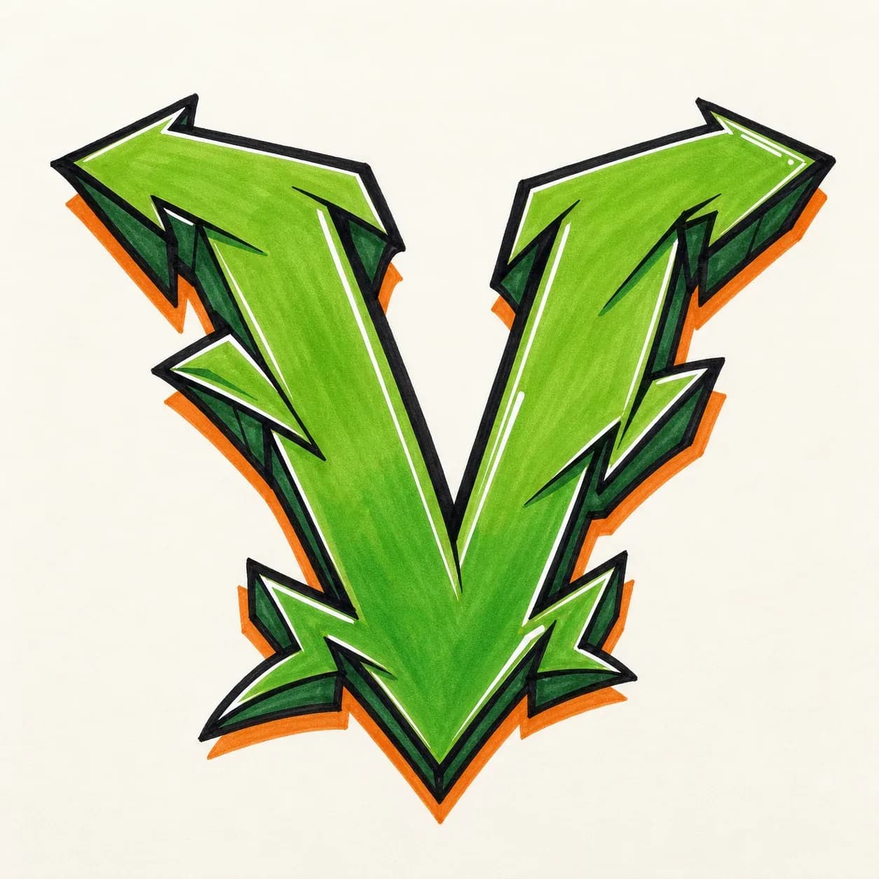
A wildstyle letter V with arrows, cuts, and outer extensions while the bottom point stays open enough to hold the whole structure together.
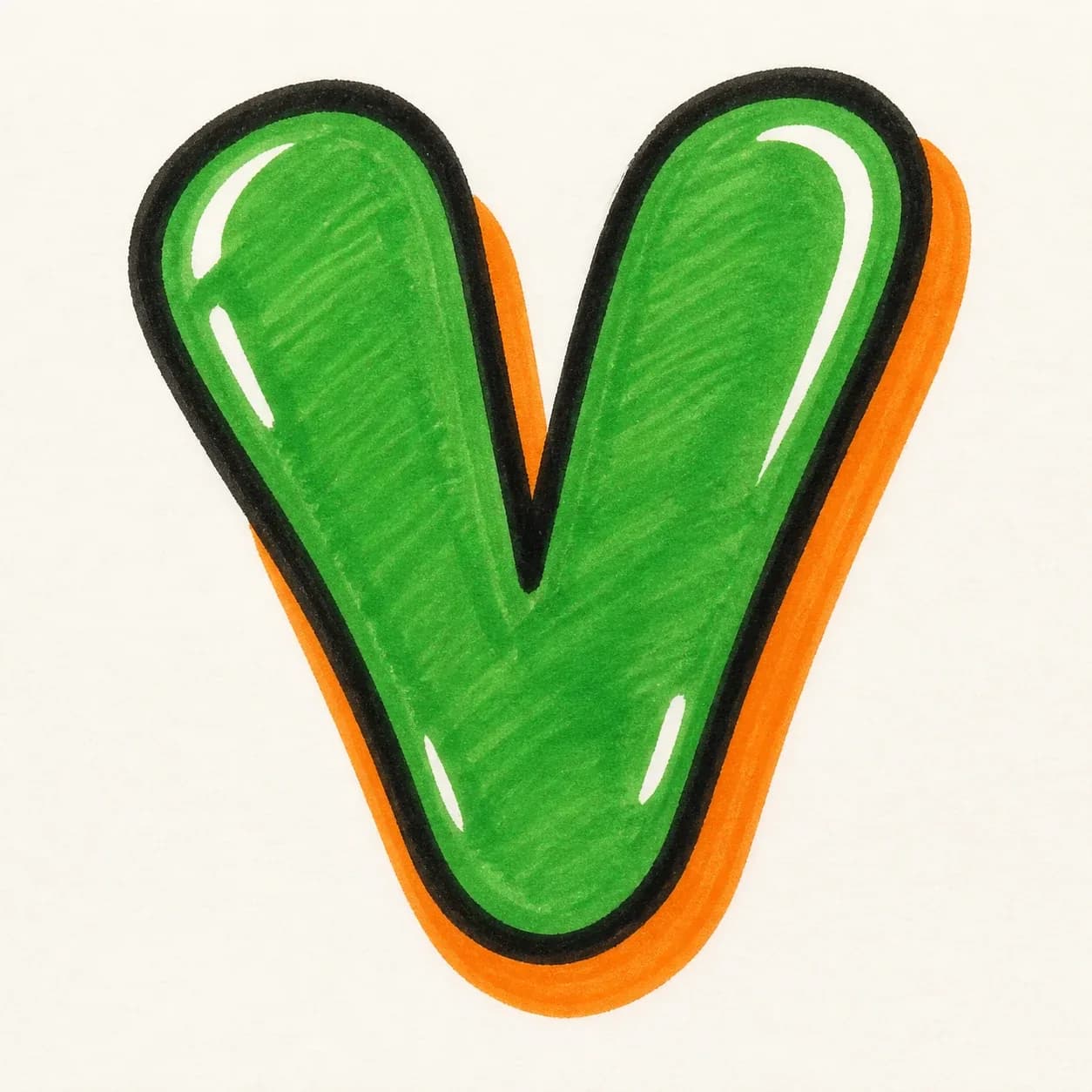
A quick throw-up V with inflated diagonal legs, rounded ends, and a bold outline, made for fast sketching without turning the shape into a loose check mark.
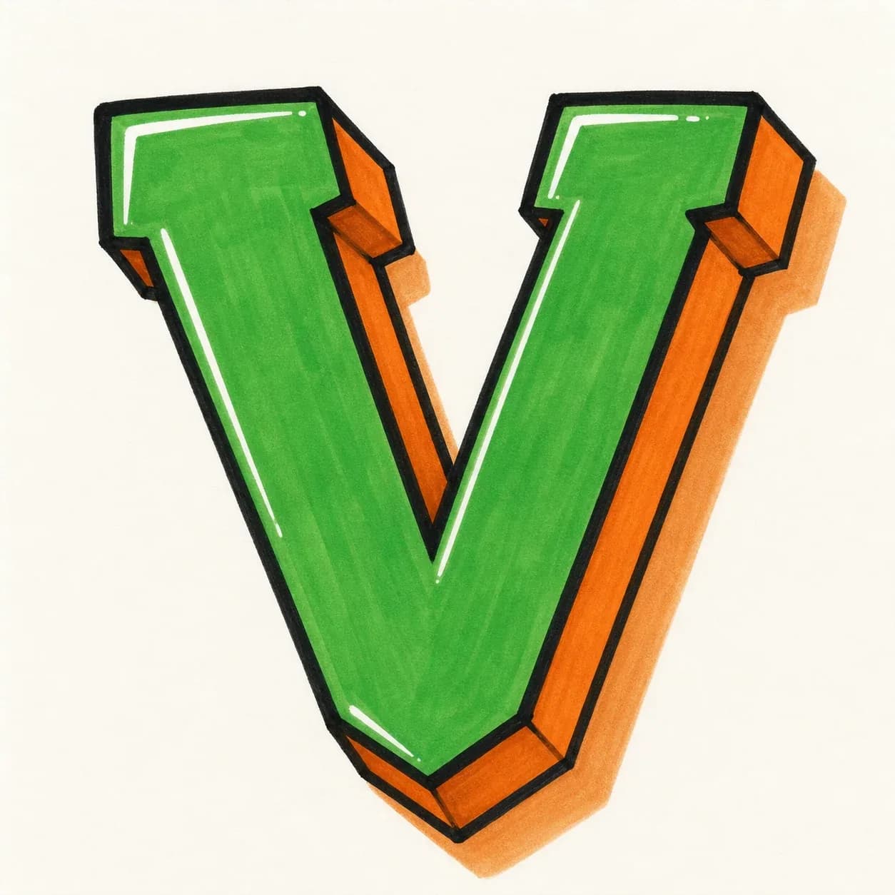
A dimensional 3D letter V with depth carried along both slanted legs and the bottom point in one consistent shadow direction.
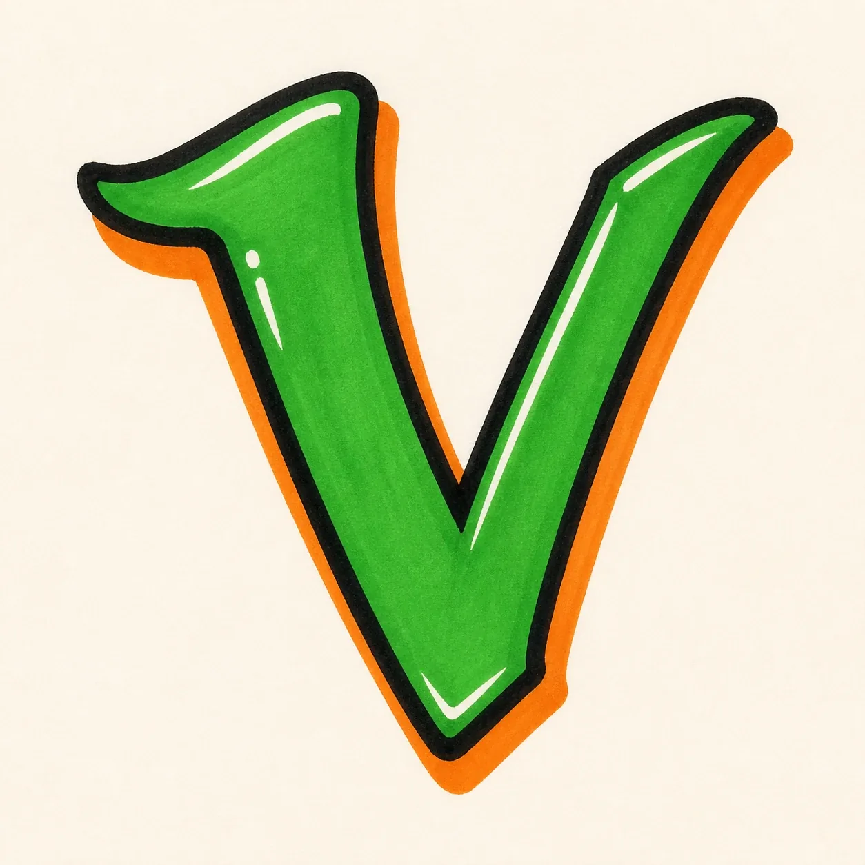
A handstyle V built from a quick downstroke and a rising exit stroke, useful when the letter has to connect smoothly inside a name or tag.
Start with two angled legs and one bottom point, then build the letter in layers: base form, cleaner valley, bold outline, shadow, and final color.
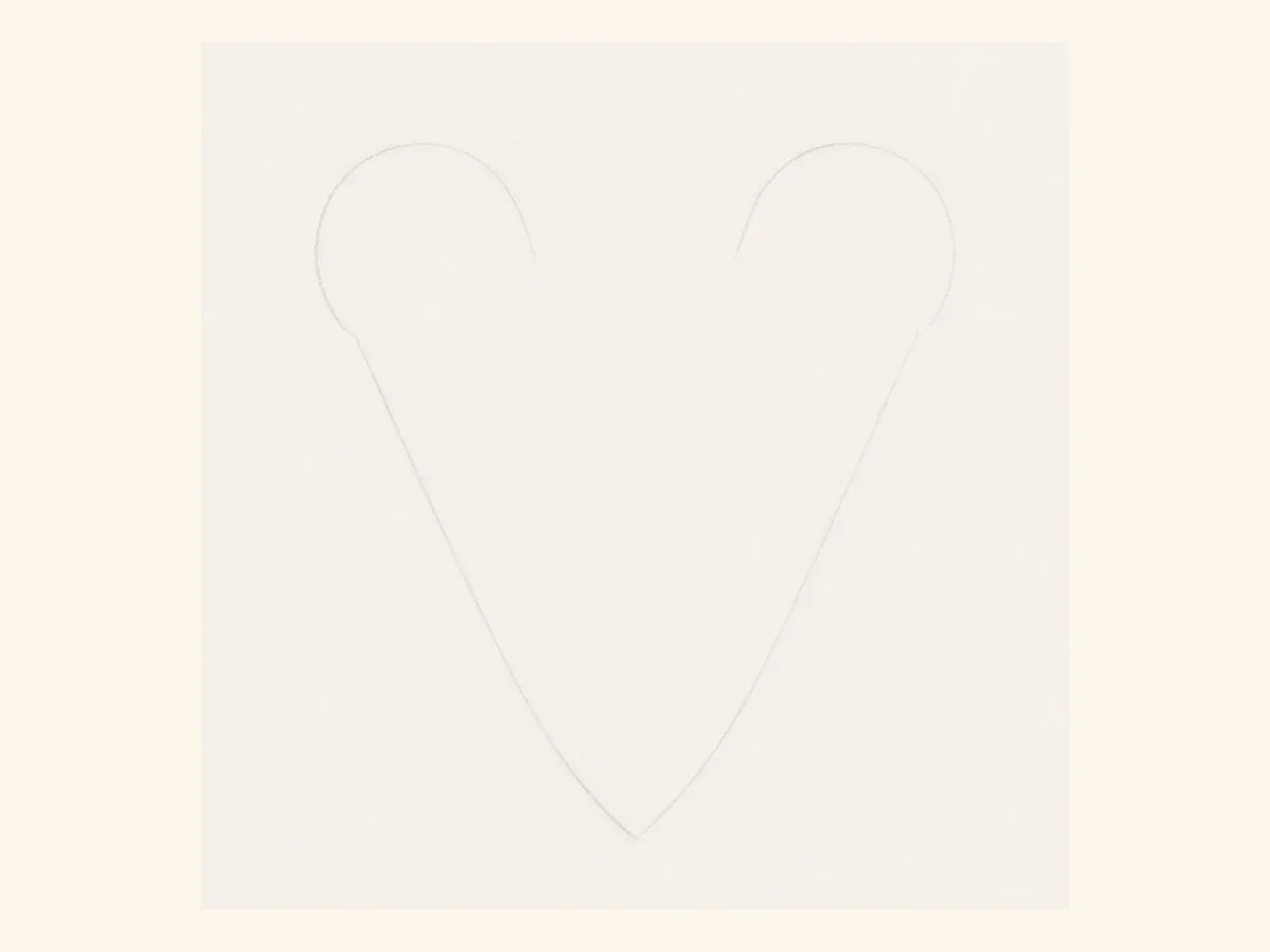
Start with two diagonal guide lines that meet at one bottom point. Leave enough space between the top arms so the V does not collapse into a narrow check mark.
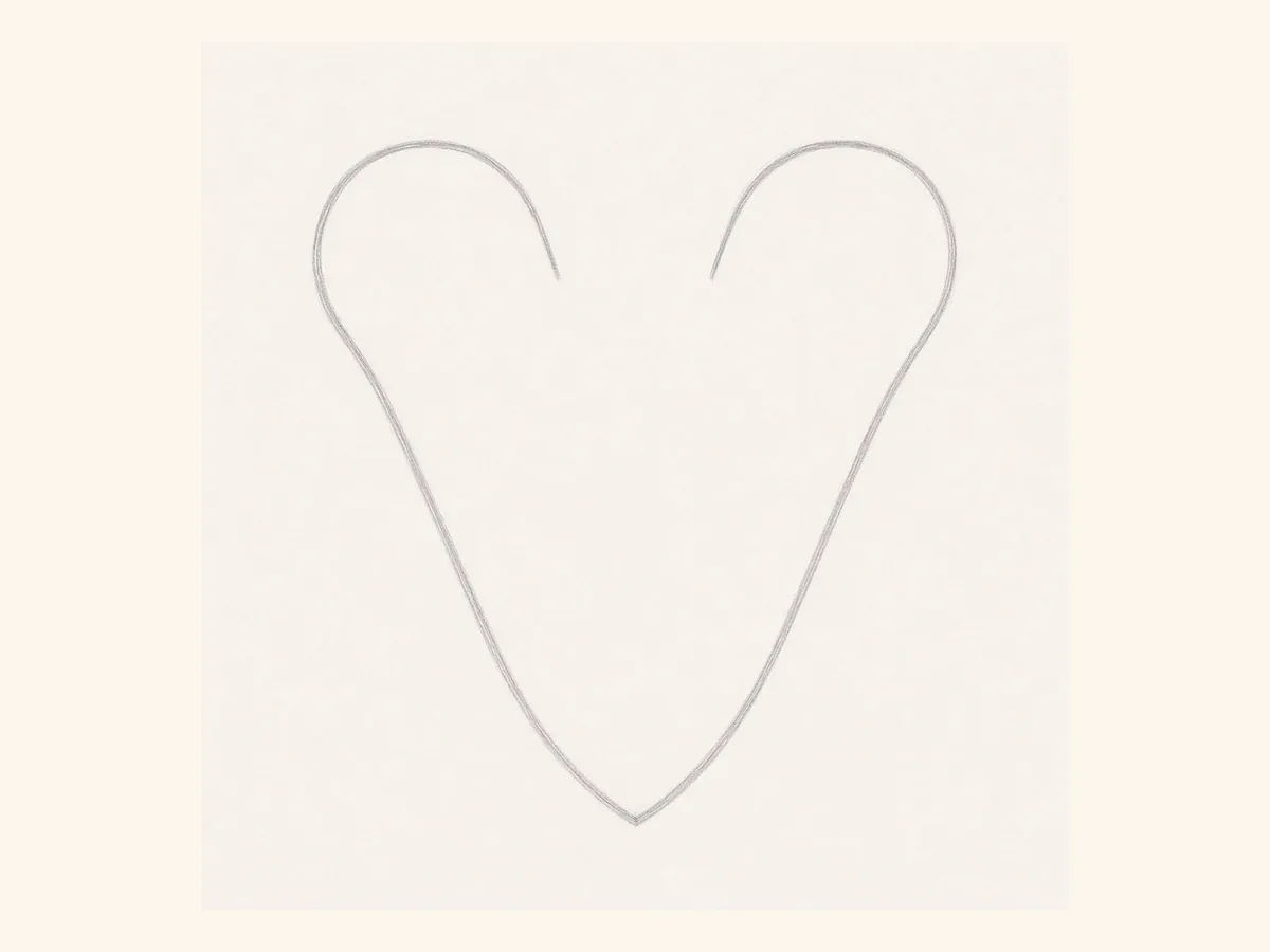
Wrap the guides with a thicker outline. Keep both legs close in weight so the V feels balanced from left to right before you add style details.
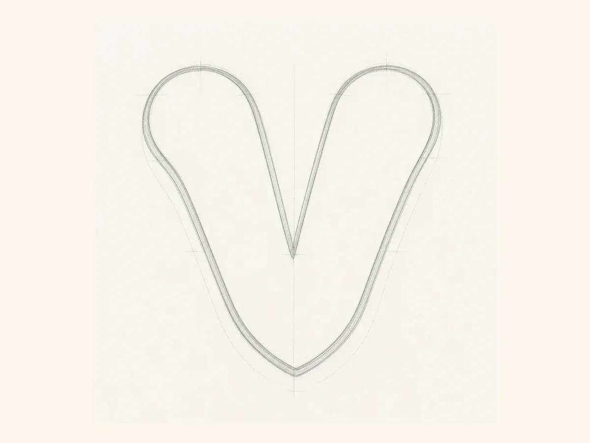
Clean up the bottom valley and the upper terminals. If that lower point gets too round, the letter can start to read like a U instead of a V.
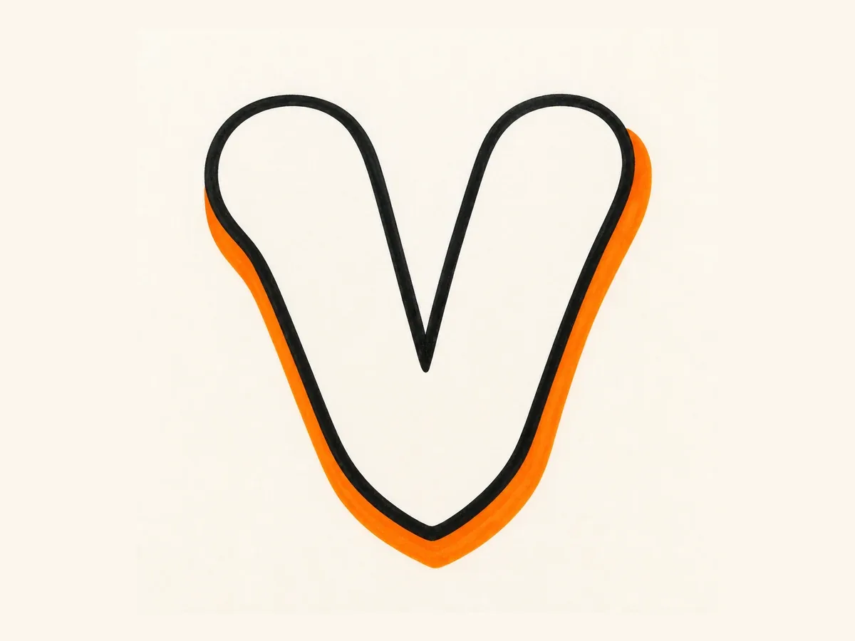
Add the bold outside line and shadow. Keep the shadow moving in one direction along both slanted legs and around the bottom point.
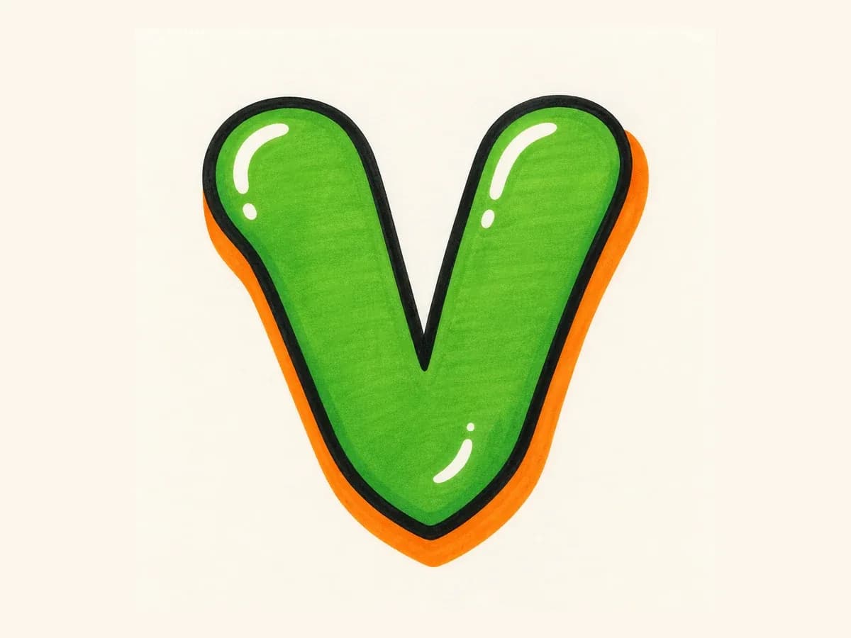
Fill the V with color, then place highlights on the upper legs. Keep extra accents away from the valley so the finished shape stays readable.
These drawing steps keep the diagonal legs, bottom valley, rounded terminals, and shadow direction consistent from the first sketch to the finished V.
Anchor the V with one clear bottom point, then balance the two slanted legs so neither side feels heavier.
For bubble V, soften the terminals. For block V, keep the legs straighter. For 3D V, carry the depth around the bottom point.
Build the simple V first, check the angle and valley, then place arrows, highlights, drips, or color around the outer edges.
Once the V is readable, use these ideas as drawing notes or prompt details for cleaner single-letter results.
Open the top arms slightly, then bring both diagonal legs into one clean bottom point so the V feels stable.
For bubble letter V, round the upper terminals and soften the legs, but keep a small valley so the letter does not become a U.
For wildstyle V, push arrows and extensions toward the upper corners or outer legs instead of covering the center point.
For tag letter V, use a quick down-up motion and let the exit stroke aim naturally toward the next letter.
Start with two diagonal guide lines that meet at one clear bottom point. Once the angle feels right, thicken the legs into a bubble or block shape, balance the left and right weight, then add outline, shadow, color, and highlights after the V is easy to recognize.
Bubble letter V is usually the easiest place to start because the rounded legs are forgiving and the bottom point can stay simple. If you want something cleaner and more structured, block letter V is also beginner-friendly as long as both slanted strokes keep a similar angle and weight.
Keep the top arms open and make the two legs meet at one clear valley point. Avoid placing arrows, highlights, or heavy cuts directly over that point, because if the bottom gets too round or crowded, the V can start to look like a U.
Yes. Use the builder on this page or open the AI tool and ask for one capital V only, with no extra words and no full alphabet. Then add the style details you want, such as rounded bubble ends, block weight, 3D shadow, wildstyle arrows outside the valley, or a tag-style down-up motion.
Yes. After creating the V in the AI tool, download the result as a PNG for practice sheets, sticker concepts, thumbnails, initials, or design references. If you plan to reuse it in another design, choose a simple background and keep the bottom point easy to see.
Bubble letter V uses rounded, puffy legs, so it is easier to read and better for beginner practice. Wildstyle letter V adds sharper cuts, arrows, and extensions, which can look more advanced, but the bottom point still needs to stay visible so the letter does not become too abstract.