
Bubble Letter Z
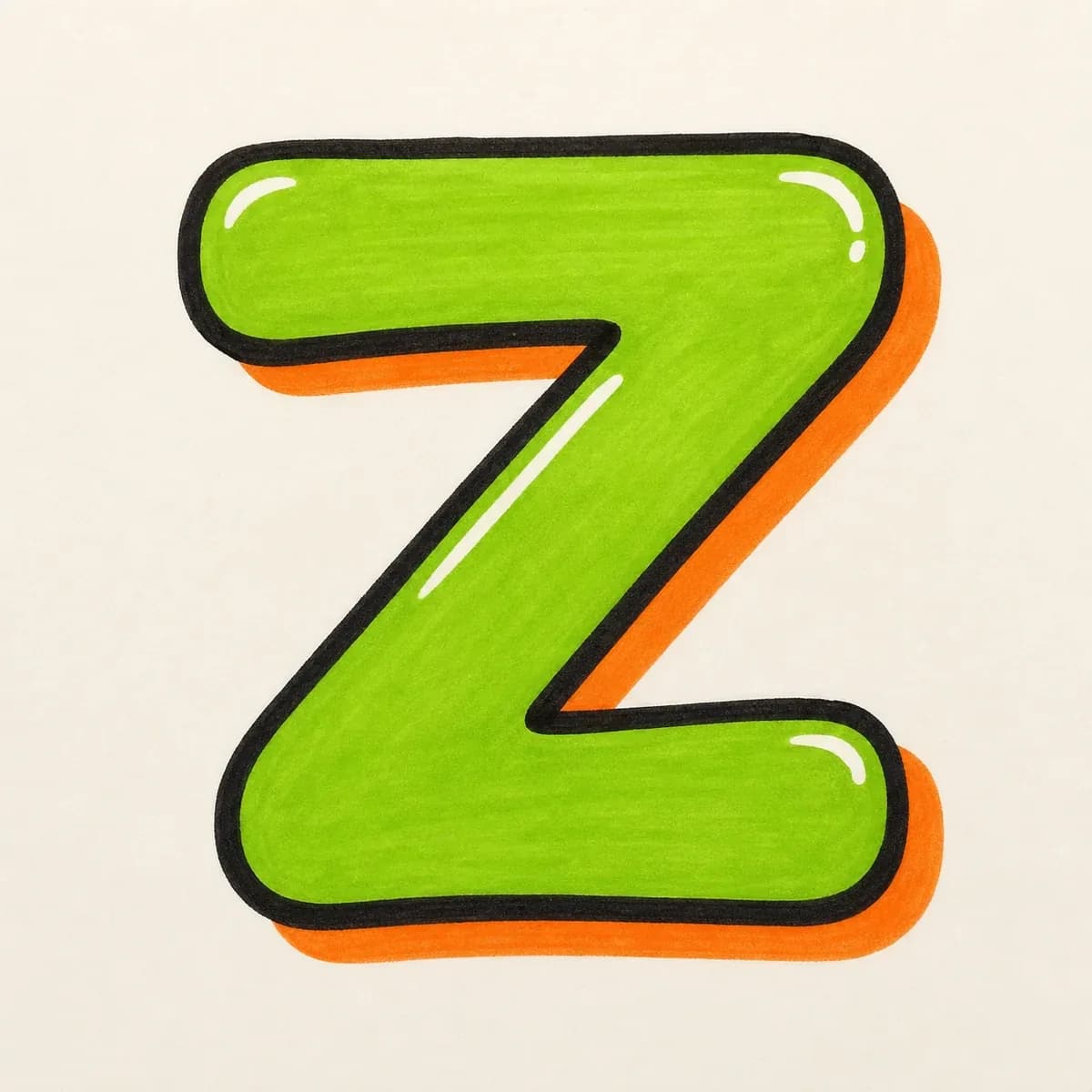
A rounded bubble letter Z with soft top and bottom bars connected by a clear diagonal. Keep the inside turns open so the zigzag is easy to read.
Explore Bubble LettersExplore graffiti letter Z styles, from bubble and block letters to wildstyle, tag, and 3D examples. Learn how the top bar, diagonal stroke, lower bar, and corners work together, then use the builder to create your own design.
AI Letter Builder
Open the AI graffiti letter generator to create more custom graffiti letter Z ideas.
Choose a letter
Choose a style
Write your instructions
Compare the main graffiti letter Z styles before you draw or generate your own. Bubble and block versions keep the zigzag simple, while tag, 3D, and wildstyle versions add speed, depth, or sharper corner movement.
A rounded bubble letter Z with soft top and bottom bars connected by a clear diagonal. Keep the inside turns open so the zigzag is easy to read.
Explore Bubble Letters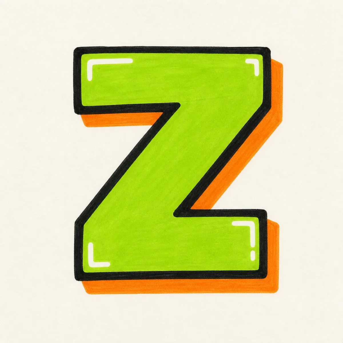
A strong block graffiti letter Z built from two heavy horizontal bars and one clean diagonal. Keep the bars similar in weight so the letter feels solid, not stretched.
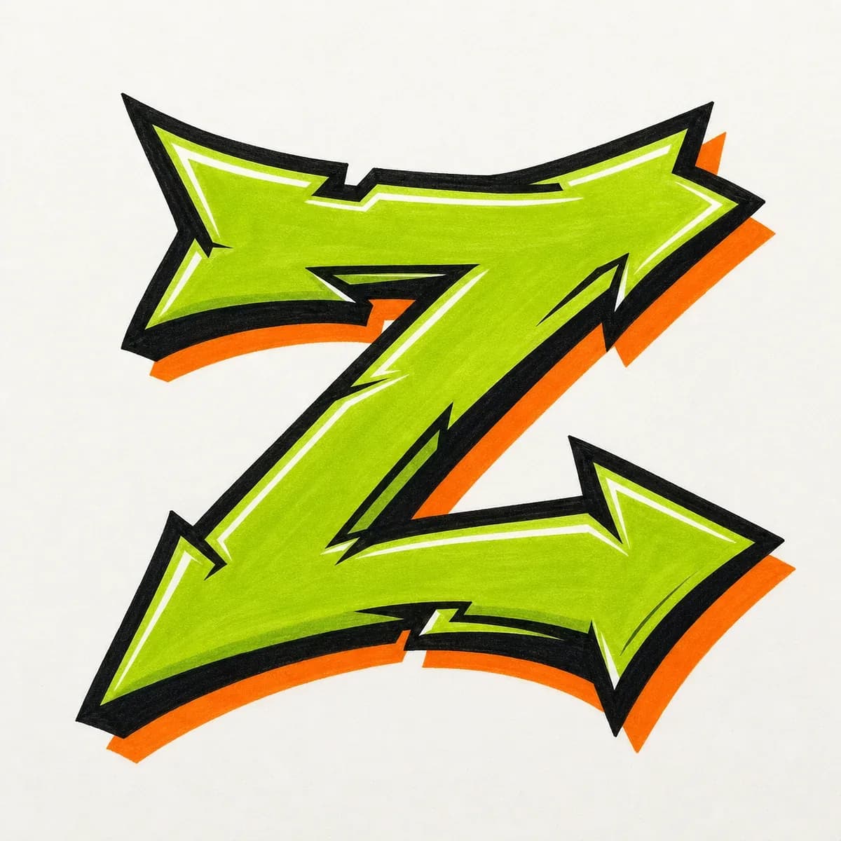
A wildstyle Z with arrows, cuts, and sharp corner extensions. Let the outer edges carry the detail, while the main diagonal still does the reading.
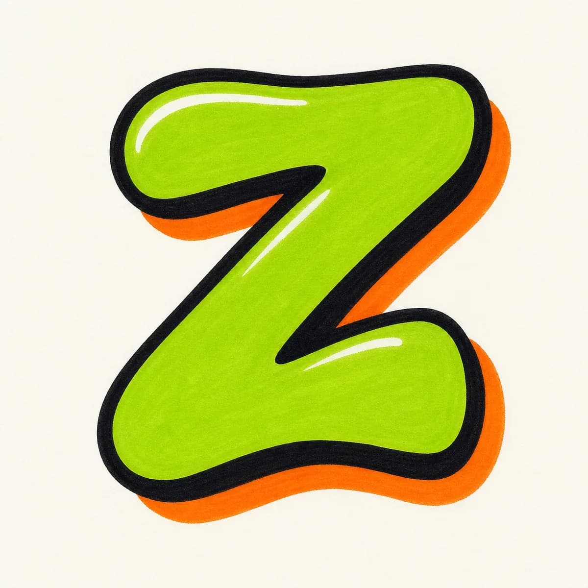
A quick throw-up Z with inflated bars, simple fill, and a bold outline. Give the diagonal enough room so the letter still feels like a Z at a glance.
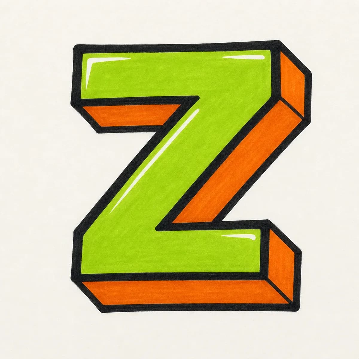
A dimensional 3D Z with the same shadow direction across the top bar, diagonal, and lower bar. That consistency keeps the corners from feeling disconnected.
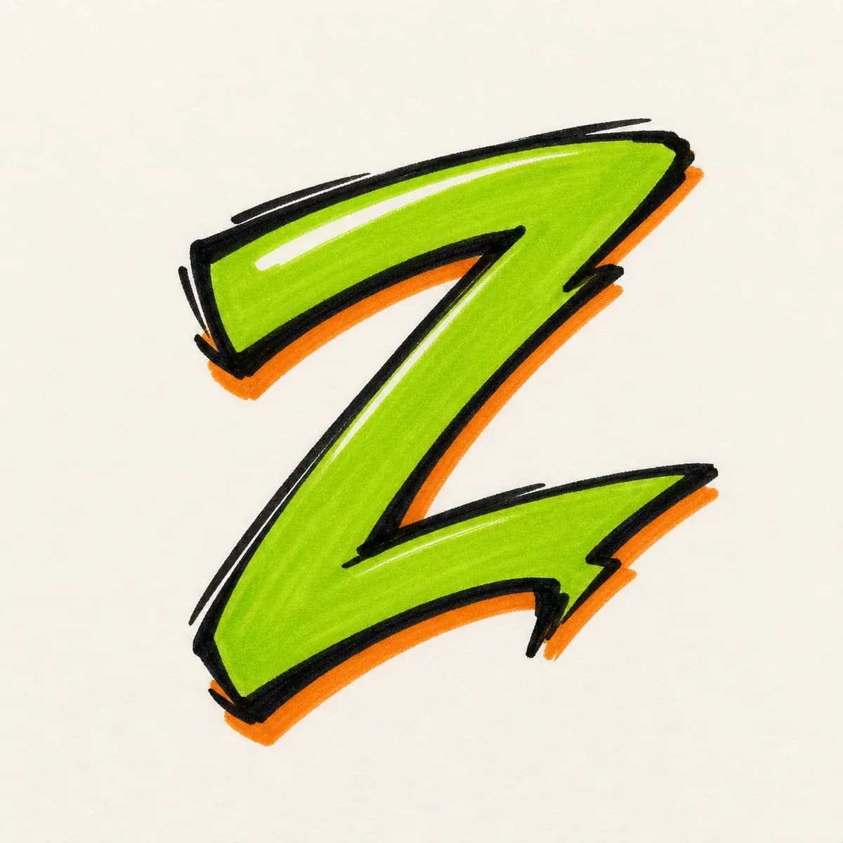
A handstyle Z built from a fast top stroke, a sharp diagonal slash, and a clean exit line that can flow into tags, names, or signatures.
Start with two horizontal guides and one diagonal guide, then build the Z in layers: thicker bars, clean corner joins, bold outline, shadow, and final color.
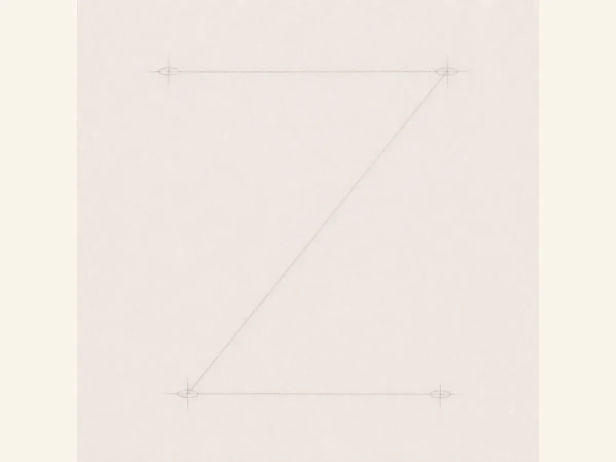
Start with a light top guide, a diagonal from upper right to lower left, and a bottom guide. Make sure the zigzag works before you thicken it.
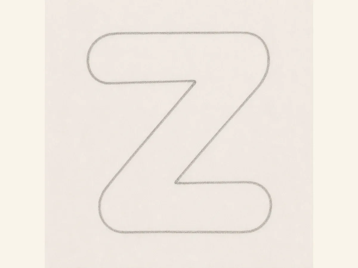
Wrap the guides with a rounded bubble outline. Keep the top and bottom bars wide, then join them with one clear diagonal stroke.
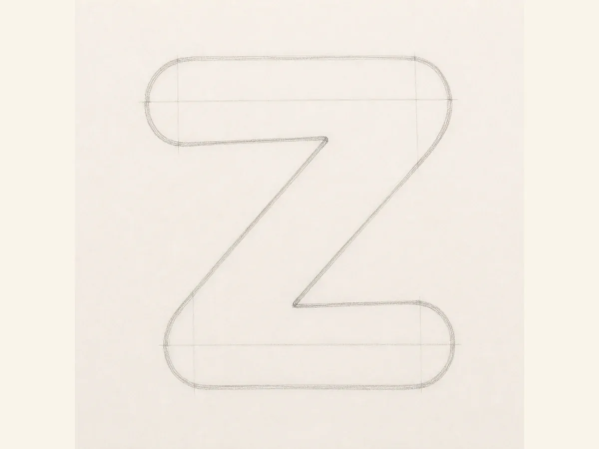
Clean up the rounded ends and the inner turns where the diagonal meets the bars. If those joins are clear, the Z will stay readable after ink and shadow.
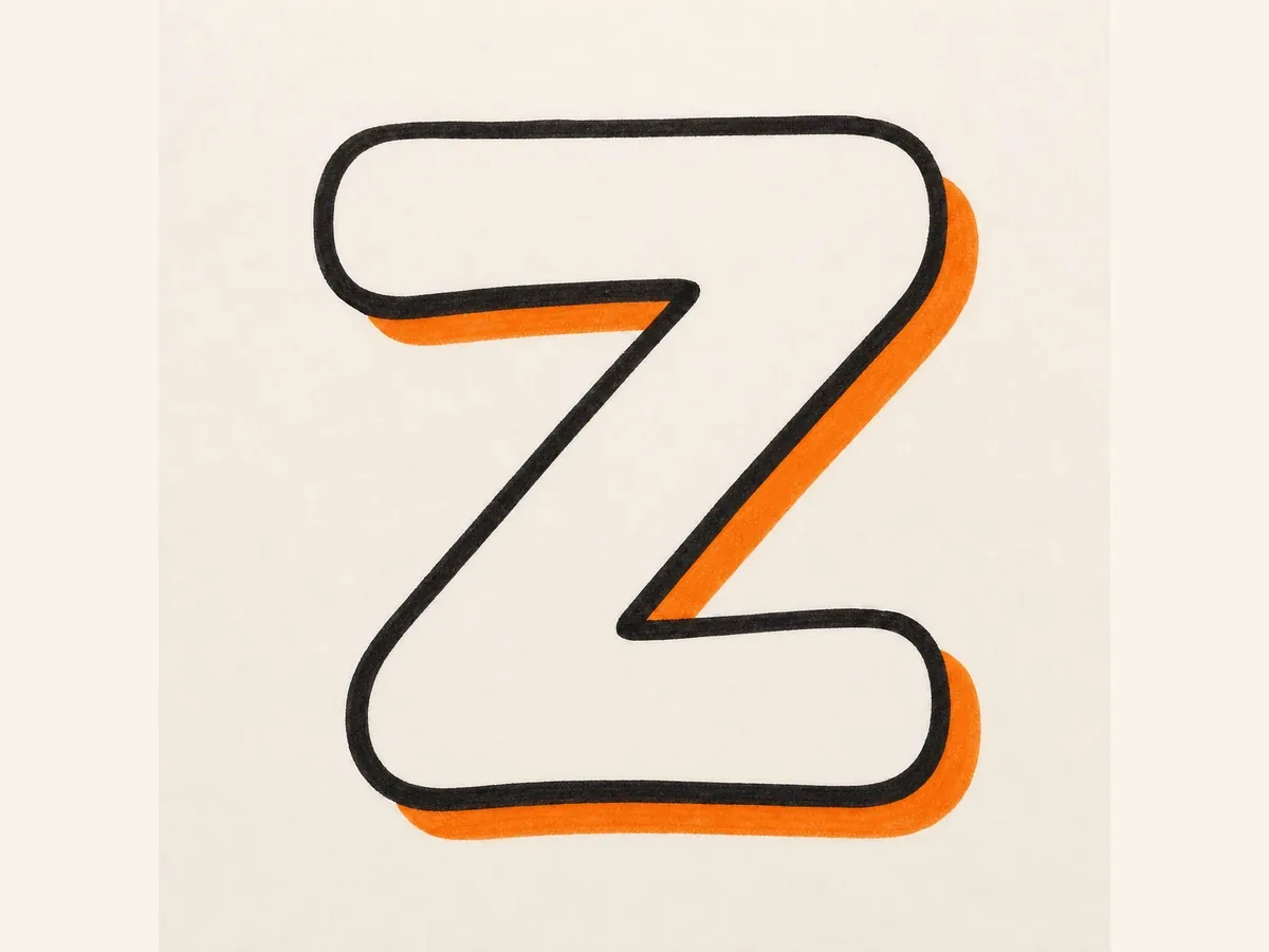
Add a bold marker outline and choose one shadow direction. Carry it evenly across the top bar, diagonal, and lower bar so the depth feels intentional.
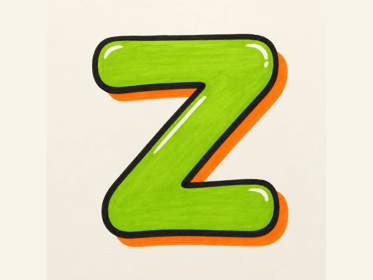
Fill the Z with color and add highlights near the bar ends. Keep the heaviest accents away from the diagonal so the finished letter stays clear.
These drawing steps keep the top bar, diagonal stroke, lower bar, rounded corners, and shadow direction consistent from the first sketch to the finished Z.
Make the top bar, diagonal, and bottom bar clear before adding arrows or highlights. If the diagonal disappears, the letter stops reading as a Z.
For bubble Z, round the ends and soften the corners. For block Z, keep the bars straighter. For 3D Z, use one shadow direction across the whole letter.
Build the simple Z first, check the two bars and diagonal, then add wildstyle cuts, drips, highlights, or color around the outside corners.
Use these ideas when sketching by hand or prompting the AI tool, especially when you want the graffiti letter Z to stay readable after sharper style details are added.
Use the diagonal as the anchor. If it gets too thin or too steep, the graffiti letter Z can stop reading as a letter.
For bubble letter Z, round the four outer ends, but leave the inner corners open enough to show the top bar, diagonal, and bottom bar.
For wildstyle Z, place arrows and cuts on the outside corners first. Check the main zigzag before you add more detail.
For tag graffiti letter Z, make the top stroke quick, let the diagonal carry the motion, and use the lower stroke to move into the next letter.
Start with a top bar, a diagonal stroke, and a bottom bar. Once that simple Z reads clearly, thicken the bars, clean up the corner joins, and then add outline, shadow, color, and highlights.
Bubble letter Z is usually the easiest starting point because rounded ends forgive small mistakes in the corners. Keep the diagonal clear, and try a block graffiti letter Z when you want straighter edges or a cleaner poster-style result.
Most unclear Z sketches have the same problems: the diagonal is too thin, the bars feel uneven, or decoration covers the corner joins too early. Balance the top and bottom bars first, then add details after the zigzag reads clearly.
Yes. Use the builder above or open the AI tool and ask for one capital Z only, not a full word or alphabet. Describe the style you want, such as bubble bars, a bold diagonal, 3D shadow, or wildstyle corner extensions.
Yes. After creating the Z in the AI tool, download it as a PNG for practice sheets, sticker concepts, thumbnails, or initials. Choose a simple background if you want the outline to be easier to reuse.
Bubble letter Z keeps the shape soft, simple, and easy to read, so it is better for beginners. Wildstyle letter Z adds arrows, cuts, and sharper corner movement, but the diagonal still needs to stay visible.