
Bubble Graffiti Letter E
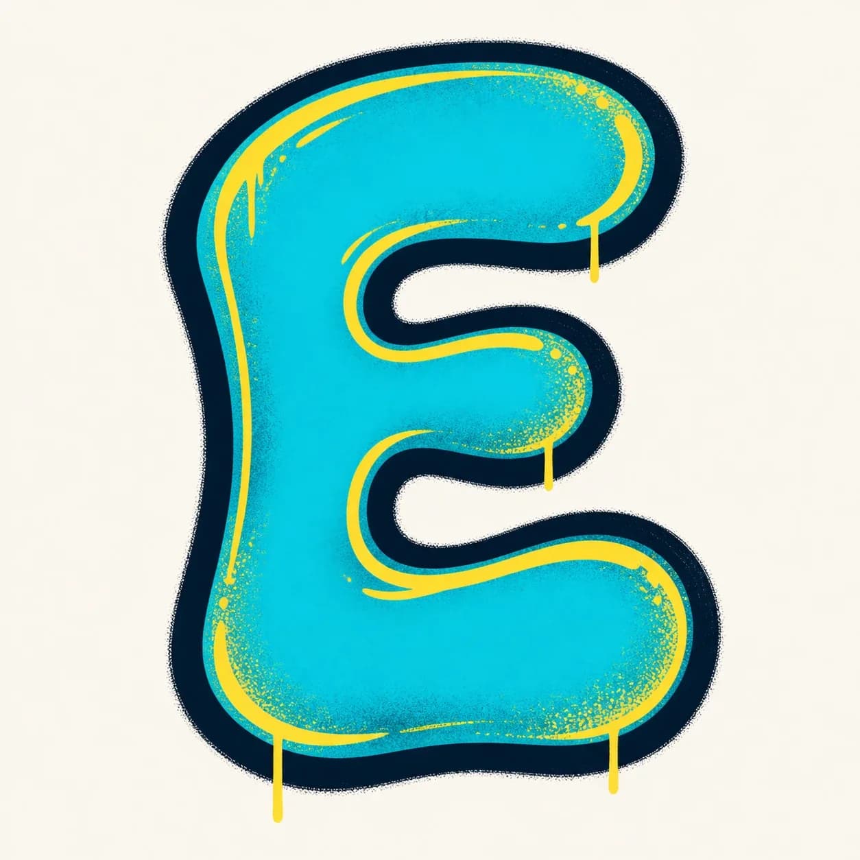
A rounded letter E with a soft left stem, three puffy bars, and clear gaps so the bubble E does not collapse into a B.
Explore Bubble LettersExplore graffiti letter E styles, from bubble and block letters to wildstyle, tag, and 3D examples. Use the drawing steps to understand the vertical stem and three-bar structure, then build your own graffiti letter E design.
AI Letter Builder
Open the AI graffiti letter generator to create more custom graffiti letter E ideas.
Choose a letter
Choose a style
Write your instructions
Compare different graffiti letter E styles before you draw or create your own. Start with bubble or block graffiti letter E shapes to learn the stem and bar spacing, then explore tag, 3D, and wildstyle versions for more attitude.
A rounded letter E with a soft left stem, three puffy bars, and clear gaps so the bubble E does not collapse into a B.
Explore Bubble Letters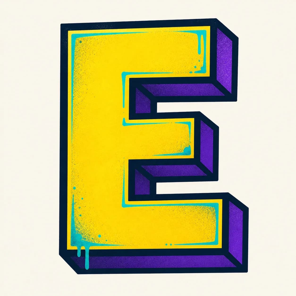
A readable block E built from one strong vertical stem and three squared bars, with the middle bar slightly shorter for balance.
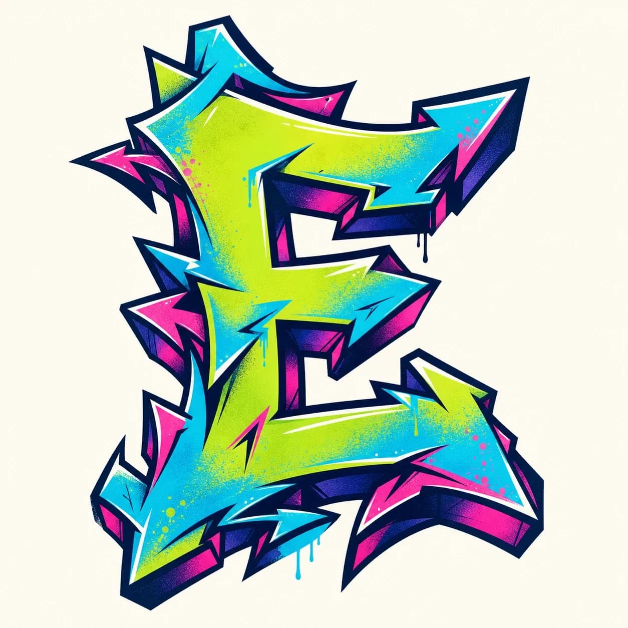
A sharper wildstyle letter E where arrows and cuts can grow from the bar ends while the left stem keeps the letter structure grounded.
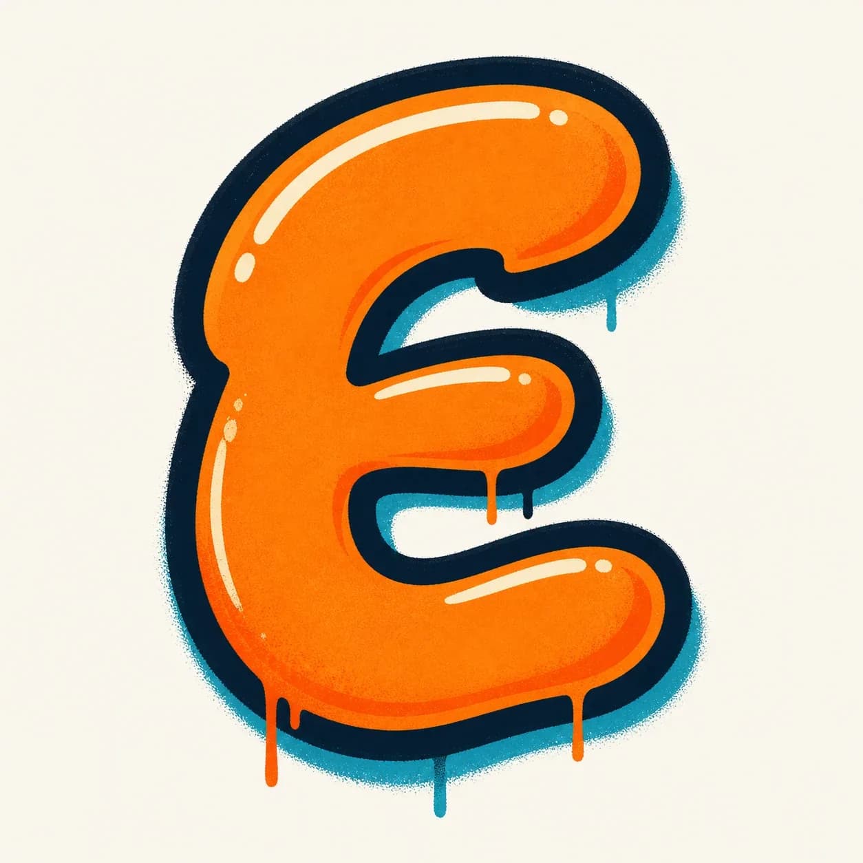
A fast throw-up E with inflated rounded bars, a bold outline, and open spaces that keep the three-bar rhythm visible.
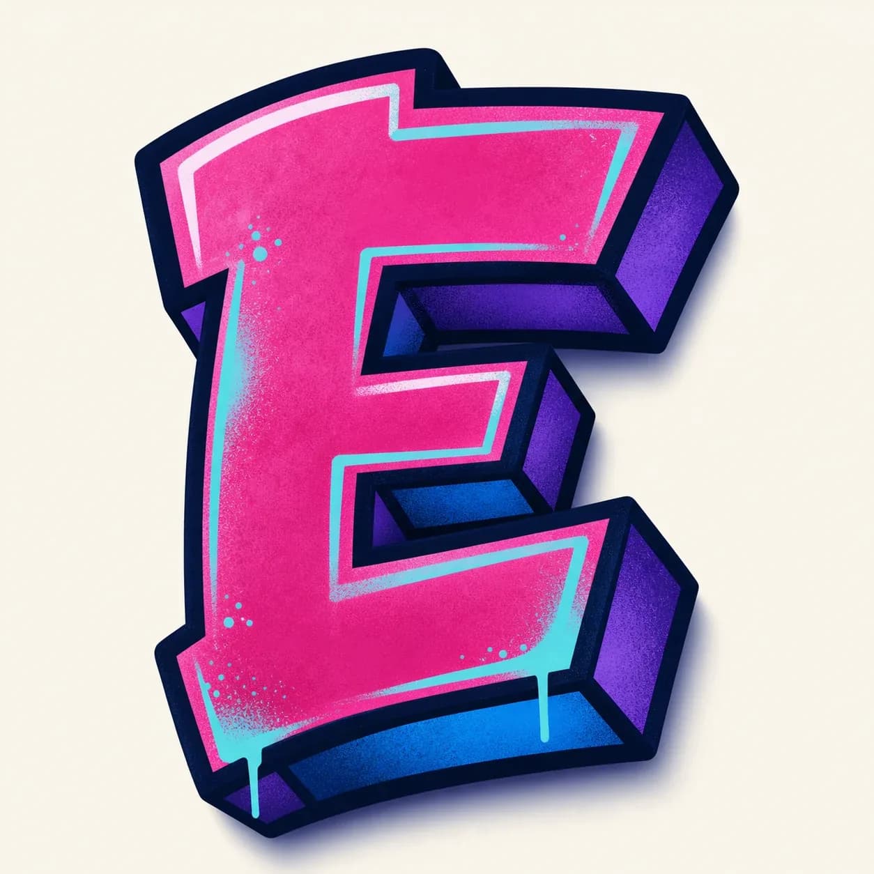
A dimensional 3D letter E that pushes shadow behind the stem and each bar, making the flat E shape feel heavy and solid.
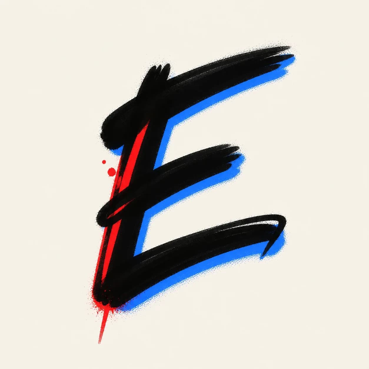
A quick handstyle E made from one vertical stroke and three fast flicks, useful for tags, names, and marker signatures.
Start with a simple stem and three bars, then build the graffiti letter E in layers: thicker bars, balanced gaps, bold outline, shadow, and final color.
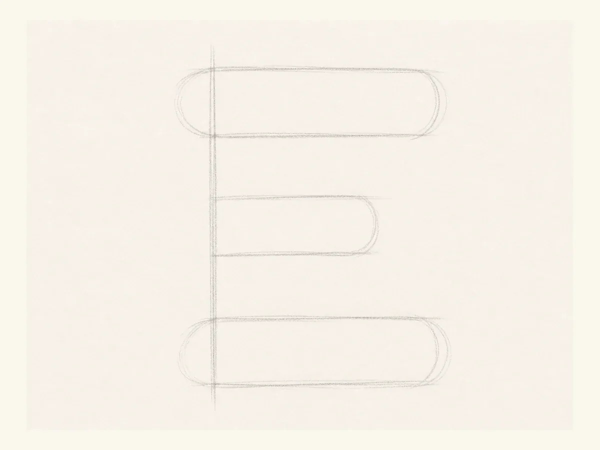
Start the E with a light vertical guide and three horizontal bars/arms. Make the top and bottom bars longer than the middle bar.
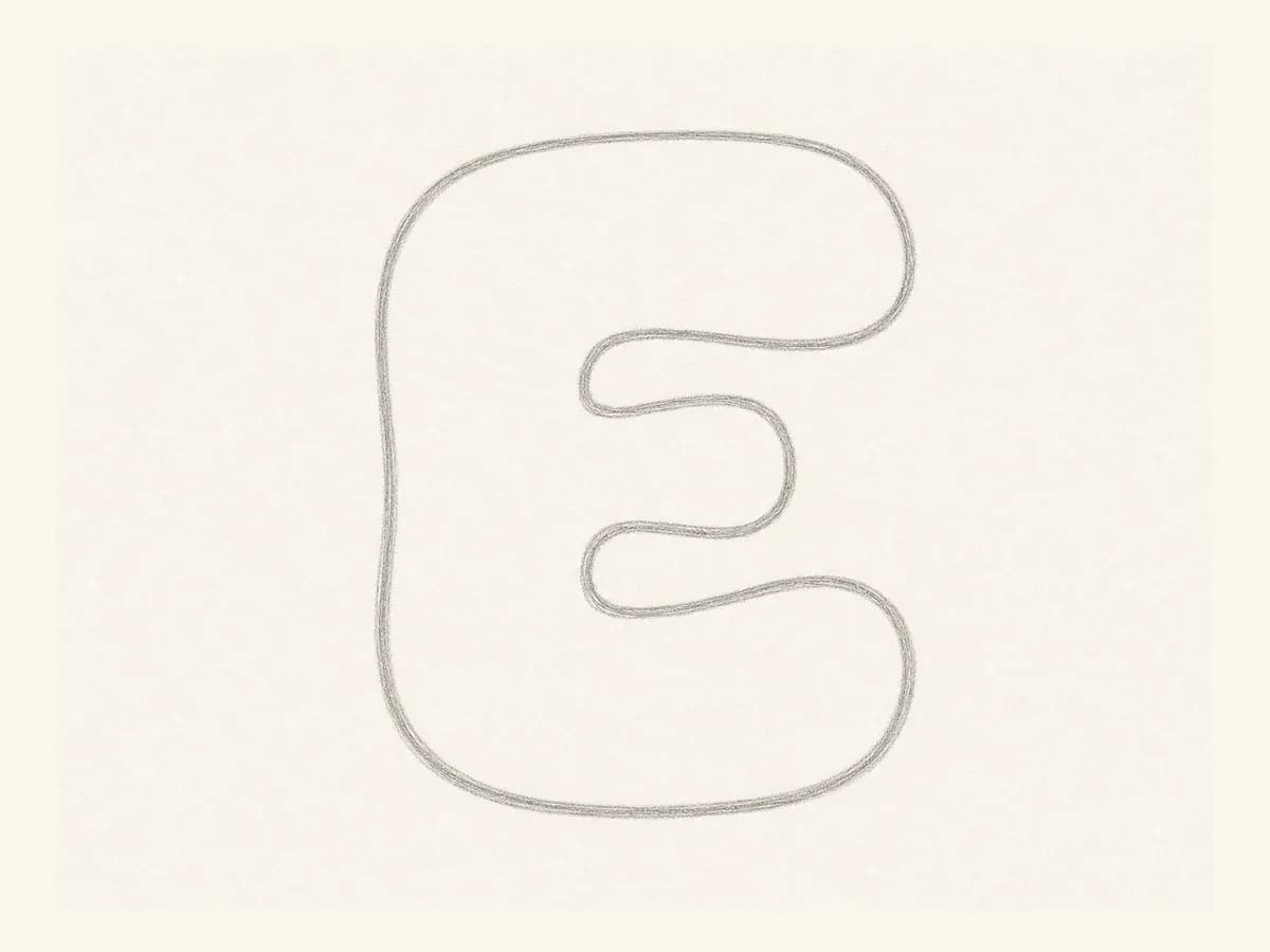
Turn the guide into a wide bubble letter E. Keep enough space between the bars so the outline will not close the gaps.
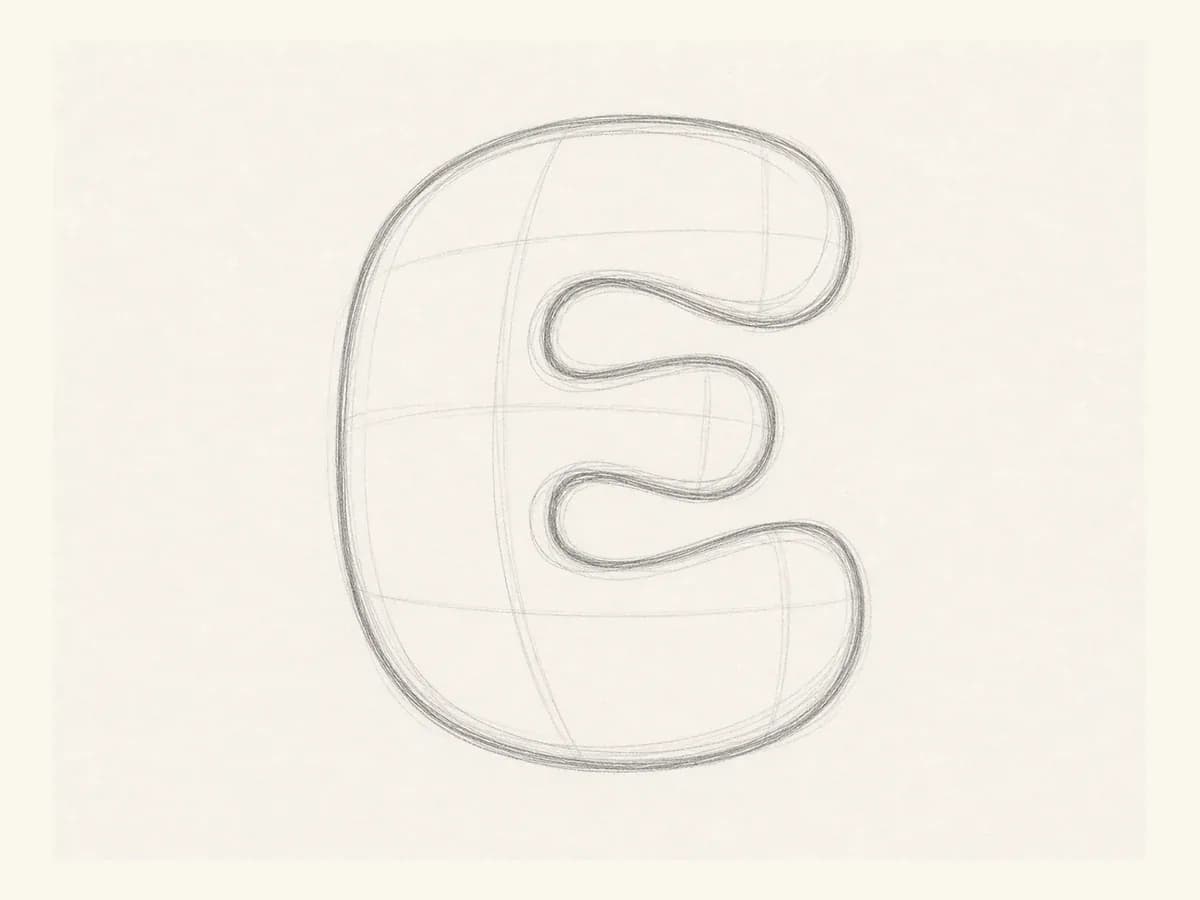
Check the left stem and the three bar ends. The middle bar can be shorter, but the gaps should feel even from top to bottom.
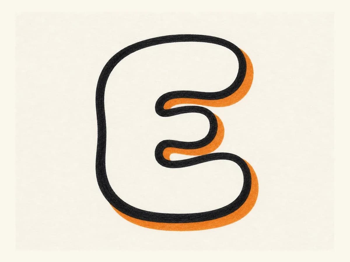
Add a bold marker outline around the stem and bars, then place a shadow behind one side so the E has depth.
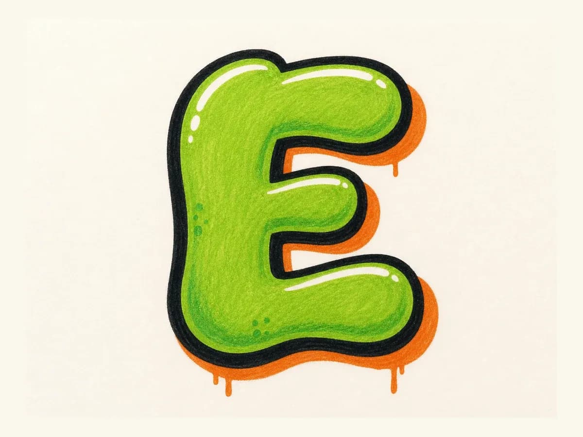
Fill the E with color, add highlights along the bars, and clean up drips or shadow edges without crowding the inner spaces.
Letter E drawing steps are created and reviewed by Graffiti Generator to keep the stem, bars, and spacing consistent from sketch to final color.
Start with a clear left stem and three bars. Leave visible gaps so the E does not read like B or F after the outline gets thick.
For bubble E, round the bar ends. For block E, keep the bars straighter and make the middle bar slightly shorter.
Build the simple E first, check the bar spacing, then add arrows, shadow, highlights, drips, or color.
Use uppercase graffiti letter E for bold initials, posters, and alphabet practice. Use lowercase e when a rounded loop needs to flow inside a tag, name, or handwritten word.
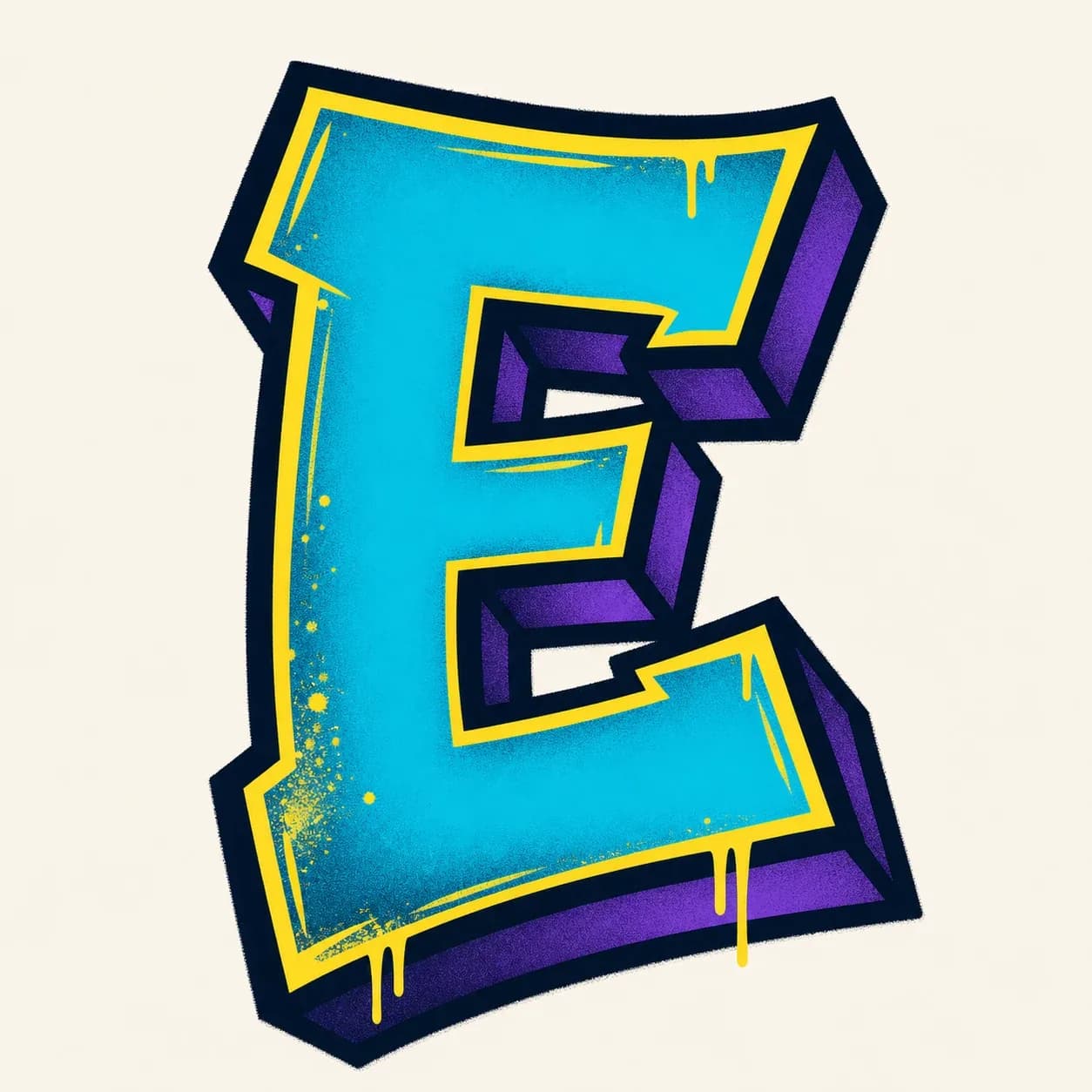
Best when the letter E needs to stand alone. The stem and three bars give plenty of room for shadow, highlights, and squared or rounded bar ends.
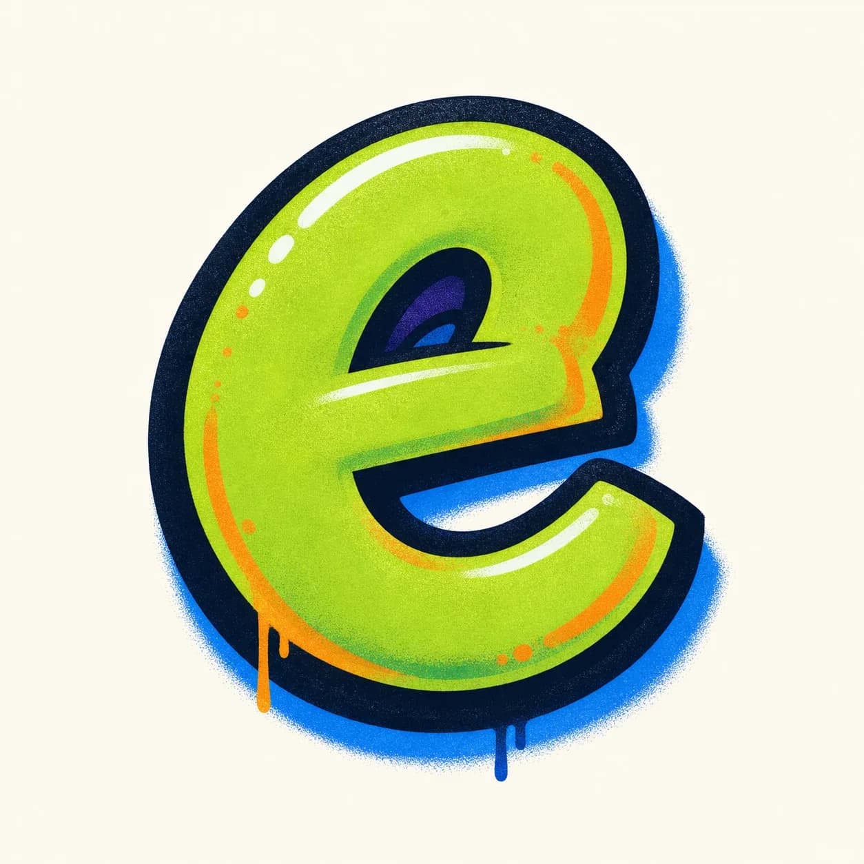
Best when the e sits inside a name or tag. Keep the loop, the inside bar across the loop, and the open side clear so it does not read like c or o.
Once the basic letter E is readable, use the stem and three bars as a frame for logo initials, stickers, wildstyle arrows, or handstyle tags.
Logo initial: make the left stem heavy and let the top and bottom bars create a strong frame around the shorter middle bar.
Sticker mark: use a bubble graffiti letter E with rounded bar ends, thick outline, and bright highlights placed on each horizontal stroke.
Wildstyle piece: turn the three bar ends into arrows or angled cuts, but keep the left stem visible so the E does not become abstract.
Tag opener: start a name with one quick vertical stroke, then flick the three bars forward so the handstyle E leads into the next letter.
Start with a light vertical stem, then sketch the top, middle, and bottom bars. Make the top and bottom bars a little longer, round or square the bar ends to match your style, then add outline, shadow, color, and highlights after the letter E is clearly readable.
Block letter E is usually easier if you want clean structure, because the stem and three bars are simple to measure. Bubble letter E is also beginner-friendly, but the rounded bars need enough space between them so the letter does not start to look like B.
Keep all three bars visible and leave clear gaps between them. If the middle or bottom bar disappears, the E can read like F; if the rounded gaps close too much, a bubble E can start to feel like B.
Use uppercase E when the letter needs to stand alone as an initial, poster mark, or alphabet practice piece. Use lowercase e inside names and tags when you want a smoother loop, but keep the inside bar and open side clear so it does not turn into c or o.
Yes. Use the Letter E builder on this page to pick a style, add details like fill color, outline, drips, or wall texture, and send a single-letter E prompt to the AI graffiti generator.
Yes. After you create a graffiti letter E in the AI tool, you can download the result as a PNG and use it for practice sheets, sticker ideas, logo initials, thumbnails, or username artwork.