

Bubble Graffiti Letter T
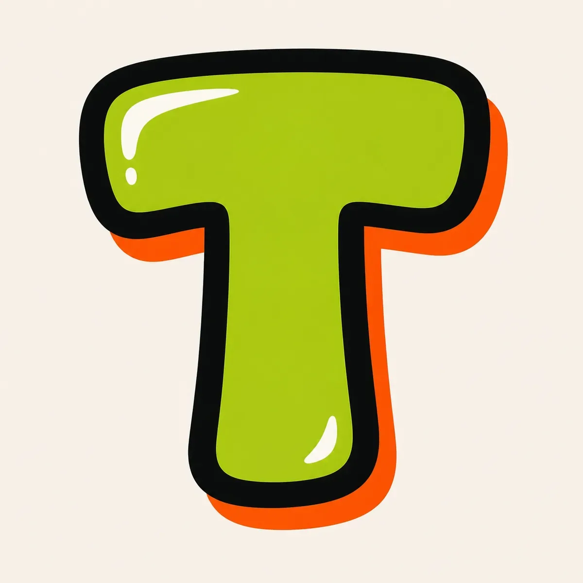
A rounded bubble graffiti letter T with a wide soft top bar, centered stem, and open lower sides so the letter stays friendly and readable.
Explore Bubble LettersExplore graffiti letter T styles, from bubble and block letters to wildstyle, tag, and 3D examples. Use the drawing steps to understand the wide top bar, centered stem, and open lower space, then build your own T design.
AI Letter Builder
Open the AI graffiti letter generator to create more custom graffiti letter T ideas.
Choose a letter
Choose a style
Write your instructions
Compare different graffiti letter T styles before you draw or create your own. Start with bubble or block T shapes to learn the bar and stem balance, then explore tag, 3D, and wildstyle versions for more movement.
A rounded bubble graffiti letter T with a wide soft top bar, centered stem, and open lower sides so the letter stays friendly and readable.
Explore Bubble Letters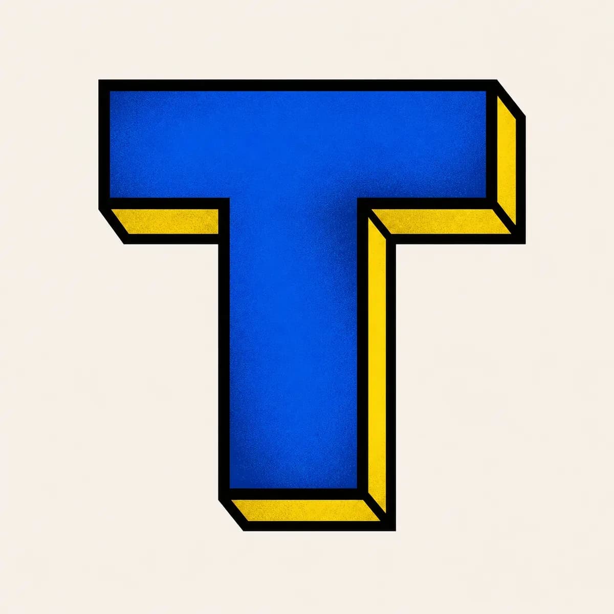
A readable block graffiti letter T built from a long horizontal bar and a straight vertical stem, useful for initials, posters, and strong simple layouts.
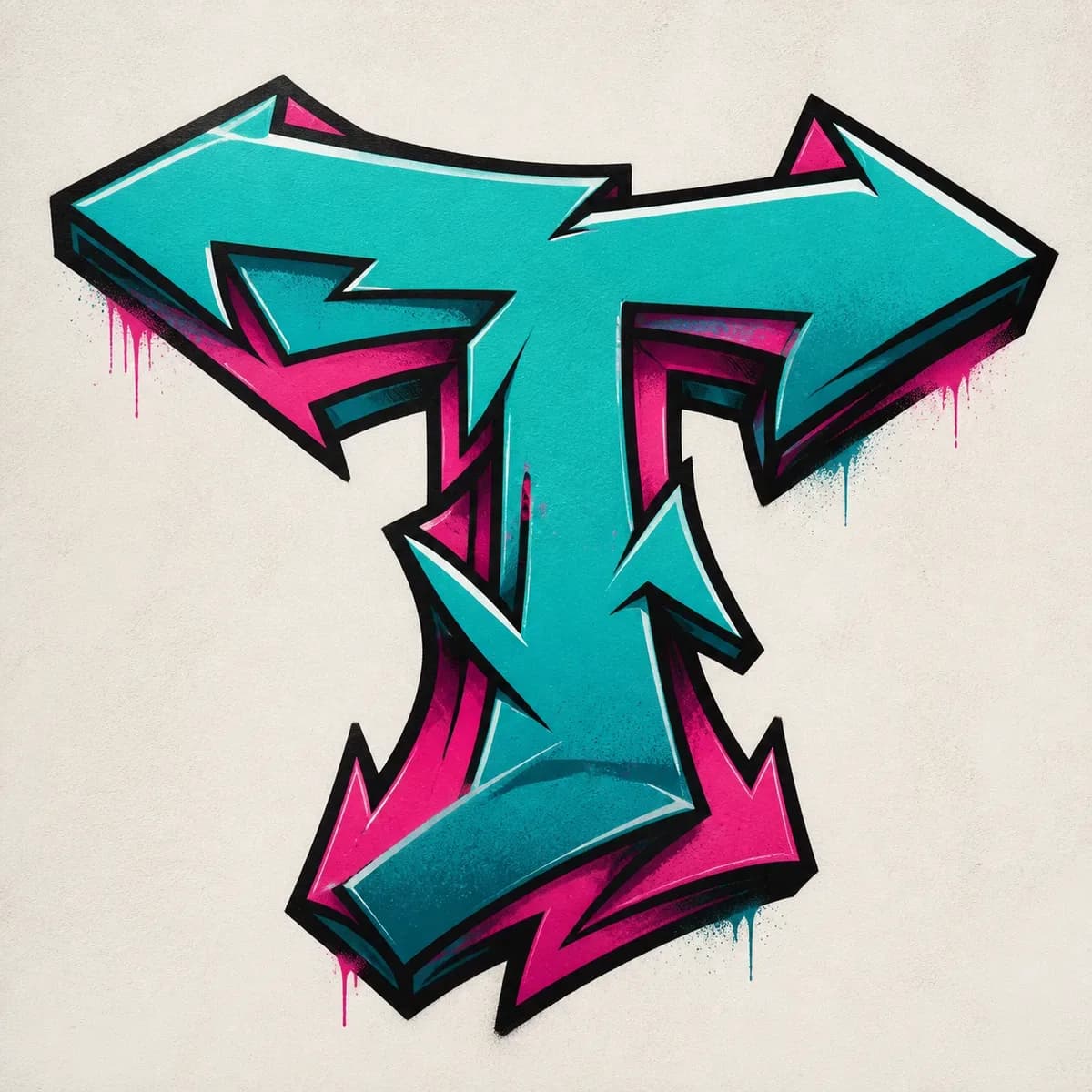
A sharper wildstyle letter T where arrows can grow from the top bar while the centered stem keeps the base letter from disappearing.

A fast throw-up graffiti letter T with inflated bar ends, a thick outline, and a short centered stem that keeps open space under the top bar.
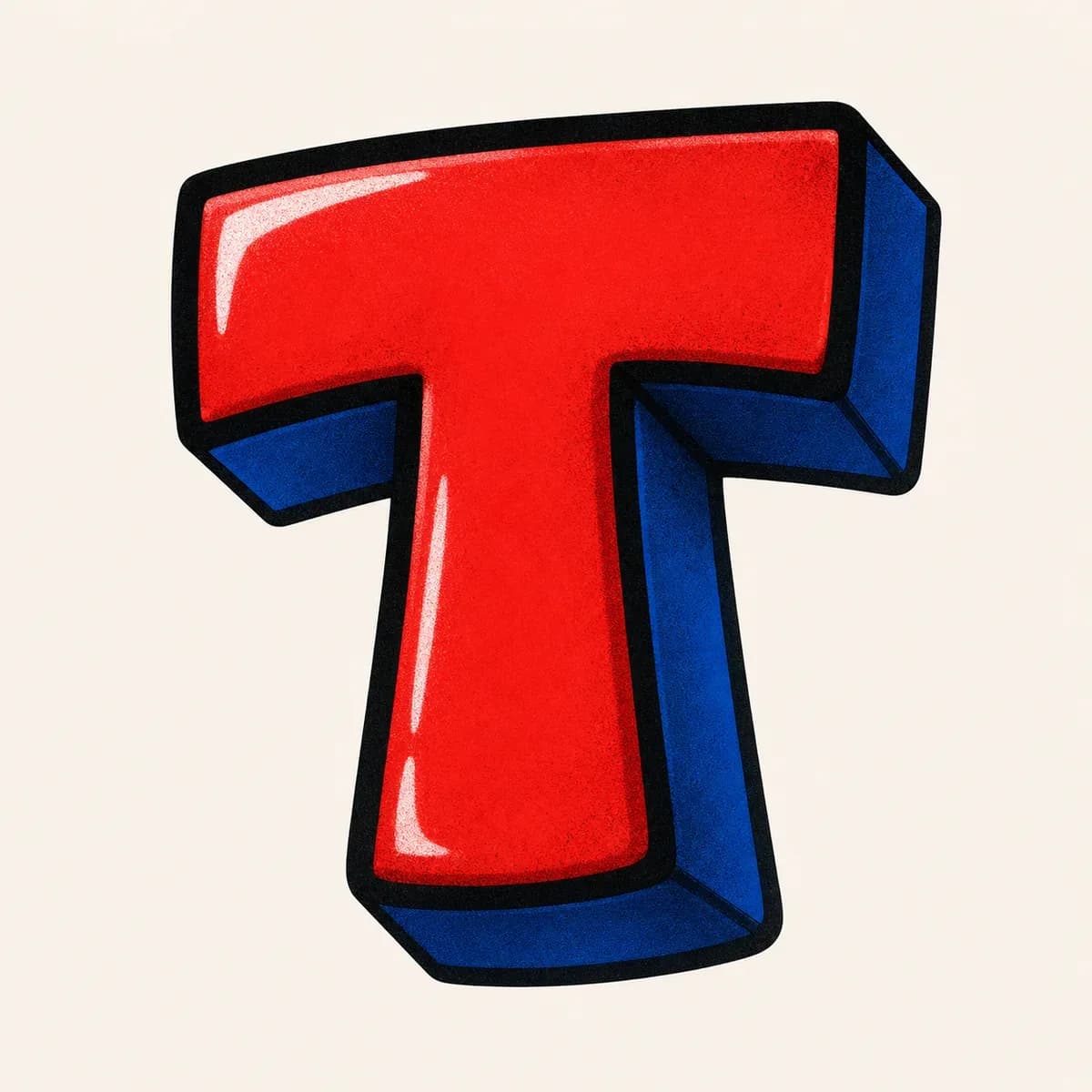
A dimensional 3D graffiti letter T with shadow behind the top bar and stem, making the wide horizontal weight feel solid instead of flat.

A quick tag graffiti letter T made from a sweeping top stroke and a downstroke, useful when T starts a name, tag, or marker signature.
Start with a wide top bar and centered stem, then build the graffiti letter T in layers: thicker form, balanced bar ends, bold outline, shadow, and final color.
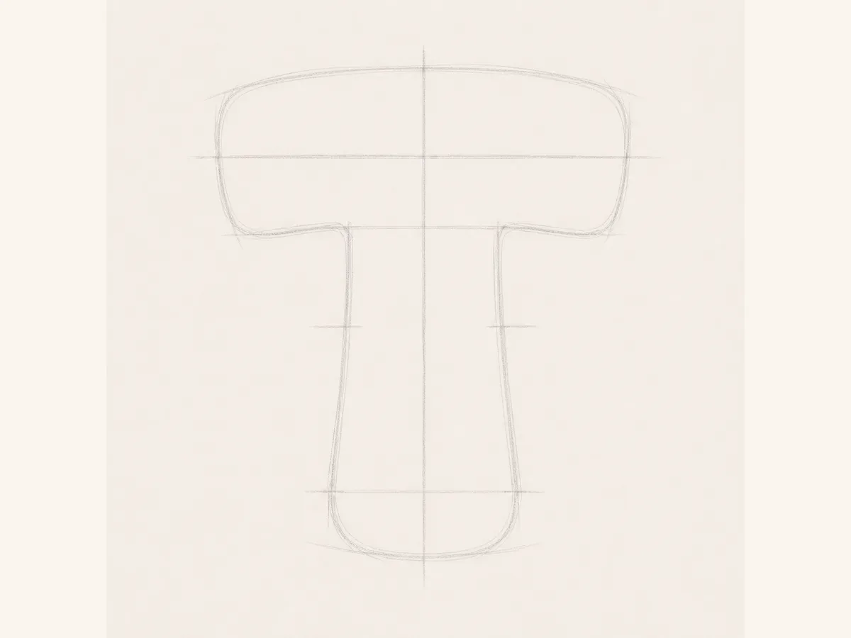
Start the graffiti letter T with a wide top guide and a centered vertical guide. Keep the stem under the middle of the bar.
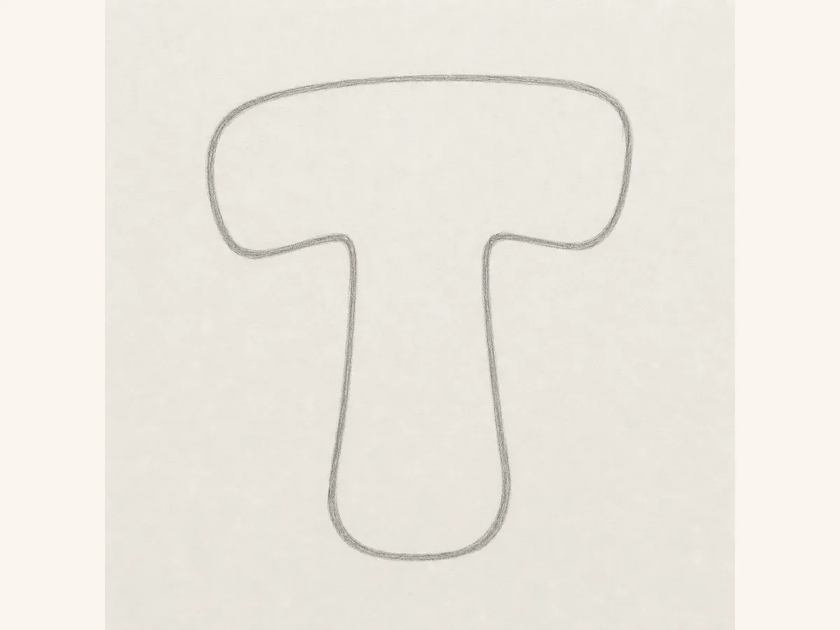
Turn the guides into a rounded bubble outline. Make the top bar wide enough, then give the stem enough weight to balance it.
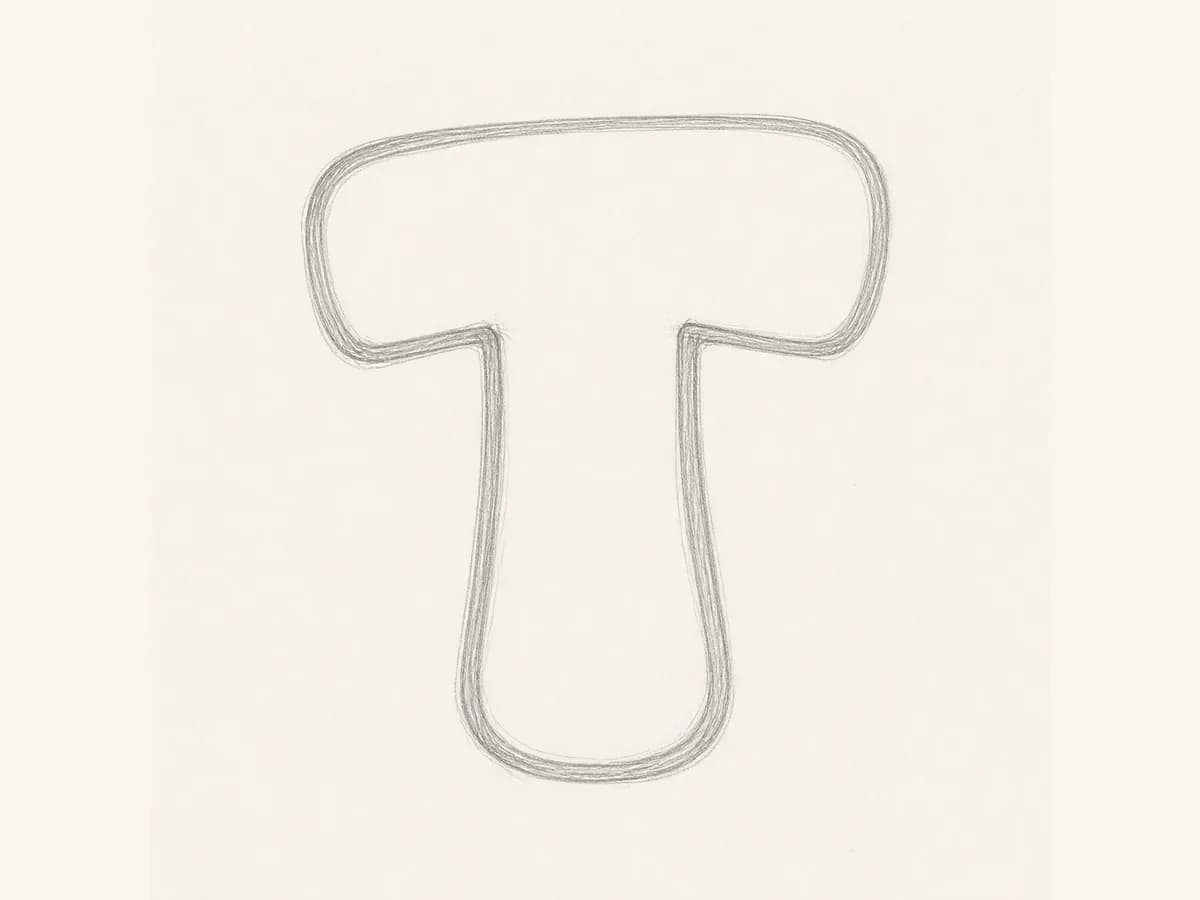
Check both ends of the top bar and the stem position before adding ink. The open lower sides should still clearly read as T.
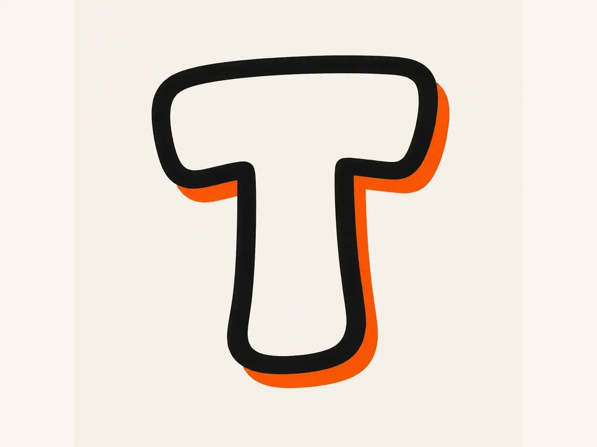
Add a bold marker outline around the bar and stem, then place the shadow behind one side without crowding the open space.
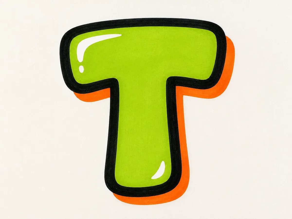
Fill the graffiti letter T with color, add highlights along the top bar, and keep drips or accents away from the stem joint.
These graffiti letter T drawing steps are designed to keep the top bar, centered stem, and open lower space consistent from sketch to final color.
Start with the top bar first, then place the vertical stem under its center. If the stem drifts too far left or right, the T quickly feels off balance.
For bubble graffiti letter T, round the bar ends and soften the stem. For block graffiti letter T, keep the bar straight and make the stem heavy enough.
Build the simple T first, check the top-bar width and stem placement, then add arrows, shadow, highlights, drips, or color.
Use uppercase graffiti letter T for bold standalone initials, posters, and alphabet practice. Use lowercase t when the letter needs a taller ascender and shorter cross stroke inside a tag, name, or handwritten word.
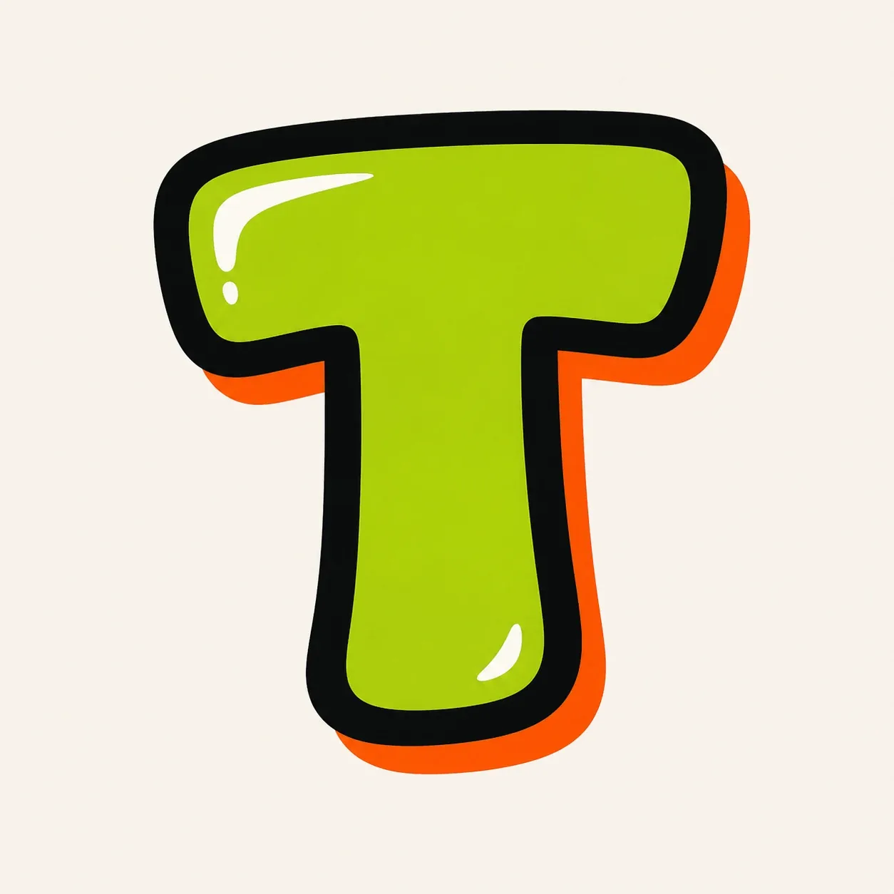
Best when the graffiti letter T needs to stand alone. The broad top bar gives room for highlights, color fills, arrows, and 3D shadow while the stem anchors the design.

Best when lowercase t sits inside a word or tag. Keep the ascender tall, the cross stroke short, and the bottom terminal clean so it still reads clearly as a lowercase t.
Once the basic graffiti letter T is readable, turn its top bar and stem into a specific use case: logo mark, bubble sticker, wildstyle sketch, or tag opener.
Top-bar initial: make the T's wide bar the main visual hook, then keep the vertical stem centered so the mark still reads instantly.
Bubble sticker: round both ends of the top bar, use a bright fill, and leave clean open space under the bar for a soft readable T.
Wildstyle sketch: turn one or both bar ends into arrows, but keep the stem visible before adding overlap, cuts, or extra spikes.
Tag opener: start with a fast sweeping top stroke, then pull the downstroke straight enough to anchor the next letter in a name.
Start the graffiti letter T with a wide top bar guide and a centered vertical stem. Thicken both parts, balance the bar ends, add a bold outline and shadow, then finish with color, highlights, and small accents.
Bubble letter T and simple block letter T are the easiest starting points because the structure is only a top bar and a stem. The main challenge is keeping the top bar wide without making the stem feel too thin.
Keep the top bar clearly horizontal, place the vertical stem under the center, and leave open space on both lower sides. Add arrows, drips, or wildstyle extensions after the graffiti letter T is already recognizable.
Yes. Use the Letter T builder on this page to choose a style, add details like fill color, outline, drips, or wall texture, and send a single-letter T prompt to the AI graffiti generator.
Yes. After you open the generated result in the AI tool, you can download the T design as a PNG and use it for practice sheets, sticker ideas, initials, thumbnails, or username artwork.
Bubble letter T uses rounded bar ends, a simple stem, and soft spacing for easy readability. Wildstyle letter T uses sharper top-bar extensions, arrows, cuts, and overlap, so it works best after the base T is clear.