

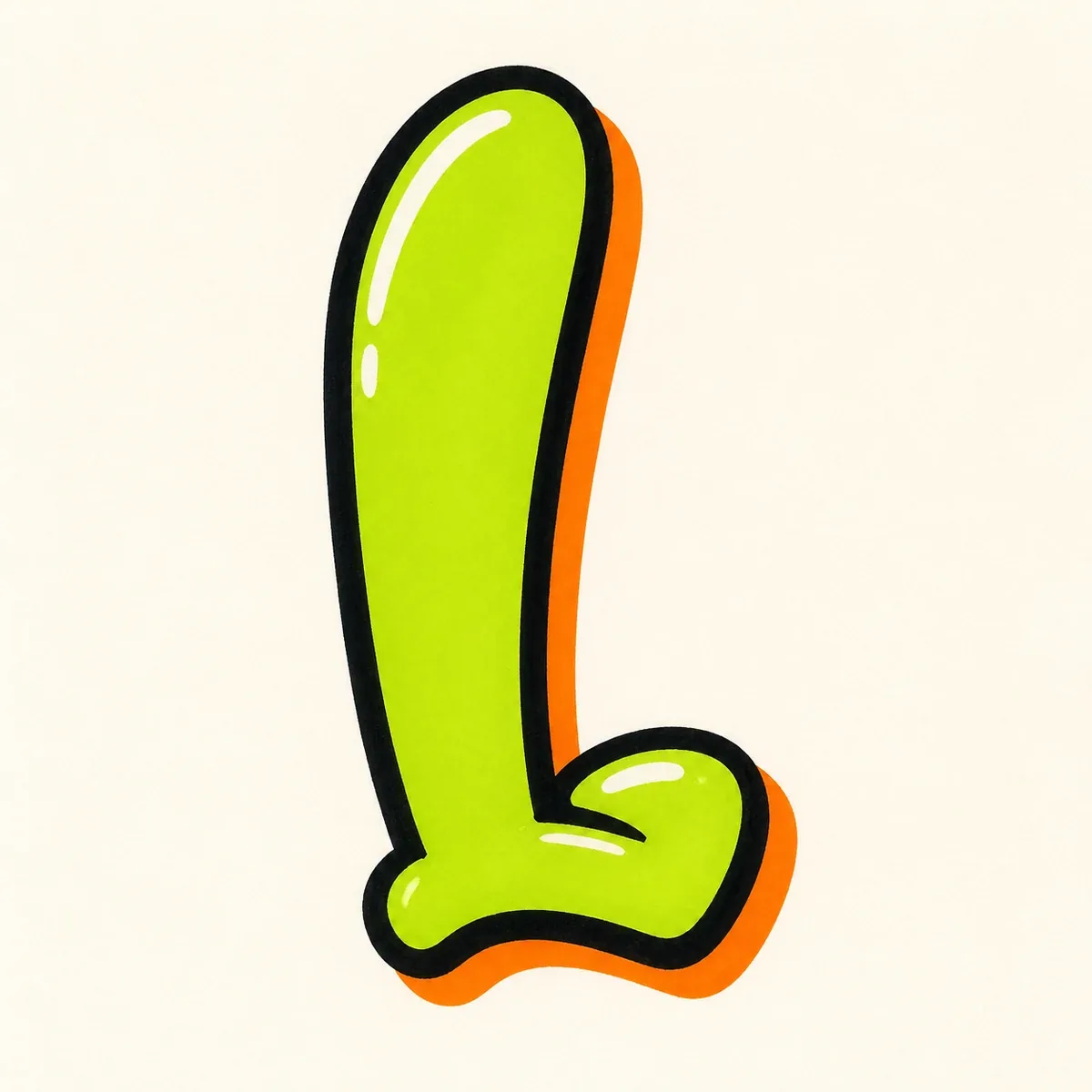
Bubble Letter L
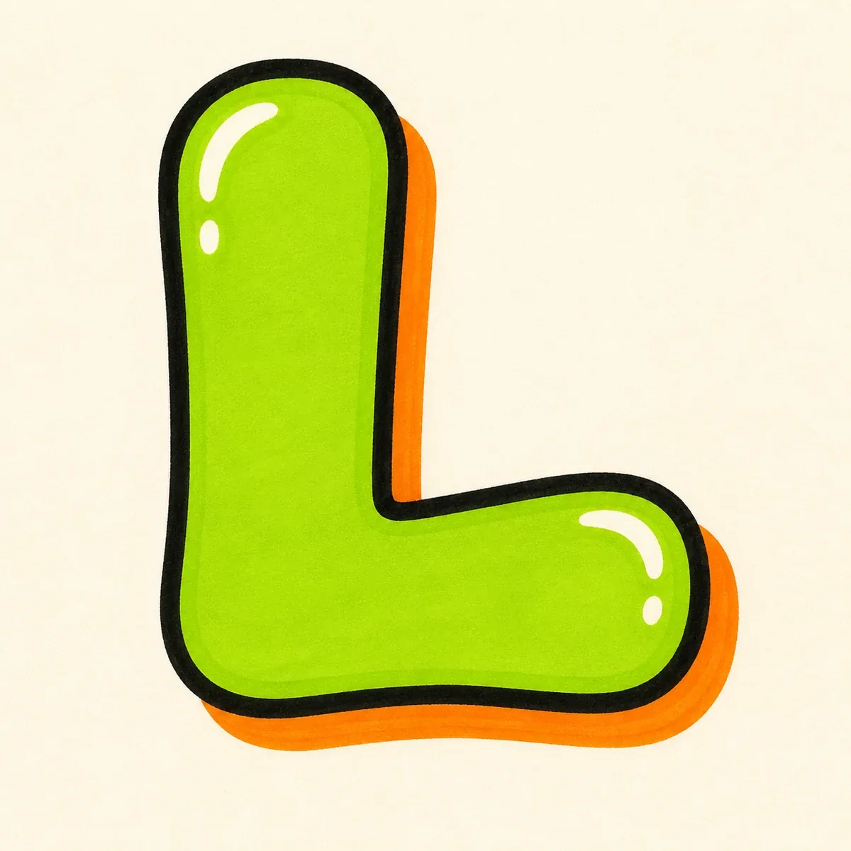
A rounded letter L with a tall soft stem, a long puffy bottom arm, and enough corner space to keep the L easy to read.
Explore Bubble LettersExplore graffiti letter L styles, from bubble and block letters to wildstyle, tag, and 3D examples. Use the drawing steps to keep the tall stem, bottom arm, and inside corner readable, then open the builder to create your own L design.
AI Letter Builder
Open the AI graffiti letter generator to create more custom graffiti letter L ideas.
Choose a letter
Choose a style
Write your instructions
Compare graffiti letter L styles before you draw or create your own. Bubble and block L designs keep the shape simple; tag, 3D, and wildstyle versions show how much movement the lower stroke can carry.
A rounded letter L with a tall soft stem, a long puffy bottom arm, and enough corner space to keep the L easy to read.
Explore Bubble Letters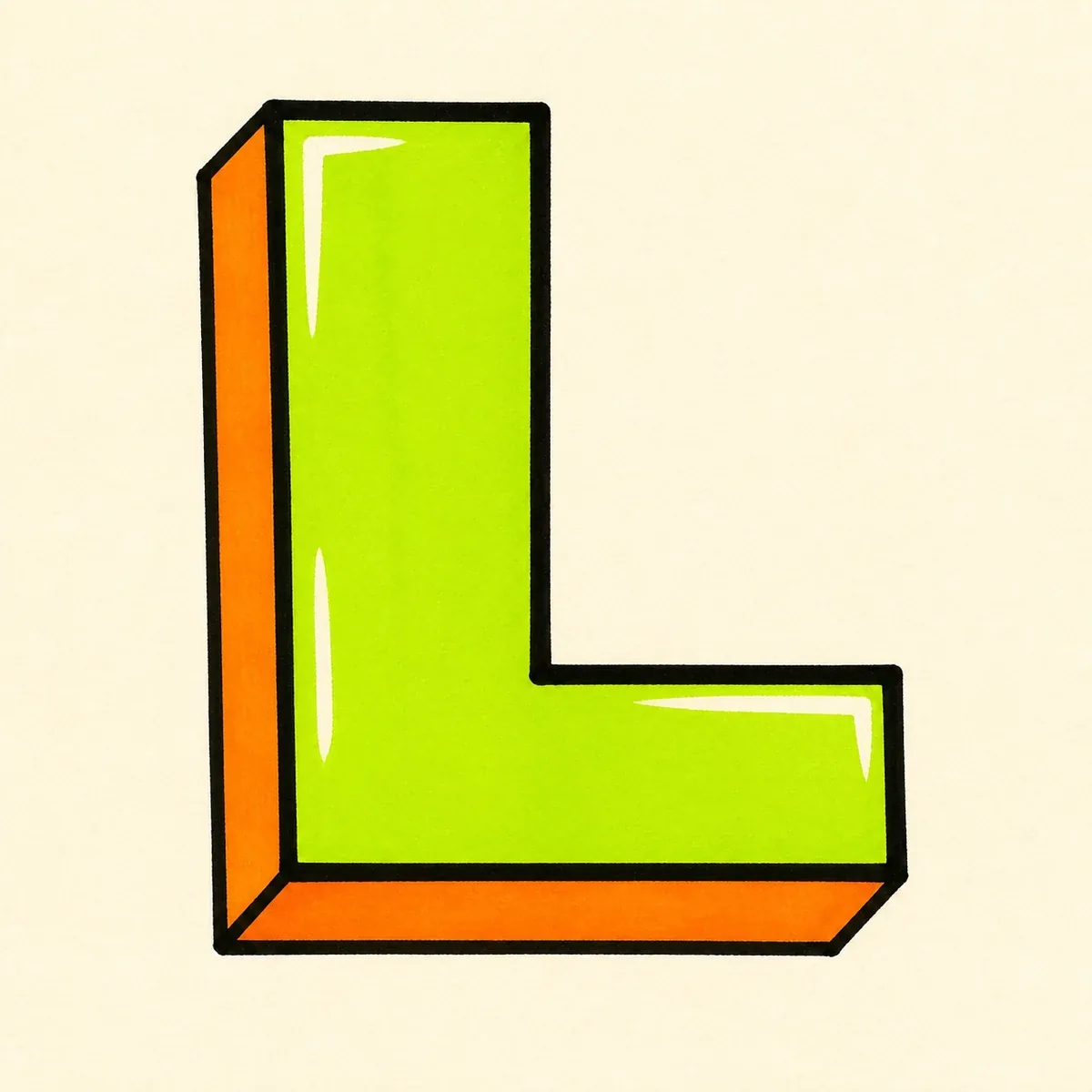
A strong block letter L built from a straight vertical stem and a solid bottom arm, useful for posters, initials, and clean alphabet practice.
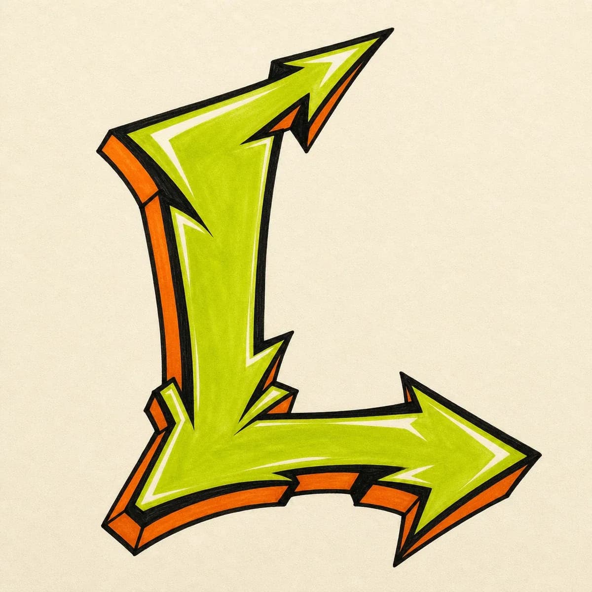
A sharper wildstyle letter L where arrows and cuts extend from the top or lower end while the main L corner stays traceable.
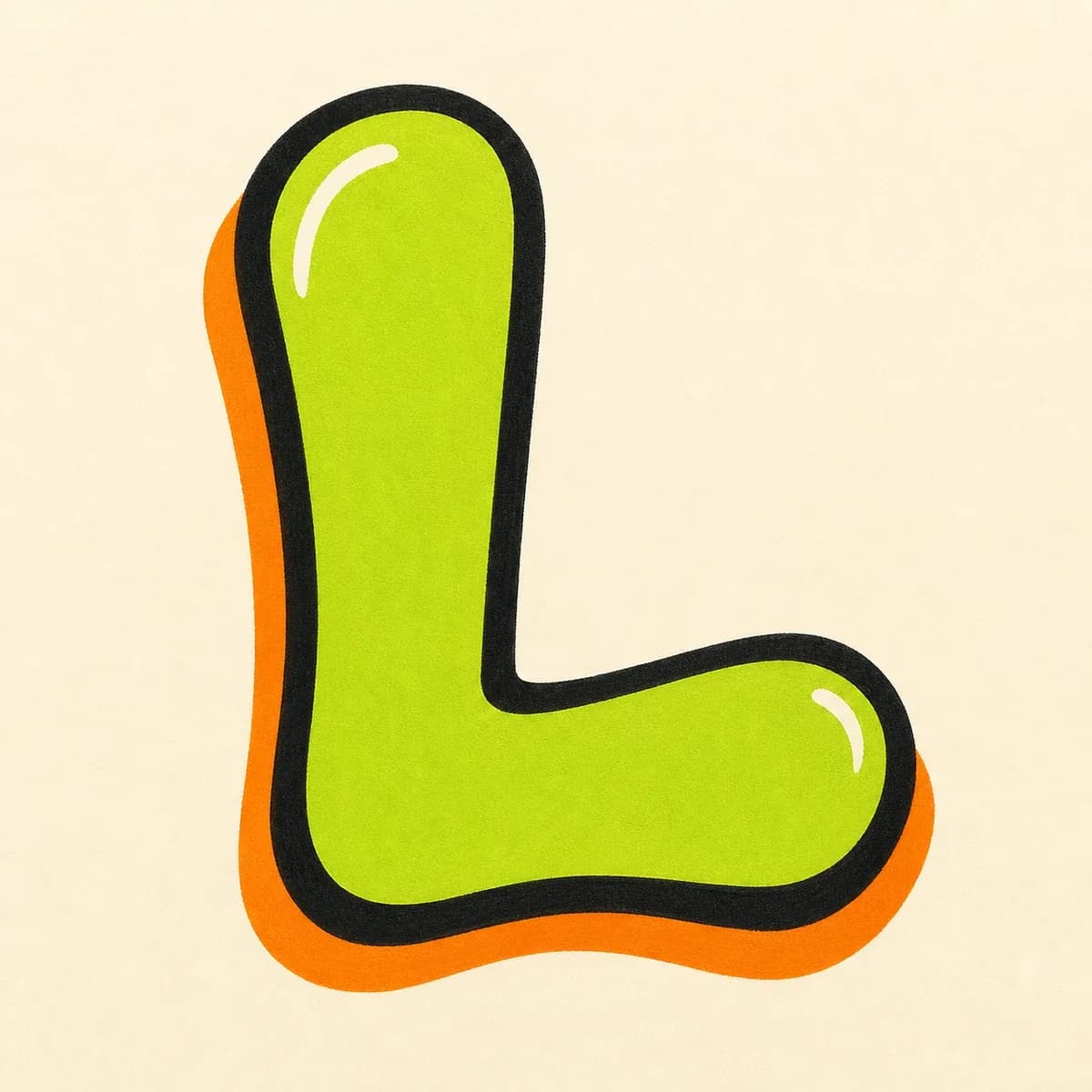
A quick throw-up L with inflated weight, a bold outline, and a wide bottom arm that keeps the letter from looking like a plain vertical stroke.
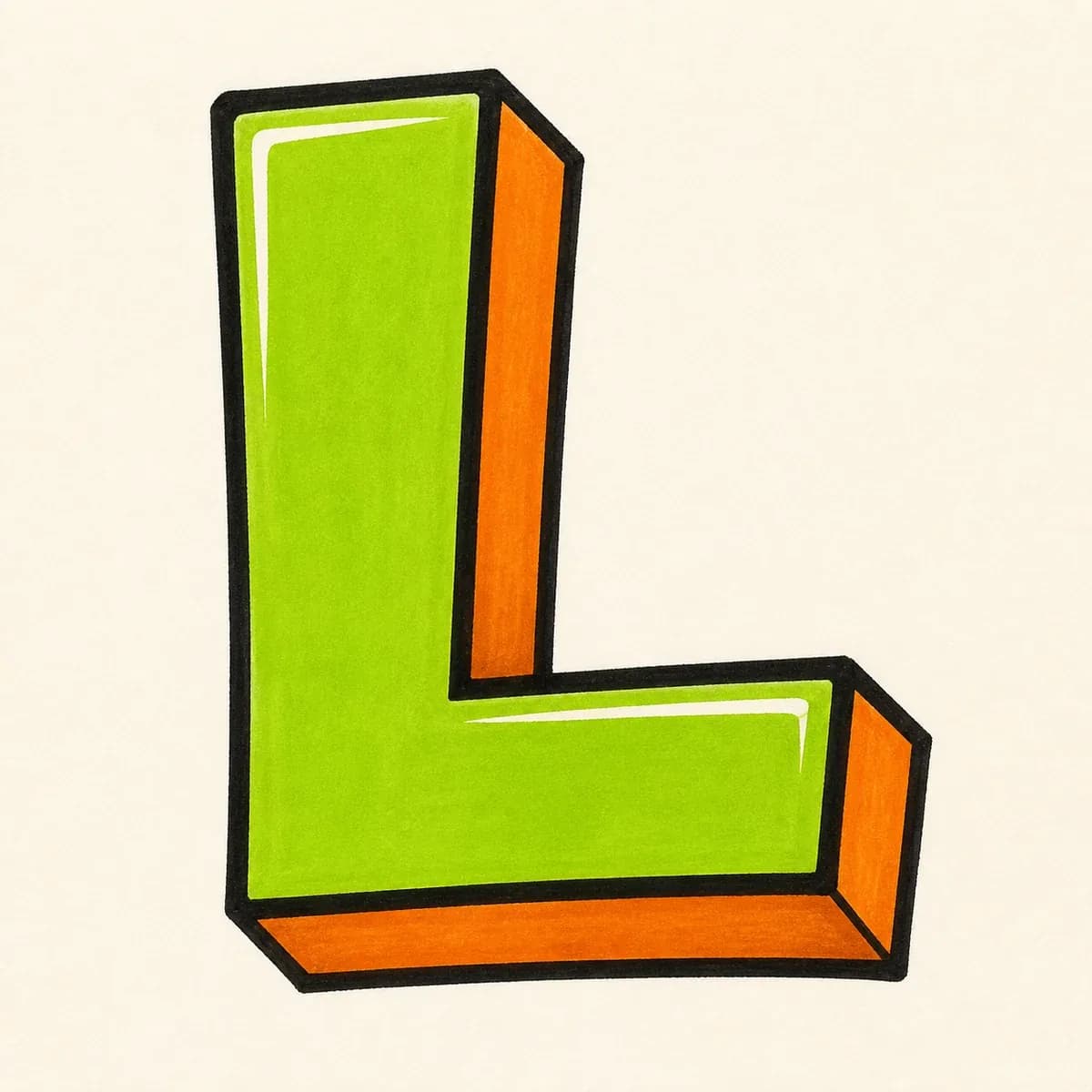
A dimensional 3D letter L with depth pushed from the tall stem and bottom arm in one consistent shadow direction.
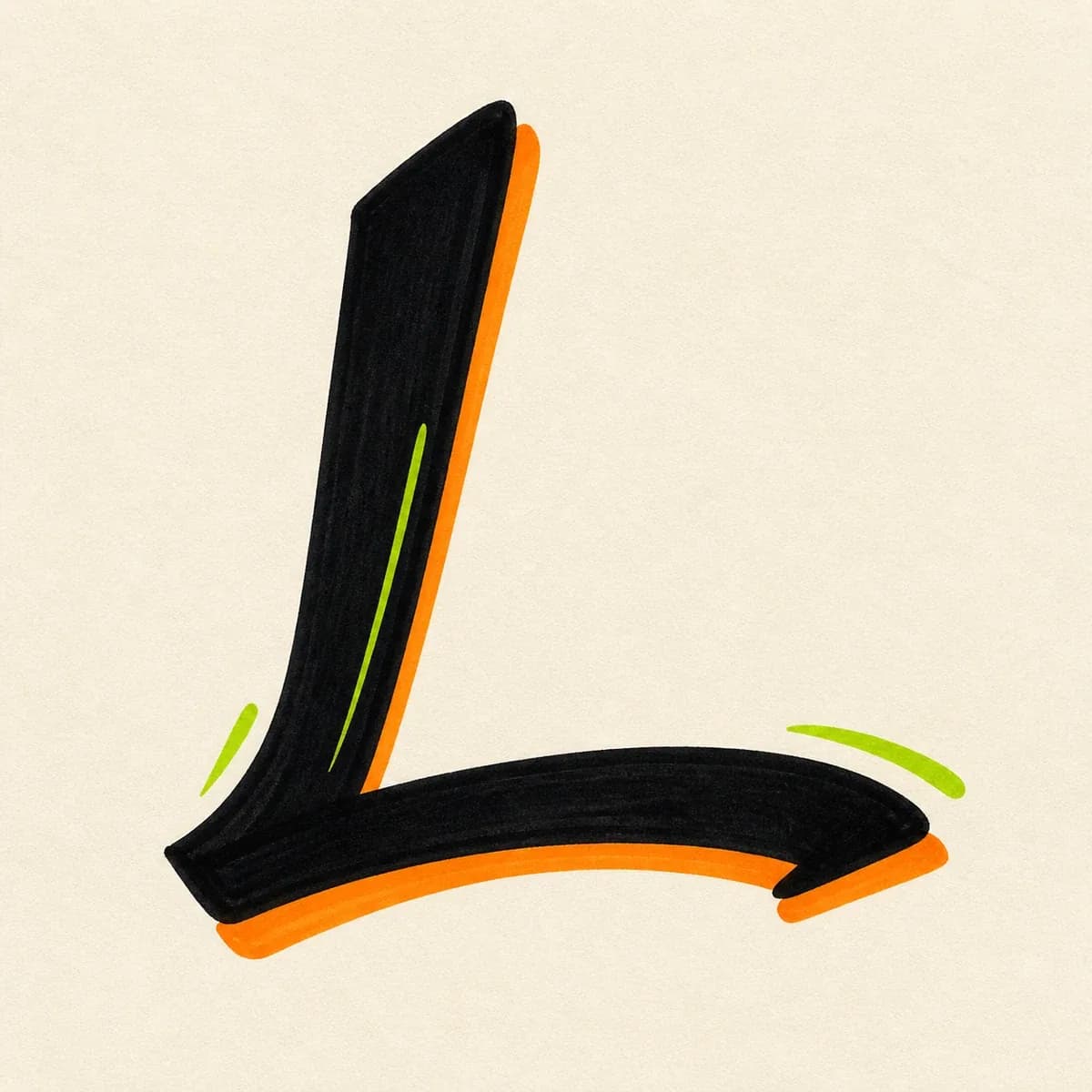
A handstyle L built from a fast downstroke and a sweeping exit stroke, best for names, signatures, and marker-style initials.
Start with a vertical stem and a long bottom arm, then build the graffiti letter L in layers: thicker form, cleaner corner, bold outline, shadow, and final color.
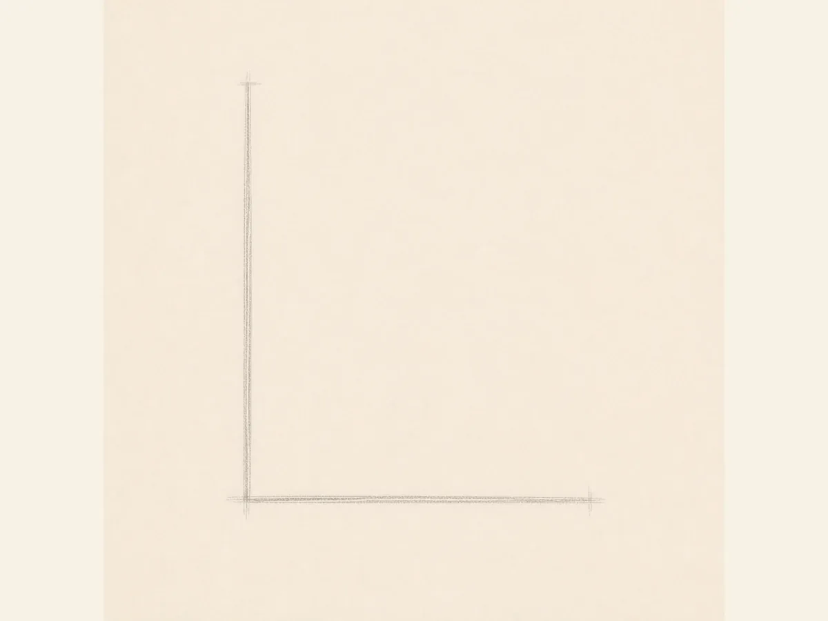
Start with one tall vertical stem and one long bottom guide. Keep the corner clear so the L does not read like I or 1.
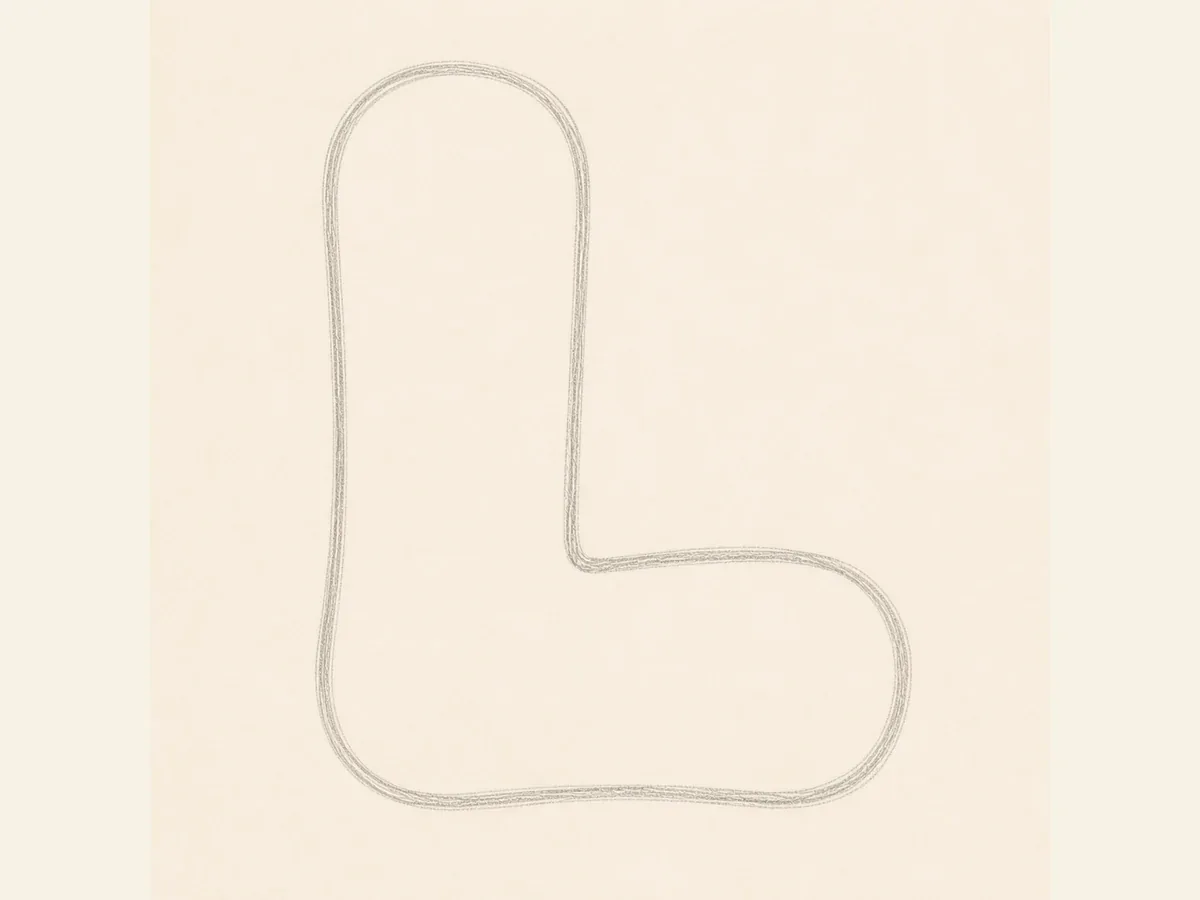
Wrap the skeleton with a rounded or block outline. Give the bottom arm enough length to anchor the whole letter.
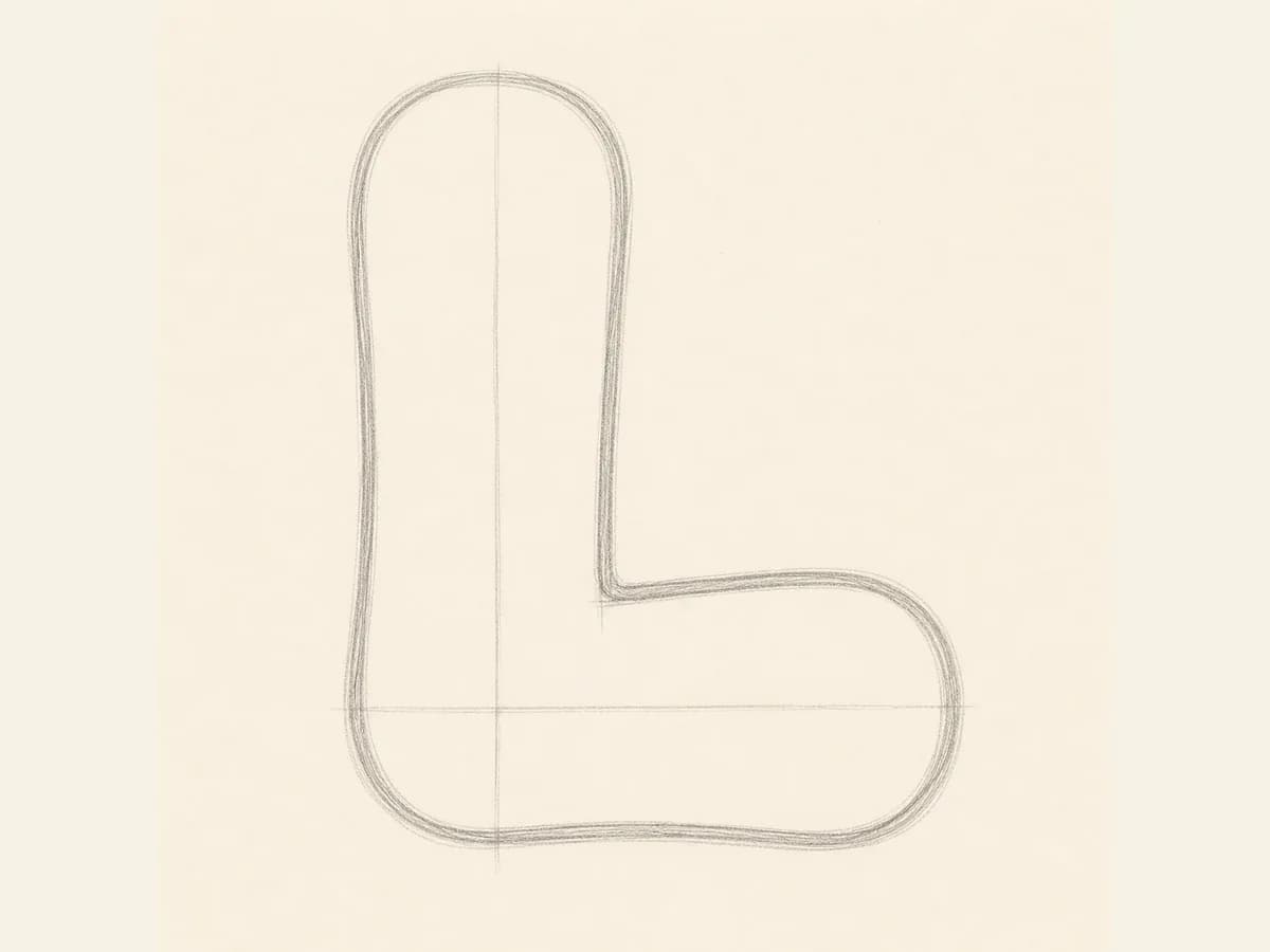
Clean up the inside corner before inking. If the corner is too soft or cramped, the L can lose its strong silhouette.
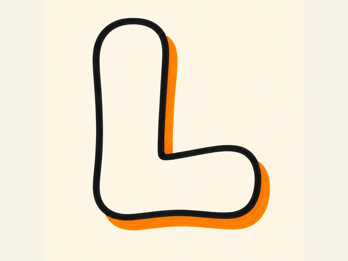
Add a bold outline and shadow. Follow the same shadow direction around the stem, bottom arm, corner, and right terminal.
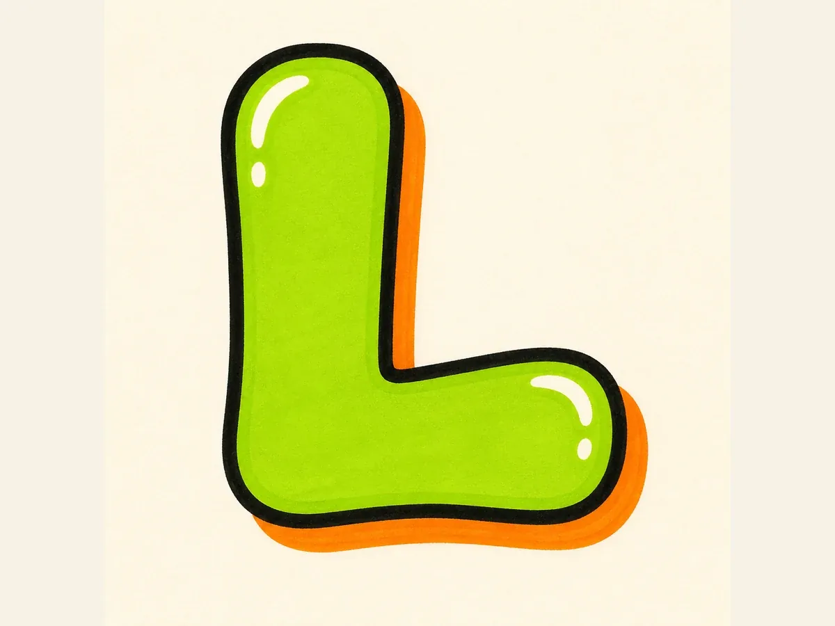
Fill the L with color, place highlights on the stem and bottom arm, then keep small accents away from the inside corner.
These drawing steps keep the vertical stem, bottom arm, corner, terminal shape, and shadow direction consistent from sketch to final color.
Anchor the L with a tall stem and a clear bottom arm. If the baseline is too short, the letter can look like I or 1.
For bubble L, round the terminals. For block L, keep the stem straight and the corner clean. For 3D L, keep depth consistent around the corner.
Build the simple L first, check the bottom arm and corner, then add arrows, highlights, drips, or color around the outer edges.
Use uppercase L when the design needs a strong standalone shape. Use lowercase l inside a name, tag, or wordmark when a slimmer vertical stroke fits the rhythm better.
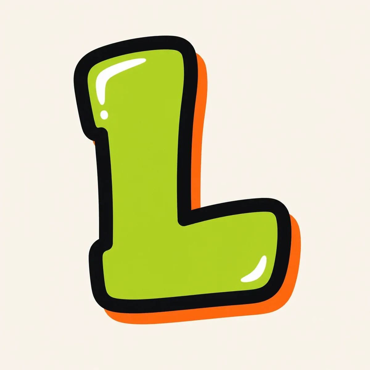
Best for single-letter designs, initials, avatars, stickers, posters, and monogram-style artwork. The tall stem and bottom arm create a stable shape with room for fill, outline weight, 3D depth, and extensions.
Best for names, tags, usernames, and wordmark-style designs. Keep the ascender tall, then add a small foot or hook so the lowercase l does not disappear into nearby vertical letters.
Once the L is readable, use the stem, lower stroke, corner, and end shape to make the letter feel intentional.
Stretch the bottom arm to make the L feel grounded, or tilt the stem slightly for motion while keeping the corner readable.
For bubble letter L, round the top and right terminal, but keep the inside corner open enough to show the L shape.
For wildstyle L, add arrows to the top or bottom-right end only after the basic stem and bottom arm still read clearly.
For tag letter L, draw one quick downstroke and let the bottom stroke lead into the next letter.
Start with a tall vertical stem and a long bottom arm, then thicken both parts into a bubble or block shape. Keep the inside corner open, add a bold outline, place the shadow in one direction, and finish with color, highlights, and small details after the L is clearly readable.
Bubble letter L is usually the easiest because the rounded stem and bottom arm are forgiving. Block letter L is also beginner-friendly if you want cleaner edges; just keep the vertical stem straight and make the bottom arm long enough to read at a glance.
Make the bottom arm obvious, keep the inside corner open, and avoid making the vertical stem too narrow. If the lower stroke is too short or hidden under arrows, the L can look like an I, a lowercase l, or the number 1.
Use a focused prompt with one capital L only, no extra words or extra letters. Then describe the structure and style, such as a rounded bubble corner, straight block bottom arm, deep 3D shadow, tag-style sweep, or wildstyle arrows that do not cover the L shape.
Yes. After creating the graffiti letter L in the AI tool, download the generated image as a PNG for practice sheets, initials, sticker concepts, thumbnails, monograms, or other creative projects. For cleaner reuse, choose a high-contrast fill, a visible outline, and a background that does not swallow the bottom arm.
Use uppercase L for standalone initials because the stem and bottom arm make a strong, stable shape. Use lowercase l inside names or tags when a slimmer vertical stroke fits the word better, but add a small foot, hook, or connection so it does not disappear beside other tall letters.