

Bubble Letter P
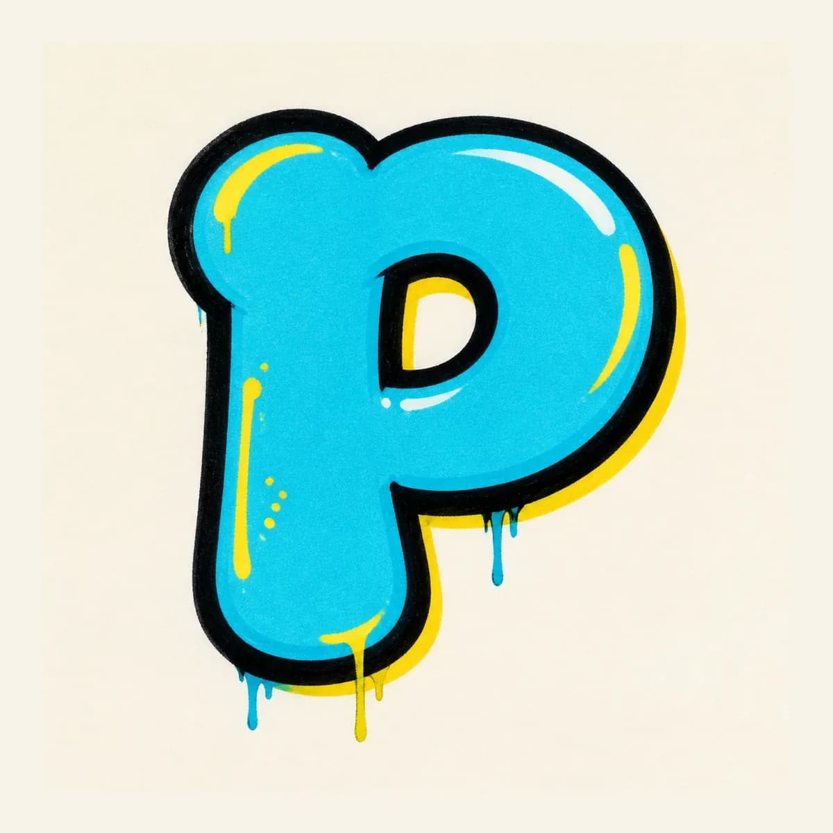
A rounded P design with a thick left stem, puffy upper bowl, and clear inner counter so the shape stays friendly and readable.
Explore Bubble LettersExplore graffiti letter P styles, from bubble and block letters to wildstyle, tag, and 3D examples. Use the drawing steps to understand the left stem, upper bowl, and inner counter, then build your own P design.
AI Letter Builder
Open the AI graffiti letter generator to create more custom graffiti letter P ideas.
Choose a letter
Choose a style
Write your instructions
Compare different graffiti letter P styles before you draw or create your own. Start with bubble or block P shapes to learn the stem, bowl, and counter, then explore tag, 3D, and wildstyle versions for more attitude.
A rounded P design with a thick left stem, puffy upper bowl, and clear inner counter so the shape stays friendly and readable.
Explore Bubble Letters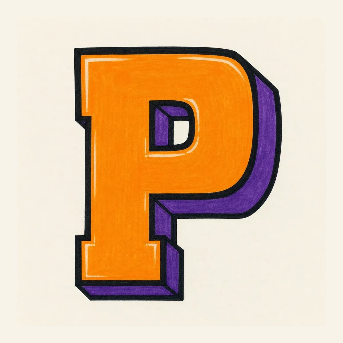
A readable block P built from a straight stem, squared bowl, and clear inner space for logo initials, stickers, and practice sheets.
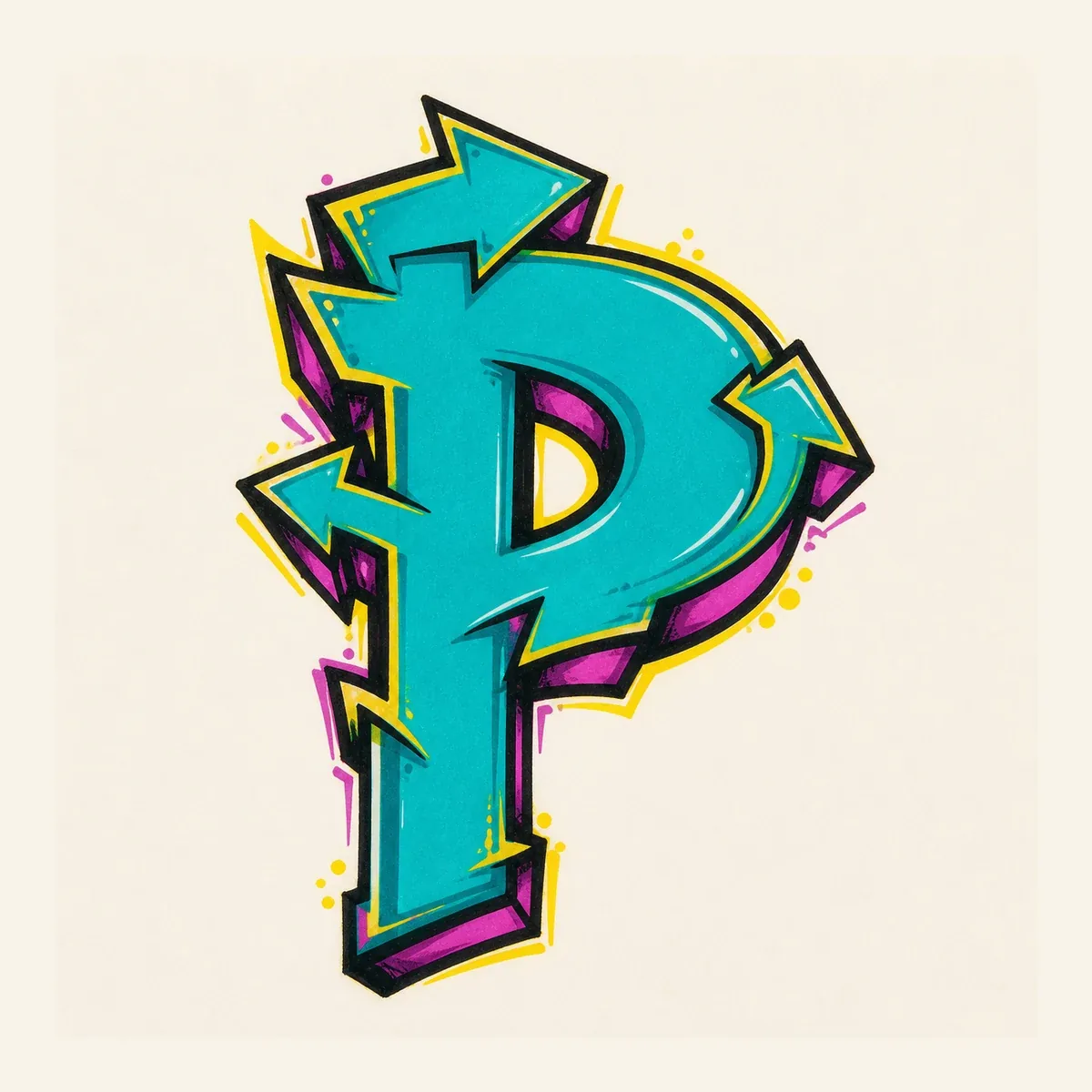
A sharper wildstyle letter P where arrows can grow from the stem and bowl while the lower half avoids a diagonal R-like leg.
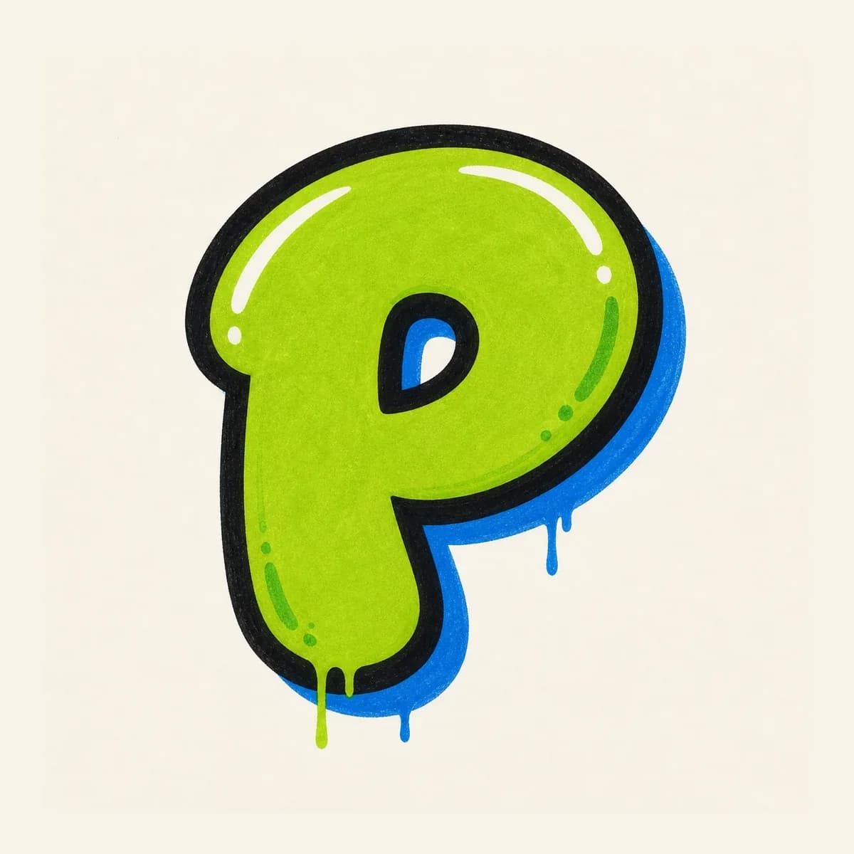
A fast throw-up P with inflated curves, thick outline, and a visible counter that keeps the upper bowl from turning into a blob.
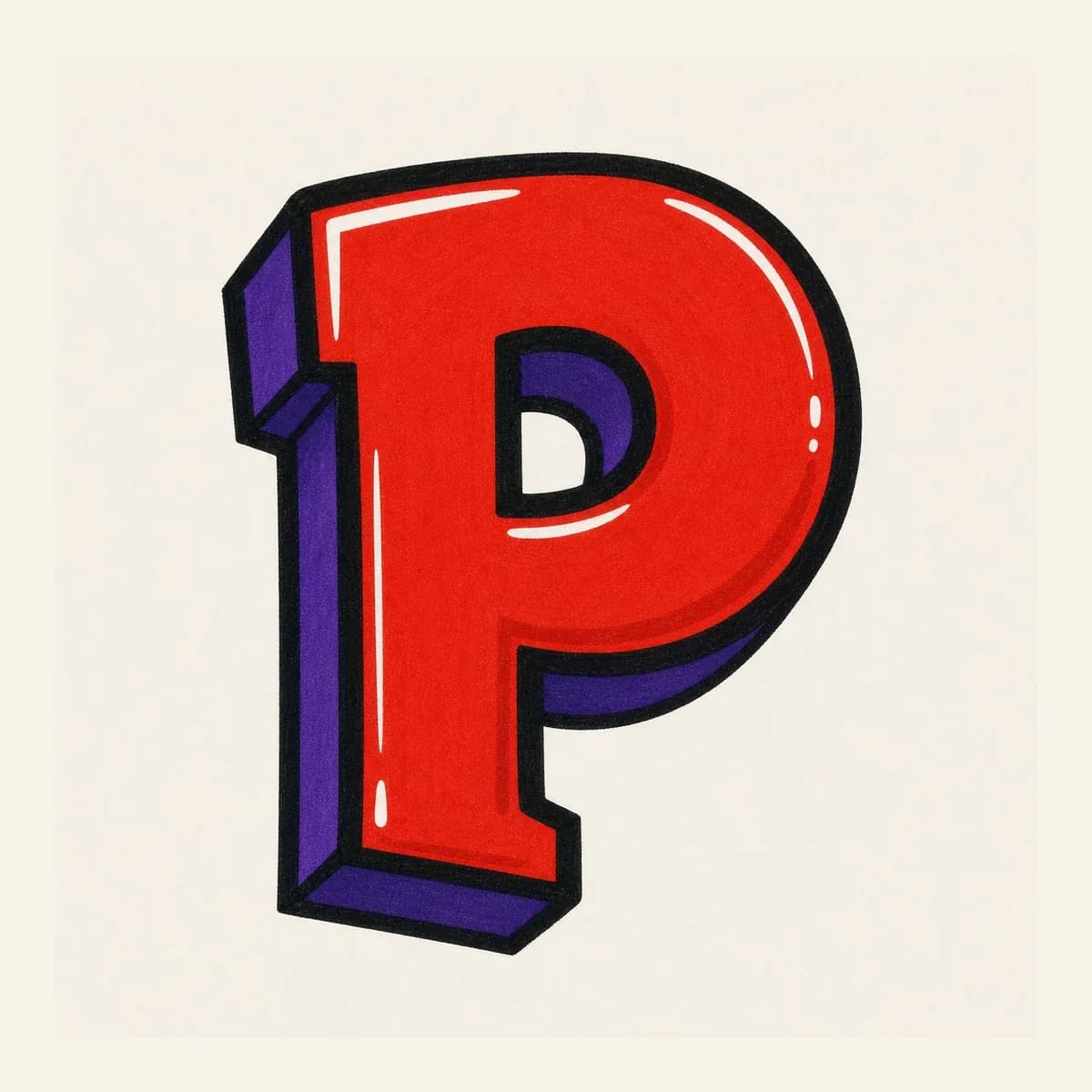
A dimensional 3D letter P that pushes shadow behind the stem and upper bowl while keeping the counter clean and readable.
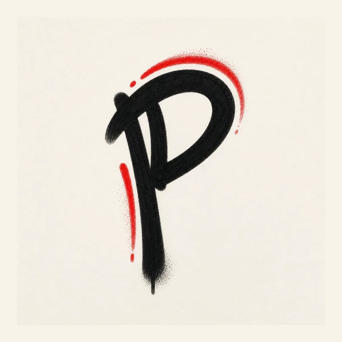
A quick handstyle P made from a vertical stroke and compact upper loop, useful for tags when the mark must not drift into R.
Start with a vertical stem and rounded upper bowl, then build the P in layers: thicker form, clear counter, bold outline, shadow, and final color.
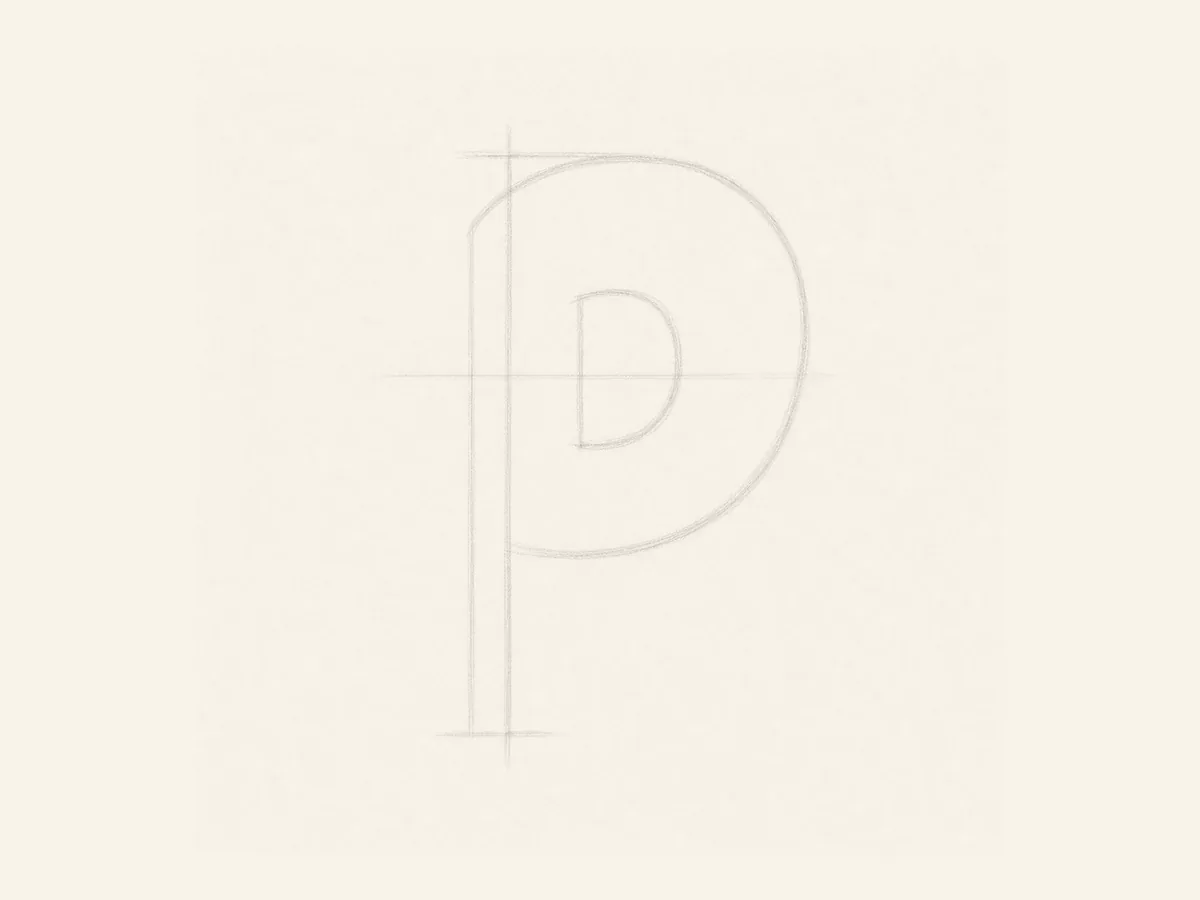
Start with a tall left stem, then place a rounded upper bowl guide and a smaller inner oval guide inside the bowl.
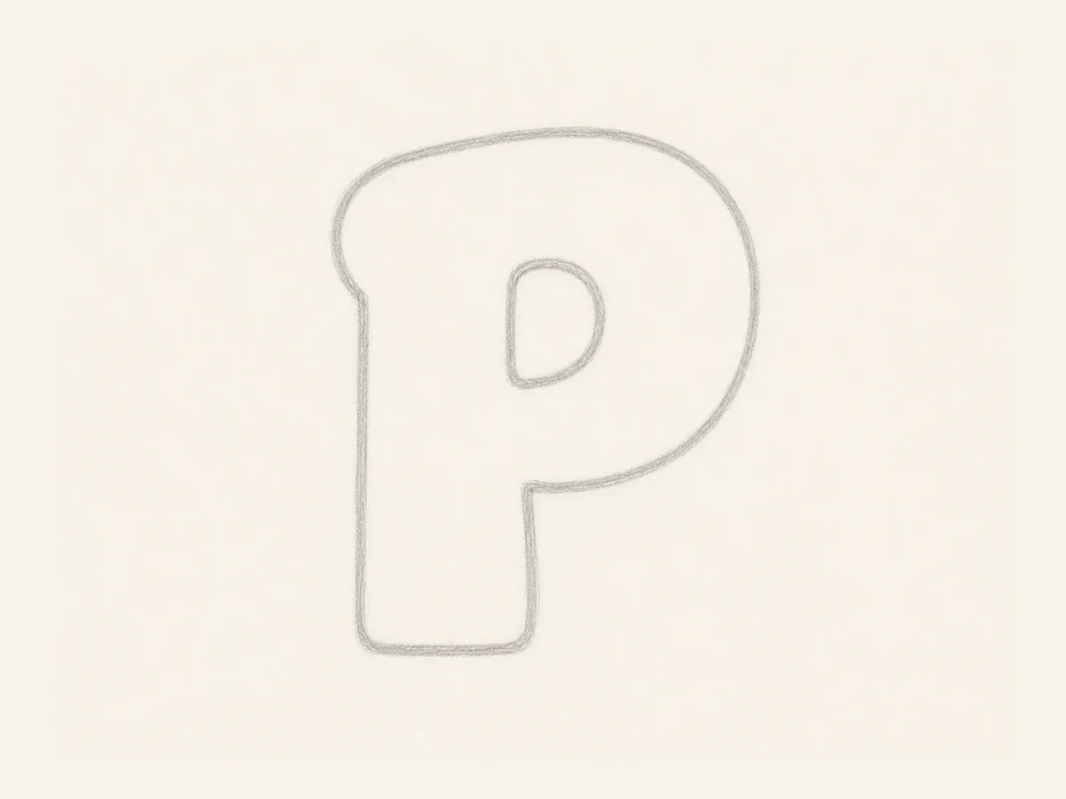
Turn the stem and bowl into a thicker bubble form. Keep the lower stem straight so the letter does not become R.
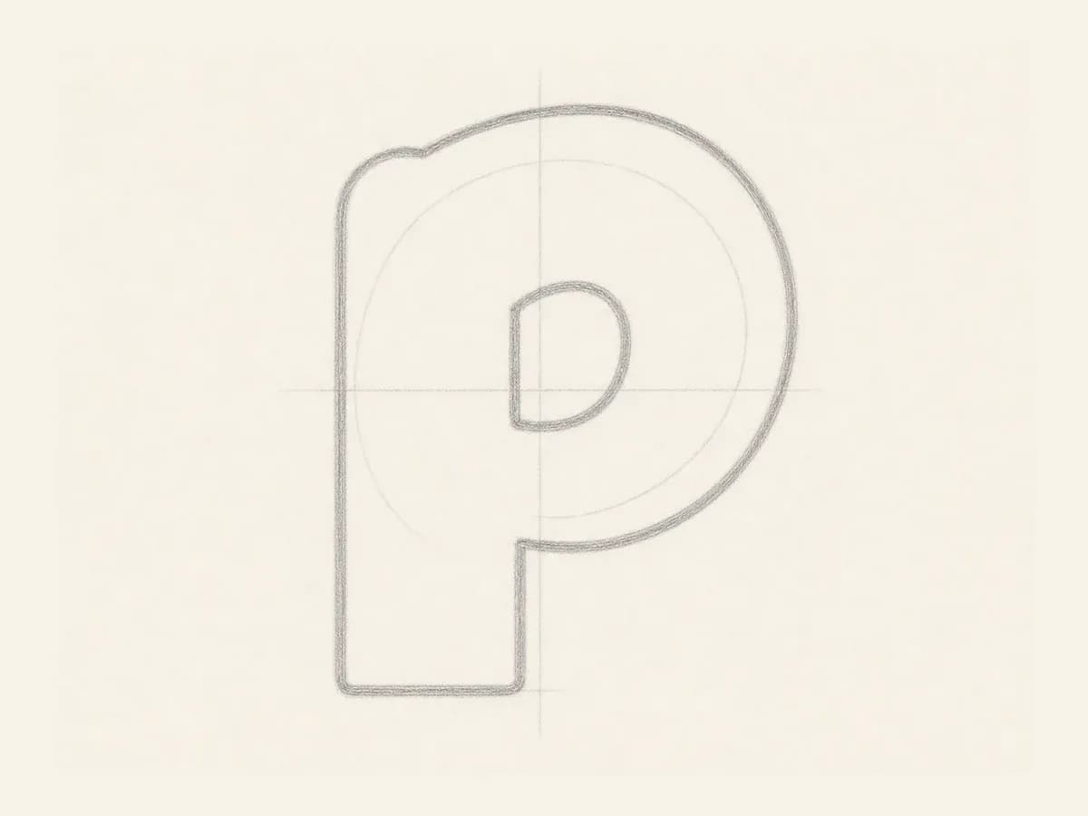
Shape the closed inner space inside the upper bowl. Leave enough white space so the P stays readable after outline and color.
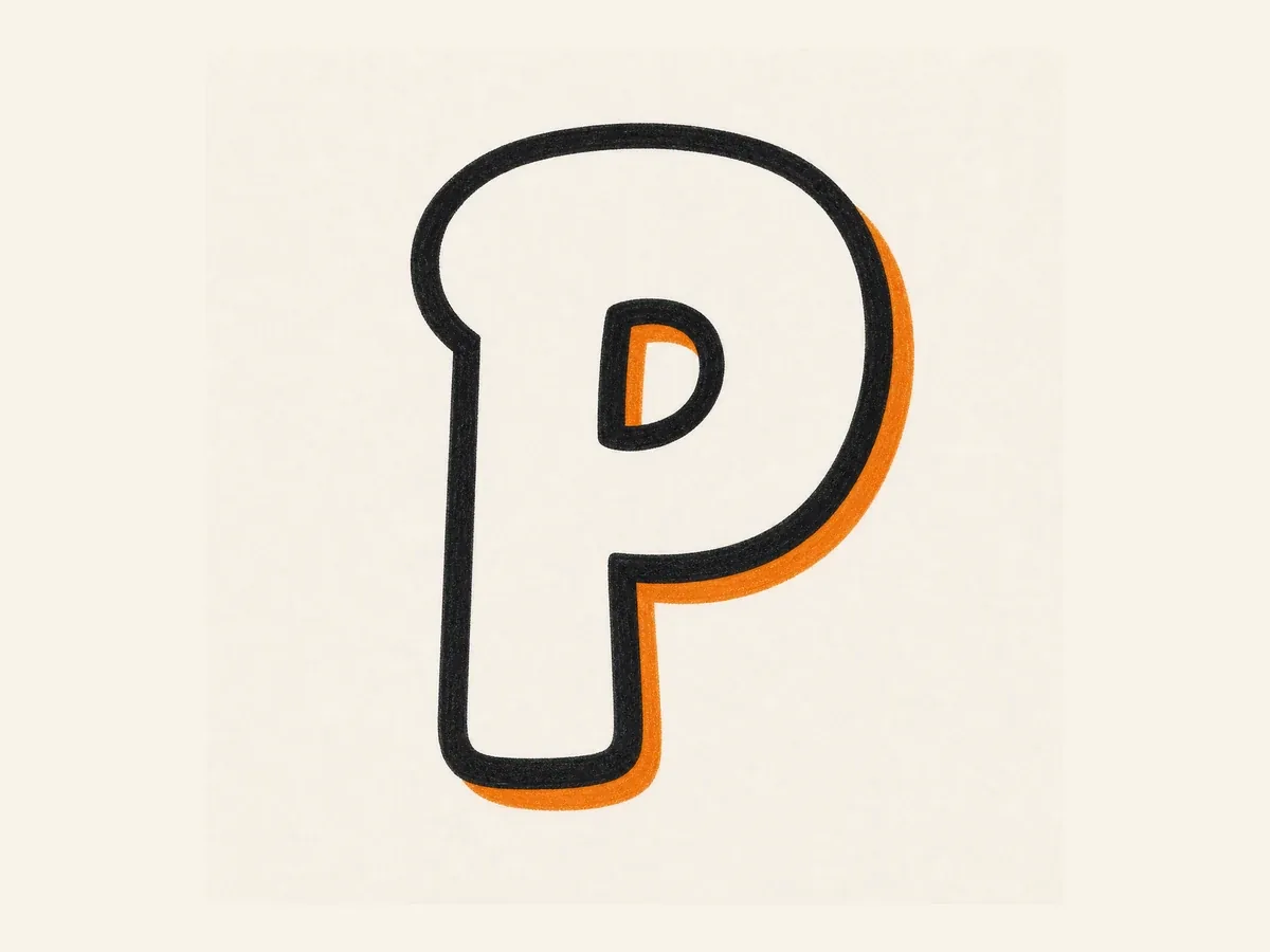
Add a bold marker outline around the stem and bowl, then place a shadow behind one side without filling the counter.
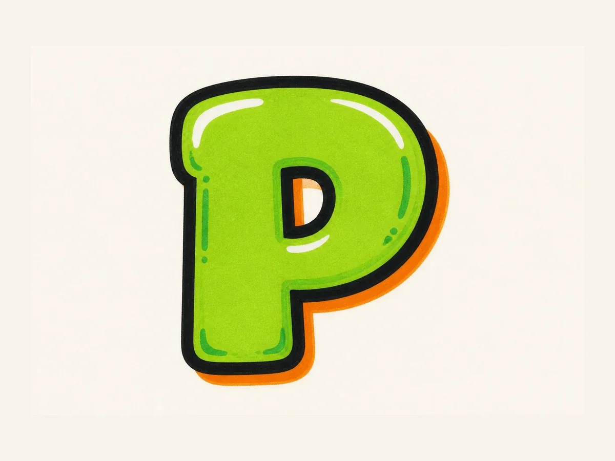
Fill the P with color, add highlights around the bowl, and keep drips or accents away from the inner counter.
Letter P drawing steps are designed to keep the stem, upper bowl, and inner counter consistent from sketch to final color.
Start with a clear left stem and a large upper bowl. Keep the counter visible so the P does not read like F.
For bubble P, round the stem and bowl. For block P, square the stem and keep the counter clean.
Build the simple P first, check the bowl and counter, then add arrows, shadow, highlights, drips, or color.
Use uppercase P for bold initials, posters, and alphabet practice. Use lowercase p when a descender stem needs to flow inside a tag, name, or handwritten word.
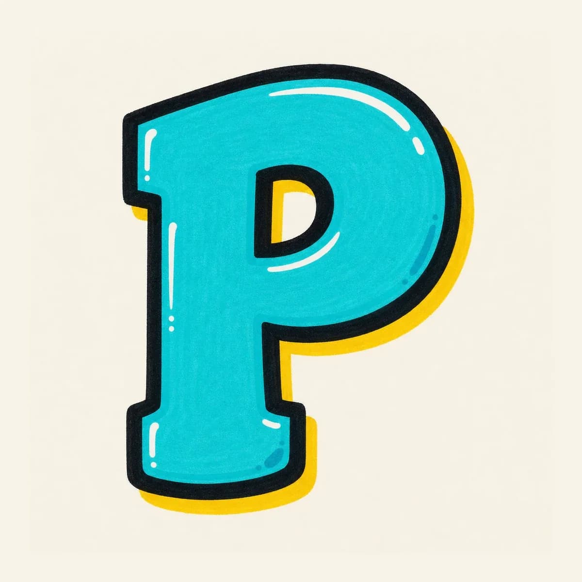
Best when the P needs to stand alone. The tall stem and upper bowl give room for shadow, highlights, and bold color.
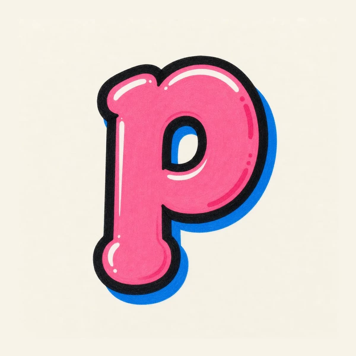
Best when the p sits inside a name or tag. Keep the descender stem and bowl direction clear so it does not read like b or q.
Once the basic P is readable, use the stem, bowl, and counter for logo initials, stickers, wildstyle arrows, or handstyle tags.
Monogram badge: use a tall stem and bold upper bowl so the P works as a clean single-letter mark.
Sticker logo: use a bubble P with bright fill, thick outline, and a clear inner space inside the bowl.
3D poster initial: push the shadow behind the stem and bowl so the P feels heavy without turning into R.
Name opener: start with a fast downstroke, then loop the upper bowl before the next letter begins.
Start the graffiti letter P with a tall left stem, add a rounded upper bowl, then draw the inner counter. Once the P is readable, thicken the shape, outline it, add shadow, then finish with color, highlights, and small accents.
Bubble letter P is usually the easiest because the stem and upper bowl are simple to round out. The key is keeping the inner counter open and avoiding a diagonal lower leg that makes the letter look like R.
Keep the upper bowl large enough to separate P from F, and do not add a diagonal lower leg unless you intentionally want R. The closed counter inside the bowl is the main readability cue.
Yes. Use the Letter P builder on this page to choose a style, add details like fill color, outline, drips, or wall texture, and send a single-letter P prompt to the AI graffiti generator.
Yes. After you open the generated result in the AI tool, you can download the graffiti letter P as a PNG and use it for practice sheets, sticker ideas, logo initials, thumbnails, or username artwork.
Use uppercase P for bold standalone initials and alphabet practice. Use lowercase p inside names and tags when you want a descender stem, but keep the bowl clear so it does not read like b or q.