
How to Draw Graffiti: A Beginner Guide to Readable Letters
Last updated: July 31, 2026


Summary
To draw graffiti, start with readable straight letters, fix the letter structure, then add style last. Choose a short word or tag, control spacing and tilt, build the outline, add color and shadow, and use the toy-looking checklist before trying wildstyle details.
To draw graffiti, start with a short word or name, sketch it as plain readable letters, then build the graffiti style in layers: structure, spacing, weight, outline, fill color, shadow, and background. Do not start with arrows, drips, or wildstyle details. Those only work after the letters are already easy to read.
Most beginner tutorials show the same basic steps, but they often skip the part that beginners need most: how to tell what is wrong with the letters. If you are learning how to draw graffiti letters, keep the first version simple and readable. A clean word with simple structure will always beat a crowded design that no one can read. Use it with pencil and paper, or preview the same word in the online graffiti generator before you redraw it by hand.
That structure-first approach is not just a personal preference. Oak National Academy teaches graffiti-style lettering through shape, color, shadow, outline, and balanced sketching; the Museum of Graffiti starts beginners with a personal tag and repeated sketch practice. In community critique spaces like r/graffhelp, the same pattern comes up often: fix basic letter structure before adding arrows, wildstyle extensions, or heavy effects.
Key takeaways
- Choose a short word, name, or tag before you add style.
- Draw keyboard letters or straight letters first so the structure stays readable.
- Use guide lines to control spacing, height, baseline, and tilt.
- Add outline, fill color, highlights, and shadow only after the word works in black and white.
- If your graffiti looks toy, remove decoration and fix the letter skeleton first.
What You Need Before You Start
You do not need spray paint to learn how to draw graffiti. In fact, beginners should start on paper or in a digital editor because the goal is practice, not speed. Use a pencil, eraser, black marker, and a few colors. A ruler can help with guide lines, but do not make the drawing feel stiff. You only need enough structure to keep the letters under control.
Keep the practice legal and low-pressure. Treat the first page as typography, shape, color, outline, and shadow practice, not as a rush to make a finished wall piece. Those basics are useful because they keep the focus on letter control before finished effects.
A sketchbook is useful because it lets you repeat the same word several times. A browser editor is useful for a different reason: you can test the same word in bubble, block, tag, or 3D styles before spending time redrawing it. If your word is a name or short alias, keep the graffiti name generator open as a reference while you practice.
Step 1: Choose a Short Word, Name, or Tag
The first mistake is choosing a word that is too long. Four or five letters gives you enough room to practice spacing, overlap, outline, and shadow. A name, nickname, initials, or simple tag works better than a full sentence. If you do not have a tag yet, use your first name, a short gamer tag, or two initials.
This starting point matches how graffiti learning usually works: writers learn letters through names, tags, and repeated words. The word becomes a small testing ground. You can draw it as straight letters, then block letters, then bubble letters, then a faster handstyle. Comparing one word across styles teaches more than jumping between random prompts.
If you want a safe practice word, try something like BLAZE, NOVA, KILO, RIFT, or your own initials. The best first word has a mix of straight, round, and angled letters, but not so many letters that the page gets crowded.
Step 2: Start With Keyboard Letters or Straight Letters
Before you draw graffiti effects, draw the word as plain capital letters. This is sometimes called keyboard letter practice or straight letter practice. It can feel boring, but it fixes the exact problems that make beginner graffiti fall apart: uneven letter height, random tilt, bad spacing, and weak structure.
Think of each letter as a skeleton. The skeleton of an A needs two angled legs and a crossbar. The skeleton of an R needs a stem, a bowl, and a leg. The skeleton of an S needs a clear top curve, middle turn, and lower curve. If you hide these parts too early, people cannot read the word, even if the colors look good.
Draw the same word three times without any decoration. On the first pass, keep every letter the same height. On the second pass, make the spacing more even. On the third pass, give the letters one shared tilt. That small exercise builds more control than adding ten arrows to a weak word.
This is also the advice beginners often hear in critique communities: learn basic letter structure first, then add style. Community feedback can be blunt, but the useful pattern is consistent. If the straight letters are weak, the finished graffiti will be weak too.
Step 3: Sketch Guidelines for Flow and Spacing
Guide lines help your graffiti drawing feel intentional. Draw a baseline where the letters sit, then a top line that controls their height. If you want the word to move, tilt both guide lines together or curve them gently. Do not make each letter choose its own direction unless you already know why.
Divide the word area into sections before drawing. If your word has five letters, give each letter a rough space. The sections do not have to be equal, because some letters need more room than others, but they stop you from squeezing the final letter into a tiny corner.
Check the middle of the word early. If the center letters are too large, the ends will collapse. If the center is too empty, the word will feel weak. This is why many paper tutorials start with layout before color. Layout is not decoration; it is the frame that keeps the word readable.
Step 4: Turn the Skeleton Into Graffiti Letter Shapes
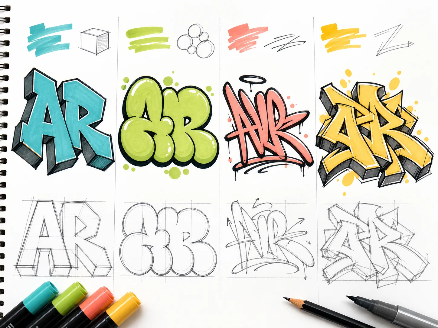
Once the skeleton works, thicken each stroke into a bar. A bar is the body of the letter. In block letters, bars are straighter and heavier. In bubble letters, bars become rounded and inflated. In tag letters, bars may move faster and connect more loosely. The style changes, but the underlying letter still needs to be there.
Keep the inside spaces open. These inside spaces are called counters. The holes in A, B, D, O, P, Q, and R help people identify the letters quickly. If the counter closes, the letter can turn into a blob. This is one reason new graffiti often looks like a pile of shapes instead of a word.
Use one style decision at a time. Round the corners for a bubble version. Square the bars for a block version. Stretch one or two bars for movement. Save wild extensions for later. If you want to inspect a single letter before building the full word, use the graffiti letter generator or browse the graffiti letters A-Z reference pages.
Step 5: Overlap Letters Without Hiding the Word
Overlap makes graffiti feel connected, but too much overlap kills readability. Let one letter tuck slightly behind another, or let two bars share an edge. Do not cover the part of the letter that tells people what it is. The bowl of a B, the leg of an R, the crossbar of an A, and the middle turn of an S need to stay visible.
A good test is the three-second read. Step back from the drawing or shrink the image on your screen. If someone could read the word in three seconds, the overlap is probably controlled. If they have to guess, simplify the connections before adding more style.
Step 6: Add the Outline
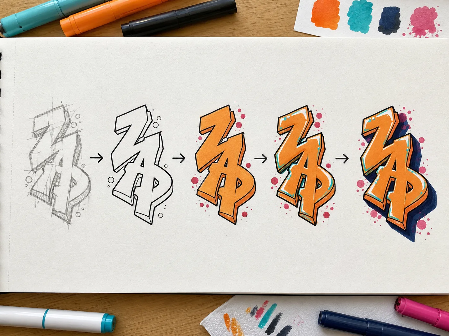
The outline separates the letters from the background and makes the word feel finished. Clean the pencil sketch first, then draw a confident black outline around the letters. Keep the outline thickness consistent unless you are deliberately creating weight in one direction.
Do not use the outline to hide weak structure. If the sketch is confusing, fix the letter shapes before inking. A thick outline can make a good word stronger, but it cannot make an unreadable word clear.
Step 7: Add Fill Color, Highlights, and Shadow
Keep the first color pass simple. Use one fill color or a clean two-color blend, a dark outline, and one shadow direction. More colors do not automatically make graffiti better. They often make beginner work harder to read.
Highlights should follow one light source. If the shine is on the top-left of one letter, keep it top-left on the others. Shadows work the same way. Pick down-right, down-left, or straight down, then stay consistent. Random shadow directions make the word look unstable.
Try the design in black and white before judging the color. If the word works without color, the fill and highlights can improve it. If the word only works because the colors distract you, the structure still needs another pass.
Step 8: Add a Simple Background Last
Background comes after the letters. A brick wall, cloud shape, spray texture, splatter, or simple block color can make the drawing feel complete, but it should support the word. If the background is more detailed than the letters, people will look at the wrong thing.
For digital practice, export one transparent version and one wall version. The transparent version shows whether the letters are strong by themselves. The wall version shows whether the design feels like street art. For a larger scene, move from the text editor to the AI graffiti art generator after the lettering direction is clear.
Common Beginner Mistakes That Make Graffiti Look Toy
If your graffiti looks toy, the problem is usually not that you need more effects. It is usually that the basic letter decisions are not working yet. Use this table before you redraw.
| What you see | Likely cause | How to fix it |
|---|---|---|
| The word feels messy | Every letter has a different size or tilt | Redraw as straight letters on shared guide lines |
| People cannot read it | Overlap hides key letter parts | Open counters and reduce connections |
| It looks like a bubble doodle | Rounded shapes have no skeleton underneath | Draw block structure first, then round the corners |
| The effects feel random | Arrows, drips, shine, and shadows were added too early | Keep one effect and remove the rest |
| The color looks loud but weak | Too many colors fight the outline | Use one fill, one outline, one shadow |
Readability Checklist Before You Finish
Before you call the drawing finished, run a quick readability check. This matters more than whether the word has enough decorations.
- Can someone read the word in three seconds?
- Are the letters sitting on the same baseline or following one planned curve?
- Are the counters still open where the letter needs them?
- Does every letter have a similar visual weight?
- Is the shadow direction consistent across the word?
- Does the design still work in black and white?
- Did the decoration improve the word, or did it hide the word?
A 7-Day Graffiti Practice Plan for Beginners
Do not practice by drawing a different complicated word every day. Practice by improving the same small set of decisions. This one-week plan gives you a simple loop.
- Day 1: Draw your word as clean straight letters ten times.
- Day 2: Redraw it with better spacing and one shared tilt.
- Day 3: Turn the same word into block letters.
- Day 4: Turn the same word into bubble letters.
- Day 5: Add outline only. No color, no background.
- Day 6: Add one fill color and one shadow direction.
- Day 7: Redraw the best version from memory, then compare it with the earlier sketches.
If you want to compare style directions during the week, use the graffiti styles page to review bubble, wildstyle, tag, block, and 3D directions. Start with readable styles before you chase complexity.
Try the Same Word Online Before Drawing Again
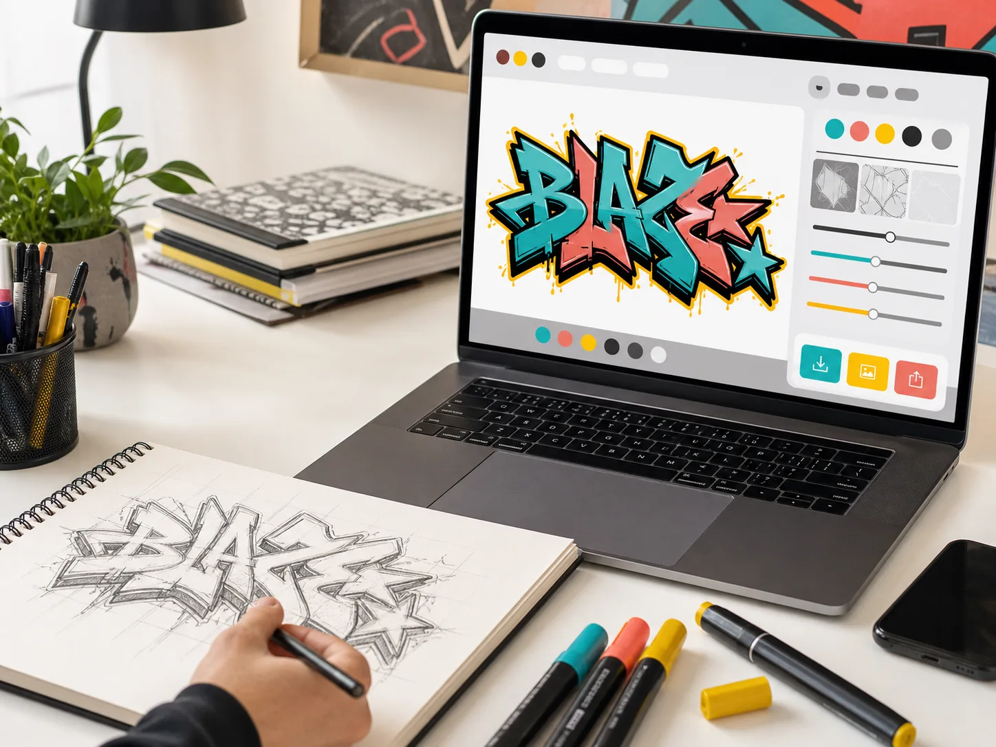
A digital preview helps because it separates decisions. You can test the word, then the style, then the outline, then the shadow. That is easier than trying to invent every choice at once on paper.
Start with the online graffiti generator when you want a fast browser workflow. Use the graffiti text generator for words and slogans, the graffiti tag generator for short aliases, and the bubble letters guide when you want a beginner-friendly style with rounded forms.
FAQ
What is the easiest graffiti style to draw first?
Start with straight letters or simple block letters. They teach spacing, size, tilt, and letter structure before you add bubble shapes, shadows, or wildstyle extensions.
Should beginners start with tags or full graffiti pieces?
Start with readable letters and a short tag or name. A full piece is easier after you understand how each letter is built, spaced, outlined, and weighted.
Why does my graffiti look toy?
Beginner graffiti often looks toy when the letter structure is weak, spacing is uneven, arrows are added too early, or shadows and colors hide the word. Fix the skeleton before adding style.
Can I draw graffiti without spray paint?
Yes. Use pencil, paper, markers, colored pencils, or a browser-based graffiti generator. Practice on paper or digitally before painting anything in a legal, approved space.
When should I try wildstyle graffiti?
Try wildstyle after you can draw readable straight, block, or bubble letters. Wildstyle depends on structure, connections, rhythm, and restraint, not just arrows and complexity.